Suivi des étendues de mangroves
Mots clés : données utilisées ; sentinel-2, données utilisées ; externe, mangroves, indice de bande ; NDVI
Aperçu
Global Mangrove Watch (GMW) est une initiative visant à suivre l’étendue des mangroves à l’échelle mondiale. Les données ALOS PALSAR et Landsat (optiques) ont été utilisées pour établir une base de référence sur l’étendue des mangroves pour les années 1996, 2007, 2008, 2009, 2010, 2015 et 2016. Des informations plus détaillées sur l’initiative sont disponibles ici <http://data.unep-wcmc.org/datasets/45>`__. Cet ensemble de données a été rastérisé et indexé dans le cube de données ouvert de DE Africa. Pour plus d’informations sur la manière de charger cet ensemble de données, consultez le bloc-notes GMW Datasets.
Description
L’objectif de ce carnet est de surveiller l’évolution de l’étendue des mangroves, en utilisant les couches GMW comme masque de base.
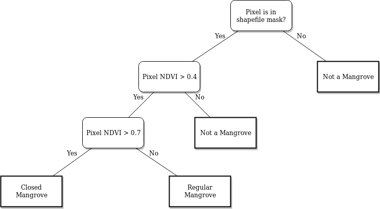
Le processus commence par la récupération des données Sentnel-2 pour une zone spécifique dans une série chronologique. Cet ensemble de données est ensuite compressé dans un composite median pour chaque année. À partir du composite, nous calculons ensuite les valeurs NDVI de chaque pixel de chaque année. L’ensemble de données est ensuite masqué et le seuil NDVI est appliqué pour la classification des mangroves. L’image suivante montre l’arbre de décision pour la classification.
Après la classification, nous pouvons effectuer diverses analyses sur les données :
Nous pouvons estimer l’évolution des zones de mangrove en comptant tous les pixels classés pour chaque année et en traçant la ligne de tendance du comptage.
Nous pouvons estimer l’évolution des zones de mangrove en comptant tous les pixels classés pour chaque année et en traçant la ligne de tendance du comptage.
Commencer
Pour exécuter cette analyse, exécutez toutes les cellules du bloc-notes, en commençant par la cellule Load packages.
Une fois l’analyse terminée, revenez à la cellule Paramètres d’analyse, modifiez certaines valeurs (par exemple, choisissez votre propre fichier de formes de mangrove ou période de temps à analyser) et réexécutez l’analyse.
Charger des paquets
[1]:
%matplotlib inline

import warnings
import datacube
import numpy as np
import pandas as pd
import xarray as xr
import geopandas as gpd
import matplotlib.pyplot as plt
from datacube.utils import geometry
from matplotlib.patches import Patch
from matplotlib.colors import ListedColormap
from deafrica_tools.bandindices import calculate_indices
from deafrica_tools.dask import create_local_dask_cluster
from deafrica_tools.datahandling import load_ard
from deafrica_tools.plotting import display_map
from odc.geo.geom import Geometry
from deafrica_tools.spatial import xr_rasterize
from deafrica_tools.areaofinterest import define_area
from eo_tides.eo import tag_tides
Configurer un cluster Dask
Dask peut être utilisé pour mieux gérer l’utilisation de la mémoire et effectuer l’analyse en parallèle. Pour une introduction à l’utilisation de Dask avec Digital Earth Africa, consultez le Dask notebook.
Remarque : nous vous recommandons d’ouvrir la fenêtre de traitement Dask pour afficher les différents calculs en cours d’exécution ; pour ce faire, consultez la section Tableau de bord Dask en Afrique de l’Ouest du Dask notebook.
Pour utiliser Dask, configurez le cluster de calcul local à l’aide de la cellule ci-dessous.
[2]:
create_local_dask_cluster()
Client
Client-0cac734d-c464-11f0-88b1-22be2d1047ac
| Connection method: Cluster object | Cluster type: distributed.LocalCluster |
| Dashboard: /user/mpho.sadiki@digitalearthafrica.org/proxy/37905/status |
Cluster Info
LocalCluster
ef26f679
| Dashboard: /user/mpho.sadiki@digitalearthafrica.org/proxy/37905/status | Workers: 1 |
| Total threads: 4 | Total memory: 26.21 GiB |
| Status: running | Using processes: True |
Scheduler Info
Scheduler
Scheduler-fb8c210e-bfc7-4345-b685-c845c0f7e6aa
| Comm: tcp://127.0.0.1:34577 | Workers: 1 |
| Dashboard: /user/mpho.sadiki@digitalearthafrica.org/proxy/37905/status | Total threads: 4 |
| Started: Just now | Total memory: 26.21 GiB |
Workers
Worker: 0
| Comm: tcp://127.0.0.1:37267 | Total threads: 4 |
| Dashboard: /user/mpho.sadiki@digitalearthafrica.org/proxy/45861/status | Memory: 26.21 GiB |
| Nanny: tcp://127.0.0.1:39507 | |
| Local directory: /tmp/dask-scratch-space/worker-s36gr1se | |
Charger les données
Connectez-vous à la base de données Datacube et configurez un cluster de traitement.
[3]:
dc = datacube.Datacube(app="Mangrove")
Paramètres d’analyse
« lat, lon, buffer » : latitude/longitude centrales et taille de la fenêtre d’analyse pour la zone d’intérêt
product_name: le nom du produit satellite à utiliser.time_range: la plage de dates à analyser (par exemple("2017", "2020")).tide_range: proportion minimale et maximale de l’amplitude des marées à inclure dans l’analyse. Par exemple,tide_range = (0,25, 0,75)sélectionnera toutes les images satellite prises dans des conditions de marée moyenne (c’est-à-dire entre le 25e et le 75e percentile). Cela nous permet de supprimer tout impact des marées sur la classification de l’étendue des mangroves. De plus, comme Sentinel-2 est un capteur héliosynchrone, la marée moyenne est observée plus que les marées basses et hautes. Il est donc avantageux d’utiliser l’étendue de la marée moyenne car nous conserverons davantage d’images satellites.
Sélectionnez l’emplacement
Pour définir la zone d’intérêt, deux méthodes sont disponibles :
En spécifiant la latitude, la longitude et la zone tampon. Cette méthode nécessite que vous saisissiez la latitude centrale, la longitude centrale et la valeur de la zone tampon en degrés carrés autour du point central que vous souhaitez analyser. Par exemple, « lat = 10,338 », « lon = -1,055 » et « buffer = 0,1 » sélectionneront une zone avec un rayon de 0,1 degré carré autour du point avec les coordonnées (10,338, -1,055).
Vous pouvez également fournir des valeurs de tampon distinctes pour la latitude et la longitude d’une zone rectangulaire. Par exemple, « lat = 10.338 », « lon = -1.055 » et « lat_buffer = 0.1 » et « lon_buffer = 0.08 » sélectionneront une zone rectangulaire s’étendant sur 0,1 degré au nord et au sud et 0,08 degré à l’est et à l’ouest à partir du point « (10.338, -1.055) ».
Pour des temps de chargement raisonnables, définissez la mémoire tampon sur « 0,1 » ou moins.
By uploading a polygon as a
GeoJSON or Esri Shapefile. If you choose this option, you will need to upload the geojson or ESRI shapefile into the Sandbox using Upload Files button in the top left corner of the Jupyter Notebook interface. ESRI shapefiles must be uploaded with all the related files
 (.cpg, .dbf, .shp, .shx). Once uploaded, you can use the shapefile or geojson to define the area of interest. Remember to update the code to call the file you have uploaded.
Pour utiliser l’une de ces méthodes, vous pouvez décommenter la ligne de code concernée et commenter l’autre. Pour commenter une ligne, ajoutez le symbole "#" avant le code que vous souhaitez commenter. Par défaut, la première option qui définit l’emplacement à l’aide de la latitude, de la longitude et du tampon est utilisée.
Si vous exécutez le bloc-notes pour la première fois, conservez les paramètres par défaut ci-dessous. Cela permettra de démontrer le fonctionnement de l’analyse et de fournir des résultats significatifs.
[4]:
# Method 1: Specify the latitude, longitude, and buffer
aoi = define_area(lat=11.88, lon=-15.8558, buffer=0.15)

# Method 2: Use a polygon as a GeoJSON or Esri Shapefile.
#aoi = define_area(vector_path='aoi.shp')

#Create a geopolygon and geodataframe of the area of interest
geopolygon = Geometry(aoi["features"][0]["geometry"], crs="epsg:4326")
geopolygon_gdf = gpd.GeoDataFrame(geometry=[geopolygon], crs=geopolygon.crs)

# Get the latitude and longitude range of the geopolygon
lat_range = (geopolygon_gdf.total_bounds[1], geopolygon_gdf.total_bounds[3])
lon_range = (geopolygon_gdf.total_bounds[0], geopolygon_gdf.total_bounds[2])

product_name = "s2_l2a"

time_range = ("2017", "2021")

tide_range = (0.25, 0.75) # only keep mid tides
Afficher l’emplacement sélectionné
La cellule suivante affichera la zone sélectionnée sur une carte interactive. N’hésitez pas à zoomer et dézoomer pour mieux comprendre la zone que vous allez analyser. En cliquant sur n’importe quel point de la carte, vous découvrirez les coordonnées de latitude et de longitude de ce point.
[5]:
display_map(lon_range, lat_range)
[5]:
Charger les données Sentinel-2 masquées par le cloud
Le code ci-dessous utilise la fonction load_ard pour charger les données des satellites Sentinel-2 pour la zone et la période spécifiées. Pour plus d’informations, consultez le bloc-notes Using load_ard. La fonction masquera également automatiquement les nuages de l’ensemble de données, ce qui nous permettra de nous concentrer sur les pixels qui contiennent des données utiles :
[6]:
# create a query dict for the datacube
query = {
    "time": time_range,
    'x': lon_range,
    'y': lat_range,
    "group_by": "solar_day",
    "resolution": (-20, 20),
    "output_crs":"EPSG:6933",
}

# load data
ds = load_ard(
    dc=dc,
    products=[product_name],
    measurements=["red", "nir_2"], #use nir-narrow for NDVI
    mask_filters=[("opening", 5), ("dilation", 5)],
    dask_chunks={"time": 1, "x": 1000, "y": 1000},
    **query,
)
print(ds)
Using pixel quality parameters for Sentinel 2
Finding datasets
    s2_l2a
Applying morphological filters to pq mask [('opening', 5), ('dilation', 5)]
Applying pixel quality/cloud mask
Returning 344 time steps as a dask array
<xarray.Dataset> Size: 7GB
Dimensions:      (time: 344, y: 1875, x: 1449)
Coordinates:
  * time         (time) datetime64[ns] 3kB 2017-01-05T11:27:37 ... 2021-12-30...
  * y            (y) float64 15kB 1.524e+06 1.524e+06 ... 1.486e+06 1.486e+06
  * x            (x) float64 12kB -1.544e+06 -1.544e+06 ... -1.515e+06
    spatial_ref  int32 4B 6933
Data variables:
    red          (time, y, x) float32 4GB dask.array<chunksize=(1, 1000, 1000), meta=np.ndarray>
    nir_2        (time, y, x) float32 4GB dask.array<chunksize=(1, 1000, 1000), meta=np.ndarray>
Attributes:
    crs:           EPSG:6933
    grid_mapping:  spatial_ref
/opt/venv/lib/python3.12/site-packages/deafrica_tools/datahandling.py:565: FutureWarning: In a future version of xarray the default value for compat will change from compat='no_conflicts' to compat='override'. This is likely to lead to different results when combining overlapping variables with the same name. To opt in to new defaults and get rid of these warnings now use `set_options(use_new_combine_kwarg_defaults=True) or set compat explicitly.
  ds = xr.merge([ds_data, ds_masks])
Découpez les ensembles de données selon la forme de la zone d’intérêt
Un géopolygone représente les limites et non la forme réelle, car il est conçu pour représenter l’étendue de l’entité géographique cartographiée, plutôt que sa forme exacte. En d’autres termes, le géopolygone est utilisé pour définir la limite extérieure de la zone d’intérêt, plutôt que les entités et caractéristiques internes.
Il est important de découper les données selon la forme exacte de la zone d’intérêt, car cela permet de garantir que les données utilisées sont pertinentes pour la zone d’étude spécifique. Bien qu’un géopolygone fournisse des informations sur la limite de l’entité géographique représentée, il ne reflète pas nécessairement la forme ou l’étendue exacte de la zone d’intérêt.
[7]:
#Rasterise the area of interest polygon
aoi_raster = xr_rasterize(gdf=geopolygon_gdf, da=ds, crs=ds.crs)
#Mask the dataset to the rasterised area of interest
ds = ds.where(aoi_raster == 1)
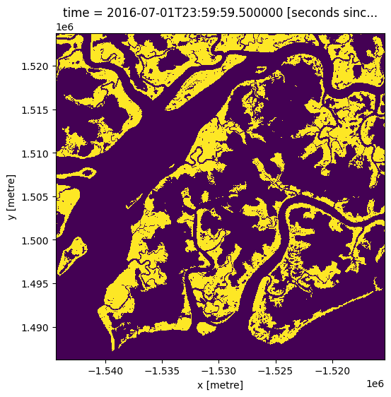
Chargement dans le Global Mangrove Watch
Ci-dessous, nous chargeons la dernière couche GMW, qui date de 2016
[8]:
gmw = dc.load(product='gmw',
              time='2016',
              like=ds.geobox)
[9]:
gmw.mangrove.plot(figsize=(6,6), add_colorbar=False);
Modèles de hauteurs de marée
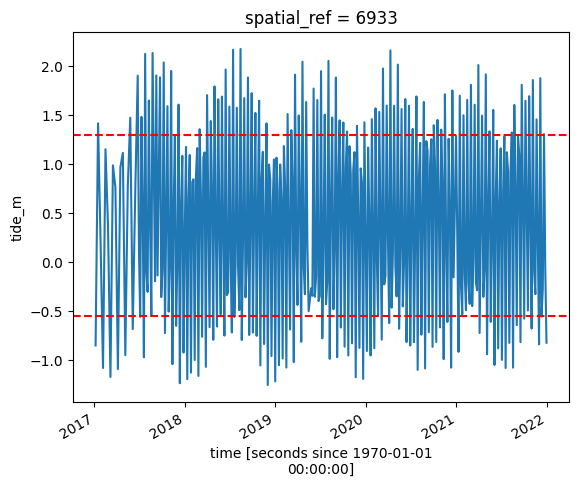
L’emplacement du littoral peut varier considérablement entre la marée basse et la marée haute, ce qui peut avoir un impact sur les valeurs NDVI des pixels où l’eau et les mangroves se mélangent. Dans le code ci-dessous, nous cherchons à réduire l’effet des marées en modélisant les données de hauteur de marée et en ne conservant que les images satellites prises dans des conditions de marée spécifiques. Par exemple, si tide_range = (0.00, 0.50), nous indiquons à l’analyse de se concentrer uniquement sur les images satellites prises lorsque la marée se situait entre les conditions de marée les plus basses et les conditions médianes (50e percentile).
We can pass our satellite dataset ds to the tag_tides function from the eo-tides Python package to model a tide for each timestep in our dataset. This can help sort and filter images by tide height, allowing us to learn more about how coastal environments respond to the effect of changing tides. The tag_tides function uses the time and date of acquisition and the geographic centroid of each satellite observation as inputs for the selected tide model (EOT20 by default). It returns an
xarray.DataArray called tide_height, with a modelled tide for every timestep in our satellite dataset.
Remarque importante : cette fonction ne peut modéliser correctement les marées que si le centre de votre zone d’étude est situé au-dessus de l’eau. Si ce n’est pas le cas, vous pouvez spécifier un emplacement de modélisation de marée personnalisé en transmettant une coordonnée à « tidepost_lat » et « tidepost_lon » (par exemple, tidepost_lat = 14,283, tidepost_lon = -16,921). Si vous n’exécutez pas l’analyse par défaut, modifiez « tidepost_lat » et « tidepost_lon » ci-dessous pour un emplacement au-dessus de l’océan près de votre zone d’étude, ou essayez de les définir sur « Aucun » et voyez si le code peut déduire l’emplacement de votre zone d’étude
[10]:
tidepost_lat=11.7443
tidepost_lon=-15.9949
[11]:
# Model tides
tides_da = tag_tides(
    ds,
    directory="/var/share/tide_models",
    tidepost_lat=tidepost_lat,
    tidepost_lon=tidepost_lon,
)
# We can easily combine these modelled tides with our original satellite data for further analysis.
# The code below adds our modelled tides as a new tide_height variable under Data variables.
ds["tide_height"] = tides_da

# Print the output dataset with new `tide_height` variable
print(ds)
Using tide modelling location: -15.99, 11.74
Modelling tides with EOT20
<xarray.Dataset> Size: 7GB
Dimensions:      (time: 344, y: 1875, x: 1449)
Coordinates:
  * time         (time) datetime64[ns] 3kB 2017-01-05T11:27:37 ... 2021-12-30...
  * y            (y) float64 15kB 1.524e+06 1.524e+06 ... 1.486e+06 1.486e+06
  * x            (x) float64 12kB -1.544e+06 -1.544e+06 ... -1.515e+06
    spatial_ref  int32 4B 6933
    tide_model   <U5 20B 'EOT20'
Data variables:
    red          (time, y, x) float32 4GB dask.array<chunksize=(1, 1000, 1000), meta=np.ndarray>
    nir_2        (time, y, x) float32 4GB dask.array<chunksize=(1, 1000, 1000), meta=np.ndarray>
    tide_height  (time) float32 1kB -0.9229 1.316 0.3223 ... -0.1774 -0.7789
Attributes:
    crs:           EPSG:6933
    grid_mapping:  spatial_ref
[12]:
# Calculate the min and max tide heights to include based on the % range
min_tide, max_tide = ds.tide_height.quantile(tide_range)

# Plot the resulting tide heights for each Landsat image:
ds.tide_height.plot()
plt.axhline(min_tide, c="red", linestyle="--")
plt.axhline(max_tide, c="red", linestyle="--")
plt.show()
Filtrer les images satellites par hauteur de marée
Ici, nous prenons l’ensemble de données et gardons uniquement les images avec les hauteurs de marée que nous voulons analyser (c’est-à-dire les marées dans les hauteurs données par « tide_range »). Cela donnera un nombre plus petit d’images.
[13]:
# Keep timesteps larger than the min tide, and smaller than the max tide
ds_filtered = ds.sel(time=(ds.tide_height > min_tide) & (ds.tide_height <= max_tide))
print(ds_filtered)
<xarray.Dataset> Size: 4GB
Dimensions:      (time: 172, y: 1875, x: 1449)
Coordinates:
  * time         (time) datetime64[ns] 1kB 2017-01-25T11:33:57 ... 2021-12-25...
  * y            (y) float64 15kB 1.524e+06 1.524e+06 ... 1.486e+06 1.486e+06
  * x            (x) float64 12kB -1.544e+06 -1.544e+06 ... -1.515e+06
    spatial_ref  int32 4B 6933
    tide_model   <U5 20B 'EOT20'
Data variables:
    red          (time, y, x) float32 2GB dask.array<chunksize=(1, 1000, 1000), meta=np.ndarray>
    nir_2        (time, y, x) float32 2GB dask.array<chunksize=(1, 1000, 1000), meta=np.ndarray>
    tide_height  (time) float32 688B 0.3223 1.063 0.472 ... -0.1634 -0.1774
Attributes:
    crs:           EPSG:6933
    grid_mapping:  spatial_ref
Combinez les observations dans des images récapitulatives sans bruit
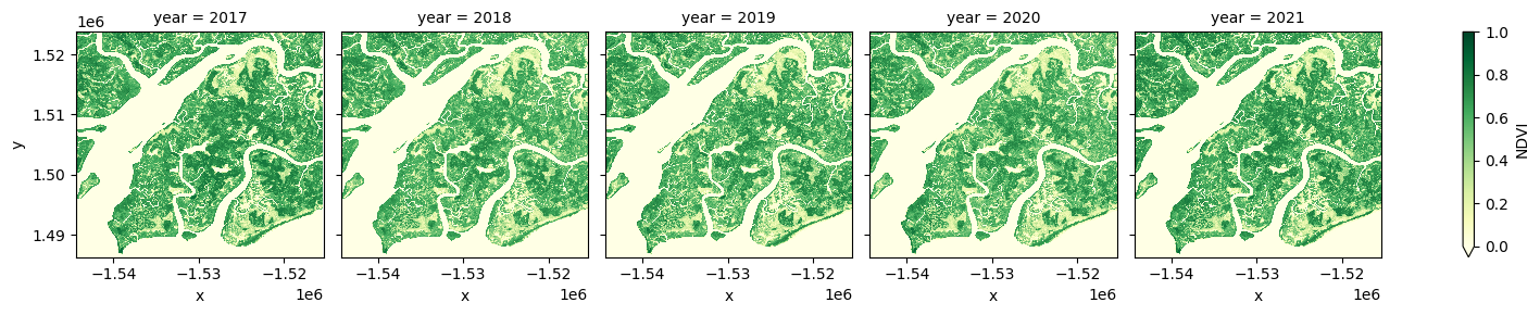
Dans le code ci-dessous, nous prenons la série chronologique d’images et les combinons en images uniques pour chaque année en utilisant le « NDVI médian ». L’indice de végétation par différence normalisée (NDVI) montre la végétation et est utilisé pour la classification des mangroves dans le masque de mangrove.
Pour plus d’informations sur les indices, consultez le bloc-notes Calculating Band Indices.
Remarque : cette étape peut prendre plusieurs minutes à charger si la zone d’étude est grande. Nous vous recommandons d’ouvrir la fenêtre de traitement Dask pour visualiser les différents calculs en cours d’exécution ; pour ce faire, consultez la section Tableau de bord Dask dans DE Africa du bloc-notes Dask.
[14]:
#calculate NDVI, rename nir2 to trick calculate_indices
ds_filtered = ds_filtered.rename({'nir_2':'nir'})
ds_filtered = calculate_indices(ds_filtered, index='NDVI', satellite_mission='s2')
[15]:
# generate median annual summaries of NDVI
ds_summaries = ds_filtered.NDVI.groupby("time.year").median().compute()

# Plot the output summary images
ds_summaries.plot(col="year", cmap="YlGn", col_wrap=len(ds_summaries.year.values), vmin=0, vmax=1.0);
/opt/venv/lib/python3.12/site-packages/rasterio/warp.py:387: NotGeoreferencedWarning: Dataset has no geotransform, gcps, or rpcs. The identity matrix will be returned.
  dest = _reproject(
Classification des mangroves
Appliquer un masque de la zone de mangrove
Nous utiliserons le masque de mangrove de l’ensemble de données Global Mangrove Watch afin de pouvoir travailler uniquement avec les pixels de la zone de mangrove.
[16]:
# Mask dataset to set pixels outside the GMW layer to `NaN`
ds_summaries_masked = ds_summaries.where(gmw.mangrove.squeeze())
Calcul des mangroves régulières et fermées
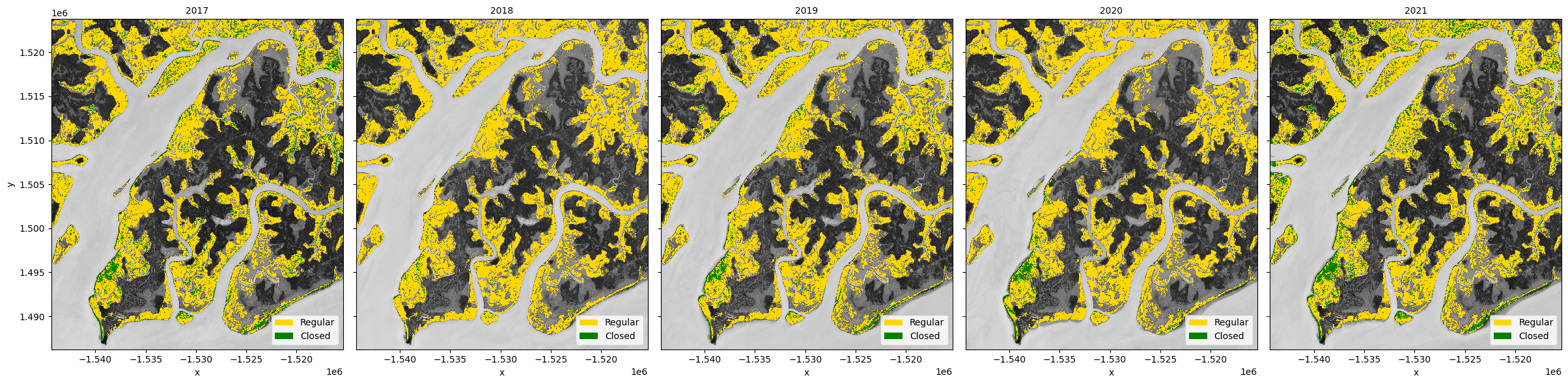
En utilisant l’arbre de décision de la mangrove <#Description>`__ ci-dessus, nous pouvons classer les pixels comme suit :
mangroves : pixels dans la zone de mangrove avec un « NDVI > 0,4 »
mangroves régulières : mangroves avec « NDVI <= 0,7 »
mangroves fermées : mangroves avec « NDVI > 0,7 »
[17]:
all_mangroves = xr.where(ds_summaries_masked > 0.4, 1, np.nan)

regular_mangroves = all_mangroves.where(ds_summaries_masked <= 0.7)
closed_mangroves = all_mangroves.where(ds_summaries_masked > 0.7)
Tracer les types de mangroves
Nous allons à nouveau combiner les types de mangroves pour faciliter le traçage.
[18]:
mangroves = xr.concat(
    [regular_mangroves, closed_mangroves, all_mangroves],
    dim=pd.Index(["regular", "closed", "total"], name="mangrove_type"),
)

regular_color = "gold"
closed_color = "green"

# Create a FacetGrid, so there is a subplot for each year
grid = xr.plot.FacetGrid(
    mangroves,
    col="year",
    col_wrap=len(ds_summaries.year.values),
    size=6,
    aspect=mangroves.x.size / mangroves.y.size,
)

# Define the sub-plot of mangrove types with a legend on a background of grey-scale NDVI
def plot_mangrove(data, ax, **kwargs):
    ds_summaries.sel(year=data.year).plot.imshow(
        ax=ax, cmap="Greys", vmin=-1, vmax=1, add_colorbar=False, add_labels=False
    )
    data.sel(mangrove_type="regular").plot.imshow(
        ax=ax,
        cmap=ListedColormap([regular_color]),
        add_colorbar=False,
        add_labels=False,
    )
    data.sel(mangrove_type="closed").plot.imshow(
        ax=ax, cmap=ListedColormap([closed_color]), add_colorbar=False, add_labels=False
    )

    ax.legend(
        [Patch(facecolor=regular_color), Patch(facecolor=closed_color)],
        ["Regular", "Closed"],
        loc="lower right",
    )

# Plot the each year sub-plot
grid.map_dataarray(plot_mangrove, x="x", y="y", add_colorbar=False)

# Update sub-plot titles
for i, name in np.ndenumerate(grid.name_dicts):
    grid.axes[i].title.set_text(str(name["year"]));
/tmp/ipykernel_2225/2631477952.py:44: DeprecationWarning: self.axes is deprecated since 2022.11 in order to align with matplotlibs plt.subplots, use self.axs instead.
  grid.axes[i].title.set_text(str(name["year"]));
Changement dans les mangroves
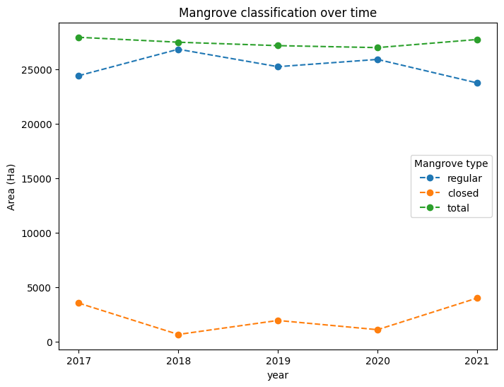
Tracer l’évolution de la classification des mangroves en fonction de leur superficie au fil du temps
[19]:
# Convert pixel count to km^2
m2_per_ha = 10000
m2_per_pixel = query["resolution"][1] ** 2
mangrove_area = mangroves.sum(dim=("x", "y")) * m2_per_pixel / m2_per_ha

# Fix axis and legend text
mangrove_area.name = r"Area (Ha)"
mangrove_area = mangrove_area.rename(mangrove_type="Mangrove type")

# Plot the line graph
mangrove_area.plot(
    hue="Mangrove type",
    x="year",
    xticks=mangrove_area.year,
    size=6,
    linestyle="--",
    marker="o",
)
plt.title("Mangrove classification over time");
Suivi de l’évolution des mangroves
Nous pouvons calculer la croissance et la perte de mangroves entre la première et la dernière année de notre série chronologique
[20]:
total_mangroves = (mangroves.loc["total"] == 1).astype(int)

# Calculate the change in mangrove extent
old = total_mangroves.isel(year=0)
new = total_mangroves.isel(year=-1)
change = new - old

# reclassify into growth, loss and stable
growth = xr.where(change == 1, 1, np.nan)
loss = xr.where(change == -1, -1, np.nan)
stable = old.where(~change)
stable = xr.where(stable == 1, 1, np.nan)
Tracer le changement
[21]:
fig, ax = plt.subplots(1, 1, figsize=(12, 12))

ds_summaries.isel(year=0).plot.imshow(
    ax=ax, cmap="Greys", vmin=-1, vmax=1, add_colorbar=False, add_labels=False
)
stable.plot(
    ax=ax, cmap=ListedColormap(["palegoldenrod"]), add_colorbar=False, add_labels=False
)
growth.squeeze().plot.imshow(
    ax=ax, cmap=ListedColormap(["lime"]), add_colorbar=False, add_labels=False
)
loss.plot.imshow(
    ax=ax, cmap=ListedColormap(["fuchsia"]), add_colorbar=False, add_labels=False
)
ax.legend(
    [
        Patch(facecolor='lime'),
        Patch(facecolor='fuchsia'),
        Patch(facecolor="palegoldenrod"),
    ],
    ["New mangroves", "Loss of mangroves", "Stable mangroves"],
    loc="lower right",
)
plt.title('Change in mangrove extent between {} and {}'.format(ds_summaries.year.values[0], ds_summaries.year.values[-1]));
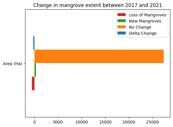
Déterminer la variation nette entre les années
[22]:
loss_count = loss.sum().values * m2_per_pixel / m2_per_ha
gain_count = growth.sum().values * m2_per_pixel / m2_per_ha
stable_count = stable.sum().values* m2_per_pixel / m2_per_ha

counts = {
          'Loss of Mangroves': loss_count,
          'New Mangroves': gain_count,
          'No Change': stable_count,
          'Delta Change': gain_count + loss_count
          }

df = pd.DataFrame(counts, index=['Area (Ha)'])
df.plot.barh(color=['tab:red','tab:green','tab:orange','tab:blue'])
plt.title('Change in mangrove extent between {} and {}'.format(ds_summaries.year.values[0], ds_summaries.year.values[-1]));
Avancé : Comparer l’étendue récente des mangroves avec le GMW 1996
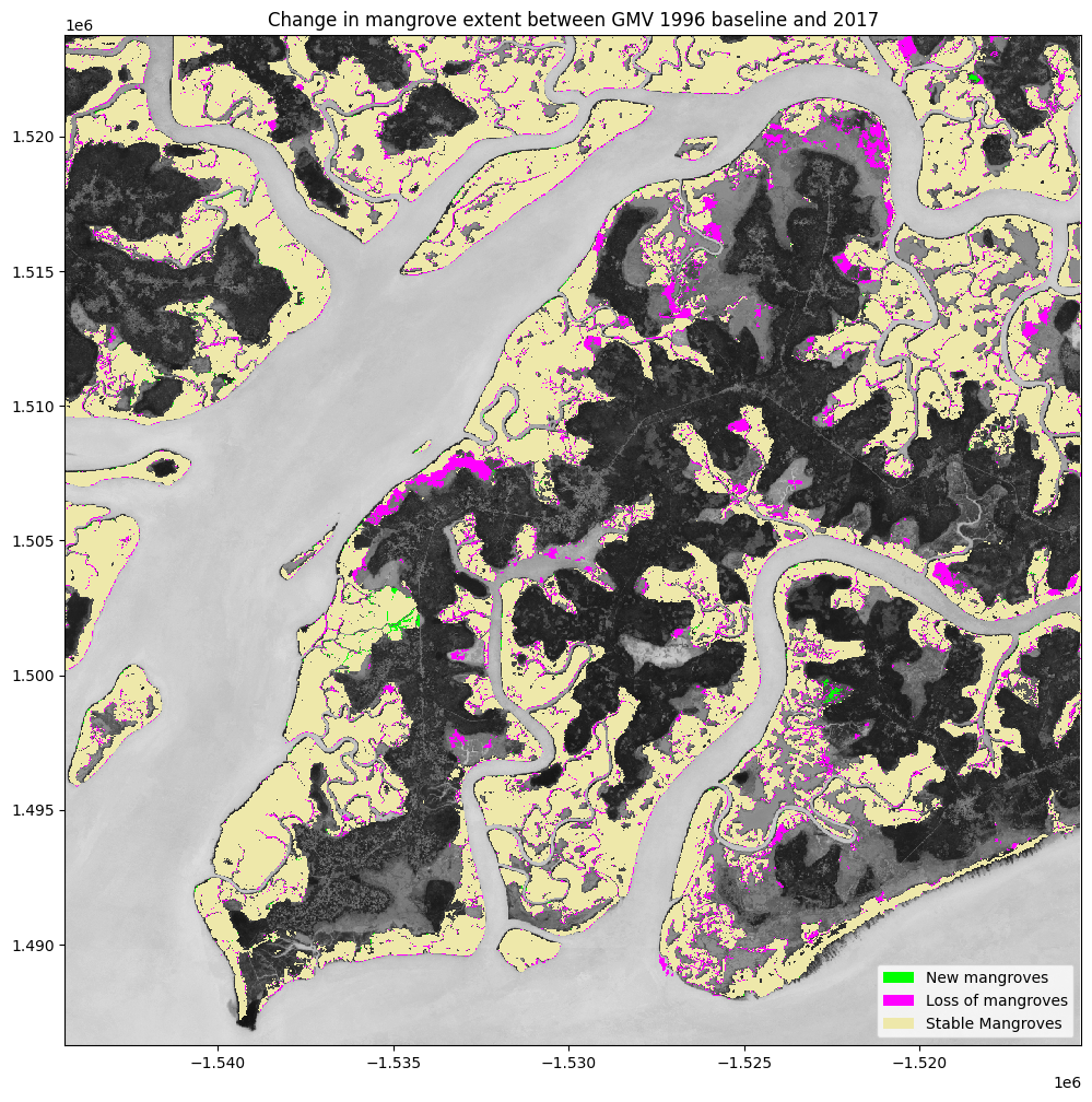
Dans les graphiques précédents, nous avons calculé l’évolution de l’étendue des mangroves depuis le début de la série chronologique Sentinel-2 (2017) jusqu’à aujourd’hui (2021). Cependant, la carte de référence de l’étendue des mangroves, la couche Global Mangrove Watch (GMW), remonte jusqu’en 1996. Ainsi, l’étendue des mangroves a pu changer de manière significative entre 1996 et le début de l’archive Sentinel-2. Nous pouvons utiliser la couche GMW pour inspecter l’évolution de l’étendue des mangroves depuis le développement du produit 2016 que nous avons examiné ci-dessus.
Attention, le produit GMW a été développé à l’aide d’une méthodologie différente de celle utilisée ici, de sorte que les différences dans l’étendue des mangroves peuvent être imputables aux différentes méthodes. Néanmoins, cela devrait nous donner une indication raisonnable des changements survenus entre 1996 et le début des archives Sentinel-2 en 2017.
Charger la couche GMW la plus ancienne
[23]:
gmw_1996 = dc.load(product='gmw',
              time='1996',
              like=ds.geobox)
Déterminer l’évolution entre 1996 et 2017
[24]:
#Find the change between now and the baseline
baseline_change = old - gmw_1996.mangrove.squeeze()

# reclassify into growth, loss and stable
growth_bs = xr.where(baseline_change == 1, 1, np.nan)
loss_bs = xr.where(baseline_change == -1, -1, np.nan)
stable_bs = gmw_1996.mangrove.squeeze().where(~baseline_change)
stable_bs = xr.where(stable == 1, 1, np.nan)
Tracer le changement
[25]:
fig, ax = plt.subplots(1, 1, figsize=(12, 12))

ds_summaries.isel(year=0).plot.imshow(
    ax=ax, cmap="Greys", vmin=-1, vmax=1, add_colorbar=False, add_labels=False
)
stable_bs.plot(
    ax=ax, cmap=ListedColormap(["palegoldenrod"]), add_colorbar=False, add_labels=False
)
growth_bs.plot.imshow(
    ax=ax, cmap=ListedColormap(["lime"]), add_colorbar=False, add_labels=False
)
loss_bs.plot.imshow(
    ax=ax, cmap=ListedColormap(["fuchsia"]), add_colorbar=False, add_labels=False
)
ax.legend(
    [
        Patch(facecolor='lime'),
        Patch(facecolor='fuchsia'),
        Patch(facecolor="palegoldenrod"),
    ],
    ["New mangroves", "Loss of mangroves", "Stable Mangroves"],
    loc="lower right",
)
plt.title('Change in mangrove extent between GMV 1996 baseline and {}'.format(ds_summaries.year.values[0]));
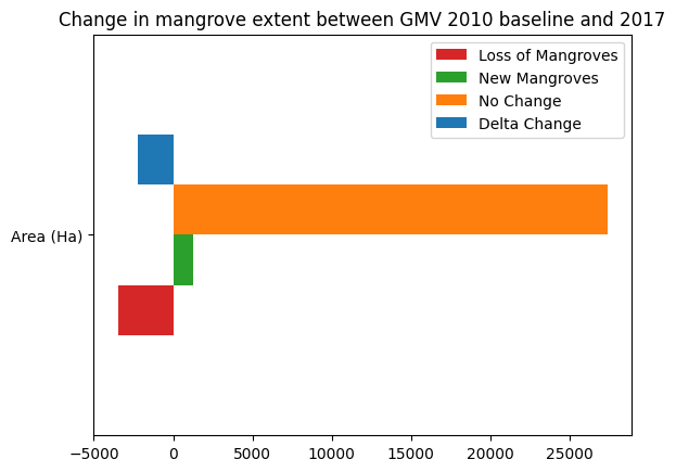
Déterminer le changement net entre 1996 et 2017
[26]:
loss_bs_count = loss_bs.sum().values * m2_per_pixel / m2_per_ha
gain_bs_count = growth_bs.sum().values * m2_per_pixel / m2_per_ha
stable_bs_count = stable_bs.sum().values* m2_per_pixel / m2_per_ha

counts = {
          'Loss of Mangroves': loss_bs_count,
          'New Mangroves': gain_bs_count,
          'No Change': stable_bs_count,
          'Delta Change': gain_bs_count + loss_bs_count
          }

df = pd.DataFrame(counts, index=['Area (Ha)'])
df.plot.barh(color=['tab:red','tab:green','tab:orange','tab:blue'])
plt.title('Change in mangrove extent between GMV 2010 baseline and {}'.format(ds_summaries.year.values[0]));
Tirer des conclusions
Voici quelques questions sur lesquelles réfléchir :
Quelles sont les causes de la croissance et de la disparition des mangroves ?
Informations Complémentaires
Licence Le code de ce notebook est sous licence Apache, version 2.0 <https://www.apache.org/licenses/LICENSE-2.0>`__.
Les données de Digital Earth Africa sont sous licence Creative Commons Attribution 4.0 <https://creativecommons.org/licenses/by/4.0/>.
Contact Si vous avez besoin d’aide, veuillez poster une question sur le canal Slack DE Africa <https://digitalearthafrica.slack.com/> ou sur le GIS Stack Exchange <https://gis.stackexchange.com/questions/ask?tags=open-data-cube> en utilisant la balise open-data-cube (vous pouvez consulter les questions posées précédemment `ici <https://gis.stackexchange.com/questions/tagged/open-data-
Si vous souhaitez signaler un problème avec ce notebook, vous pouvez en déposer un sur Github.
Version de Datacube compatible
[27]:
print(datacube.__version__)
1.8.20
Dernier test :
[28]:
from datetime import datetime
datetime.today().strftime('%Y-%m-%d')
[28]:
'2025-11-18'