Cartographie des zones urbaines à l’aide des données Sentinel 1
Produits utilisés : s1_rtc,
Mots clés données utilisées; sentinelle 1,:index:SAR,:index:urbain, :index:`analyse;
Aperçu
Les zones urbaines ne représentent qu’une petite partie de la couverture terrestre mondiale, mais elles soutiennent la vie humaine quotidienne et exercent une grande influence sur les changements environnementaux et écologiques (Xia et al. 2019). Cela signifie qu’une surveillance constante de l’environnement bâti est essentielle pour le développement durable. Il existe différentes techniques utilisées pour classer les zones urbaines à l’aide de données optiques et radar, l’une des plus simples étant le clustering k-means (apprentissage automatique non supervisé).
Bien que les zones urbaines puissent être cartographiées à l’aide de données optiques, la qualité de l’image est fortement affectée par les conditions météorologiques telles que la couverture nuageuse. Cela limite la disponibilité temporelle d’images claires dans les zones tropicales qui connaissent un temps très nuageux et de fortes pluies. La qualité d’image des données radar est indépendante de la lumière du jour et des conditions météorologiques, ce qui les rend plus adaptées à la cartographie des zones urbaines. Pour plus d’informations, consultez le bloc-notes Sentinel-1.
Description
Ce carnet utilise le clustering k-means pour classer les terres comme « urbaines », puis compare ces résultats avec le produit de couverture terrestre mondiale ESA WorldCover pour l’année 2020.
Le choix du nombre de clusters à utiliser pour le clustering k-means et la valeur de pixel qui représente la classe de couverture terrestre urbaine peuvent être éclairés en comparant les images de prédiction avec l’ensemble de données « vérité terrain ».
Ce cahier contient les étapes suivantes :
Sélectionnez un emplacement et une plage horaire pour l’analyse.
Chargez les données de rétrodiffusion Sentinel-1 pour la zone d’intérêt.
Convertissez les nombres numériques en valeurs dB pour l’analyse.
Générer une image composite de polarisation médiane VH et VV à partir des données Sentinel 1.
Effectuer un clustering k-means sur l’image composite médiane.
Afficher l’image de prédiction de l’urbanisation par clustering k-means.
Chargez et affichez les données « vérité terrain » d’ESA Worldcover pour l’année 2020.
Comparez visuellement et statistiquement les prévisions d’urbanisation avec les données de « vérité terrain ».
Commencer
Pour exécuter cette analyse, exécutez toutes les cellules du bloc-notes, en commençant par la cellule « Charger les packages ».
Charger des paquets
Importez les packages Python utilisés pour l’analyse.
[1]:
# Load the necessary Python packages.
%matplotlib inline

import warnings

import datacube
import matplotlib.colors as mcolours
import matplotlib.pyplot as plt
import numpy as np
import geopandas as gpd
import xarray as xr
import matplotlib.colors as mcolors
from matplotlib.patches import Patch

# Turn off  RuntimeWarning: divide by zero or RuntimeWarning: invalid value warnings.
import numpy as np
np.seterr(divide='ignore', invalid='ignore')
warnings.filterwarnings("ignore")

from deafrica_tools.classification import sklearn_flatten, sklearn_unflatten
from deafrica_tools.dask import create_local_dask_cluster
from deafrica_tools.datahandling import load_ard
from deafrica_tools.plotting import display_map, plot_lulc
from odc.geo.geom import Geometry
from sklearn.cluster import KMeans
from sklearn.metrics import accuracy_score, f1_score, precision_score, recall_score
from sklearn.preprocessing import StandardScaler
from deafrica_tools.areaofinterest import define_area
Configurer un cluster Dask
Dask peut être utilisé pour mieux gérer l’utilisation de la mémoire et effectuer l’analyse en parallèle. Pour une introduction à l’utilisation de Dask avec Digital Earth Africa, consultez le Dask notebook.
Remarque : nous vous recommandons d’ouvrir la fenêtre de traitement Dask pour afficher les différents calculs en cours d’exécution ; pour ce faire, consultez la section Tableau de bord Dask en Afrique de l’Ouest du Dask notebook.
Pour utiliser Dask, configurez le cluster de calcul local à l’aide de la cellule ci-dessous.
[2]:
create_local_dask_cluster()
Client
Client-7bb51a71-d3e9-11ef-9ed7-1e01ca941b00
| Connection method: Cluster object | Cluster type: distributed.LocalCluster |
| Dashboard: /user/victoria@kartoza.com/proxy/8787/status |
Cluster Info
LocalCluster
88234468
| Dashboard: /user/victoria@kartoza.com/proxy/8787/status | Workers: 1 |
| Total threads: 7 | Total memory: 59.21 GiB |
| Status: running | Using processes: True |
Scheduler Info
Scheduler
Scheduler-3422778d-107b-42c3-9a5e-13bd99738813
| Comm: tcp://127.0.0.1:40513 | Workers: 1 |
| Dashboard: /user/victoria@kartoza.com/proxy/8787/status | Total threads: 7 |
| Started: Just now | Total memory: 59.21 GiB |
Workers
Worker: 0
| Comm: tcp://127.0.0.1:38345 | Total threads: 7 |
| Dashboard: /user/victoria@kartoza.com/proxy/34857/status | Memory: 59.21 GiB |
| Nanny: tcp://127.0.0.1:44813 | |
| Local directory: /tmp/dask-scratch-space/worker-qzc9w6vd | |
Se connecter au datacube
Connectez-vous au datacube pour que nous puissions accéder aux données de Digital Earth Africa. Le paramètre « app » est un nom unique pour l’analyse qui est basé sur le nom du fichier du notebook.
[3]:
dc = datacube.Datacube(app="Urban_area_mapping")
Paramètres d’analyse
La cellule suivante définit les paramètres qui définissent la zone d’intérêt et la durée de l’analyse. Les paramètres sont les suivants :
« lat » : la latitude centrale de la zone d’intérêt à analyser.
« lon » : la longitude centrale de la zone d’intérêt à analyser.
« buffer » : le nombre de degrés carrés à charger autour de la latitude et de la longitude centrales. Pour des temps de chargement raisonnables, définissez cette valeur sur « 0,1 » ou moins.
time_range: la plage horaire de votre analyse, par exemple('2020')si vous vouliez des données pour toute l’année 2020.
Sélectionnez l’emplacement
Pour définir la zone d’intérêt, deux méthodes sont disponibles :
En spécifiant la latitude, la longitude et la zone tampon. Cette méthode nécessite que vous saisissiez la latitude centrale, la longitude centrale et la valeur de la zone tampon en degrés carrés autour du point central que vous souhaitez analyser. Par exemple, « lat = 10,338 », « lon = -1,055 » et « buffer = 0,1 » sélectionneront une zone avec un rayon de 0,1 degré carré autour du point avec les coordonnées (10,338, -1,055).
Vous pouvez également fournir des valeurs de tampon distinctes pour la latitude et la longitude d’une zone rectangulaire. Par exemple, « lat = 10.338 », « lon = -1.055 » et « lat_buffer = 0.1 » et « lon_buffer = 0.08 » sélectionneront une zone rectangulaire s’étendant sur 0,1 degré au nord et au sud et 0,08 degré à l’est et à l’ouest à partir du point « (10.338, -1.055) ».
Pour des temps de chargement raisonnables, définissez la mémoire tampon sur « 0,1 » ou moins.
By uploading a polygon as a
GeoJSON or Esri Shapefile. If you choose this option, you will need to upload the geojson or ESRI shapefile into the Sandbox using Upload Files button in the top left corner of the Jupyter Notebook interface. ESRI shapefiles must be uploaded with all the related files
 (.cpg, .dbf, .shp, .shx). Once uploaded, you can use the shapefile or geojson to define the area of interest. Remember to update the code to call the file you have uploaded.
Pour utiliser l’une de ces méthodes, vous pouvez décommenter la ligne de code concernée et commenter l’autre. Pour commenter une ligne, ajoutez le symbole "#" avant le code que vous souhaitez commenter. Par défaut, la première option qui définit l’emplacement à l’aide de la latitude, de la longitude et du tampon est utilisée.
Si vous exécutez le bloc-notes pour la première fois, conservez les paramètres par défaut ci-dessous. Cela montrera comment fonctionne l’analyse et fournira des résultats significatifs. L’exemple couvre une partie du comté de Nairobi, au Kenya.
[4]:
# Method 1: Specify the latitude, longitude, and buffer
aoi = define_area(lat=-1.2933, lon=36.8379, buffer=0.1)

# Method 2: Use a polygon as a GeoJSON or Esri Shapefile.
#aoi = define_area(vector_path='aoi.shp')

#Create a geopolygon and geodataframe of the area of interest
geopolygon = Geometry(aoi["features"][0]["geometry"], crs="epsg:4326")
geopolygon_gdf = gpd.GeoDataFrame(geometry=[geopolygon], crs=geopolygon.crs)

# Get the latitude and longitude range of the geopolygon
lat_range = (geopolygon_gdf.total_bounds[1], geopolygon_gdf.total_bounds[3])
lon_range = (geopolygon_gdf.total_bounds[0], geopolygon_gdf.total_bounds[2])

# Time frame for the analysis.
time_range = ("2020-01", "2020-04")
Afficher l’emplacement sélectionné
La cellule suivante affichera la zone sélectionnée sur une carte interactive. N’hésitez pas à zoomer et dézoomer pour mieux comprendre la zone que vous allez analyser. En cliquant sur n’importe quel point de la carte, vous découvrirez les coordonnées de latitude et de longitude de ce point.
[5]:
# View the study area
display_map(x=lon_range, y=lat_range)
[5]:
Charger et afficher les données Sentinel-1
Créer un objet de requête Datacube
Nous allons créer un dictionnaire qui contiendra les paramètres qui seront utilisés pour charger les données Sentinel 1 à partir du datacube Digital Earth Africa.
[6]:
query = {
    "y": lat_range,
    "x": lon_range,
    "time": time_range,
    "output_crs": "EPSG:6933",
    "resolution": (-20, 20),
    "dask_chunks": dict(x=1000, y=1000),
}
Charger les données Sentinel 1
La première étape de l’analyse consiste à charger les données de rétrodiffusion Sentinel-1 pour la zone d’intérêt spécifiée. Cela utilise la fonction utilitaire prédéfinie load_ard. La fonction load_ard est utilisée ici pour charger un ensemble de données prêt à l’analyse, exempt d’ombres et de données manquantes.
[7]:
ds = load_ard(
    dc=dc, products=["s1_rtc"], measurements=["vv", "vh"], group_by="solar_day", **query
)

ds
Using pixel quality parameters for Sentinel 1
Finding datasets
    s1_rtc
Applying pixel quality/cloud mask
Returning 30 time steps as a dask array
[7]:
<xarray.Dataset> Size: 296MB
Dimensions:      (time: 30, y: 1276, x: 965)
Coordinates:
  * time         (time) datetime64[ns] 240B 2020-01-04T15:56:20.113636 ... 20...
  * y            (y) float64 10kB -1.522e+05 -1.522e+05 ... -1.777e+05
  * x            (x) float64 8kB 3.545e+06 3.545e+06 ... 3.564e+06 3.564e+06
    spatial_ref  int32 4B 6933
Data variables:
    vv           (time, y, x) float32 148MB dask.array<chunksize=(1, 1000, 965), meta=np.ndarray>
    vh           (time, y, x) float32 148MB dask.array<chunksize=(1, 1000, 965), meta=np.ndarray>
Attributes:
    crs:           EPSG:6933
grid_mapping: spatial_refConvertir les valeurs numériques (DN) en valeurs décibels (dB)
Les données de rétrodiffusion Sentinel-1 sont fournies sous forme de nombre numérique (DN), qui peut être converti en rétrodiffusion en décibels (dB) à l’aide de la fonction :
\begin{equation} 10 * \log_{10}\gauche(\text{DN} \droit) \end{equation}
Il est souvent utile de convertir la rétrodiffusion en décible (dB) pour l’analyse car la rétrodiffusion en unité dB a un profil de bruit plus symétrique et une distribution de valeurs moins asymétrique pour une évaluation statistique plus facile.
[8]:
# Convert DN to db values.
ds["vv"] = 10 * np.log10(ds.vv)
ds["vh"] = 10 * np.log10(ds.vh)
Voir les données Sentinel 1
[9]:
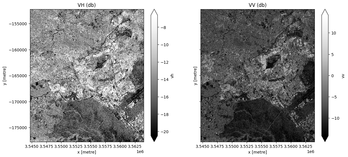
# Plot the first VH and VV observation for the year 2020.
fig, ax = plt.subplots(1, 2, figsize=(14, 6), sharey=True)
ds.vh.isel(time=0).plot.imshow(cmap="Greys_r", robust=True, ax=ax[0])
ds.vv.isel(time=0).plot.imshow(cmap="Greys_r", robust=True, ax=ax[1])
ax[0].set_title("VH (db)")
ax[1].set_title("VV (db)");
/opt/venv/lib/python3.12/site-packages/dask/core.py:133: RuntimeWarning: divide by zero encountered in log10
  return func(*(_execute_task(a, cache) for a in args))
/opt/venv/lib/python3.12/site-packages/rasterio/warp.py:387: NotGeoreferencedWarning: Dataset has no geotransform, gcps, or rpcs. The identity matrix will be returned.
  dest = _reproject(
Générer une image composite de valeur médiane
Nous combinerons toutes les observations VH et VV dans notre Sentinel 1 « ds » « xarray.Dataset » en une seule image complète (ou presque complète) représentant la médiane de la période.
Notez qu’ici nous allons « .compute() » la médiane, ce qui va mettre nos données en mémoire. Cette exécution prendra quelques minutes.
[10]:
# Obtain the median of all VH and VV observations for the time period.
ds = ds.median(dim="time").compute()

fig, ax = plt.subplots(1, 2, figsize=(14, 6), sharey=True)
ds.vh.plot.imshow(cmap="Greys_r", robust=True, ax=ax[0])
ds.vv.plot.imshow(cmap="Greys_r", robust=True, ax=ax[1])
ax[0].set_title("VH (db)")
ax[1].set_title("VV (db)");

Classification à l’aide du clustering K-means
Dans la cellule suivante, nous allons créer un ensemble de fonctions qui seront utilisées ensemble pour effectuer un clustering k-means sur notre image composite de valeur médiane. Ces fonctions sont adaptées de celles utilisées ici <https://ml-gis-service.com/index.php/2020/10/14/data-science-unsupervised-classification-of-satellite-images-with-k-means-algorithm/>`__.
[11]:
# Defining functions to use for the k-means clustering.
def show_clustered(predicted_ds):
    """
    Takes the predicted xarray DataArray and plots it.

    Last modified: October 2022
    Parameters
    ----------
    predicted_ds : xarray DataArrray
    The xarray DataArray which is the result of the k-means clustering.

    Returns
    -------
    An plot of the predicted_ds.
    """

    # Display predicted_ds Dataset with upto 6 unique classes.
    image = predicted_ds

    # Get the number of unique classes in the image.
    class_values = np.unique(image)
    no_classes = len(class_values)

    # Define the color map to use to plot.
    cmap = plt.get_cmap(name="tab20b", lut=no_classes)

    # Define where the transition is from one color to the next.
    bounds = list(np.arange(-0.5, no_classes, 1))
    norm = mcolors.BoundaryNorm(bounds, cmap.N)

    # Plot the image.
    im = image.plot.imshow(cmap=cmap, norm=norm, add_colorbar=True, figsize=(6, 6))

    # Add a title to the plot.
    title = f"K-means Clustering Predicted Image using {no_classes} clusters"
    plt.title(title)

    # Add a colour bar to the plot.
    cb = im.colorbar
    cb.set_ticks(ticks=class_values)
    cb.set_label("Kmeans Clustering cluster/class values", labelpad=20)

    plt.show();


def kmeans_clustering(input_xr, cluster_range):
    """
    Perform sklearn Kmeans clustering on the input Dataset
    or Data Array.

    Last modified: November 2021

    Parameters
    ----------
    input_xr : xarray.DataArray or xarray.Dataset
        Must have dimensions 'x' and 'y', may have dimension 'time'.

    cluster_range : list
        A list of the number of clusters to use to perform the k-means clustering
        on the input_xr Dataset.

    Returns
    ----------
    results : dictionary
        A dictionary with the number of clusters as keys and the predicted xarray.DataArrays
        as the values. Each predicted xarray.DataArray has the same dimensions 'x', 'y' and
        'time' as the input_xr.

    """

    # Use the sklearn_flatten function to convert the Dataset or DataArray into a 2 dimensional numpy array.
    model_input = sklearn_flatten(input_xr)

    # Standardize the data.
    scaler = StandardScaler()
    model_input = scaler.fit_transform(model_input)

    # Dictionary to save results
    results = {}

    # Perform Kmeans clustering on the input dataset for each number of clusters
    # in the cluster_range list.
    for no_of_clusters in cluster_range:
        # Set up the kmeans classification by specifying the number of clusters
        # with initialization as k-means++.
        km = KMeans(n_clusters=no_of_clusters, init="k-means++", random_state=1)

        # Begin iteratively computing the position of the clusters.
        km.fit(model_input)

        # Use the sklearn kmeans .predict method to assign all the pixels of the
        # model input to a unique cluster.
        flat_predictions = km.predict(model_input)

        # Use the sklearn_unflatten function to convert the flat predictions into a
        # xarray DataArray.
        predicted = sklearn_unflatten(flat_predictions, input_xr)
        predicted = predicted.transpose("y", "x")

        # Append the results to a dictionary using the number of clusters as the
        # column as an key.
        results.update({str(no_of_clusters): predicted})

    return results
Dans la cellule suivante, nous utiliserons une gamme de clusters pour effectuer une classification k-means sur notre ensemble de données composites médianes.
Ci-dessous, saisissez une liste de groupes à inclure dans la classification
[12]:
bands = ["vv"]
Nous allons maintenant exécuter la classification k-means, puis tracer les résultats
[13]:
cluster_range = [2, 3, 4]
results = kmeans_clustering(ds[bands], cluster_range)
[14]:
# Plot each of the predicted images.
for predicted_ds in results.values():
    show_clustered(predicted_ds)
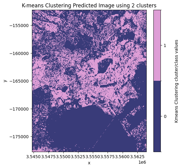
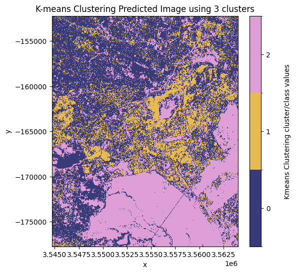
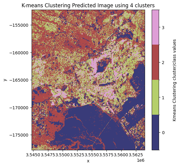
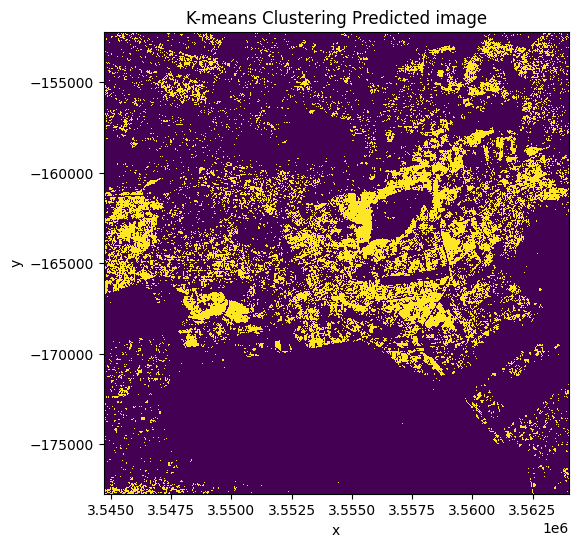
Décidez quel modèle et quelle classe attribuer comme « urbain »
D’après les images prédites tracées ci-dessus, le meilleur nombre de clusters à utiliser est « 3 ». Dans cette image, la valeur de pixel la plus susceptible de représenter la classe de couverture terrestre urbaine/bâtie est la valeur de pixel « 1 ».
Remarque : cela peut changer en fonction de la zone d’intérêt et du nombre de clusters utilisés. Dans cet exemple, l’état initial a été défini arbitrairement à l’aide de l’argument « random_state » dans la fonction « kmeans_clustering ».
Définissez la « clé » et la « pixel_value » représentant respectivement le modèle et la valeur que vous souhaitez attribuer aux zones urbaines
[15]:
# Mask the dataset to retain the pixels which are most likely to be urban/built up.
key = "3"
pixel_value = 1

clustering_predicted_ds = results[key] == pixel_value
[16]:
clustering_predicted_ds.plot.imshow(figsize=(6, 6), add_colorbar=False)
plt.title("K-means Clustering Predicted image");
Validation de la classification par clustering k-means
Nous comparerons les performances du résultat de la classification par clustering k-means des zones urbaines avec une carte de zone bâtie (zone urbaine) pour la zone d’étude dérivée des données mondiales d’utilisation/couverture du sol de 10 m de l’ESA World Cover de 2020.
Obtenir l’ensemble de données de validation
[17]:
# Load the ESA land use land cover product over the same region as the Sentinel 1 dataset.
ds_esa = dc.load(product="esa_worldcover_2020", like=ds.geobox).squeeze()

ds_esa
[17]:
<xarray.Dataset> Size: 1MB
Dimensions:         (y: 1276, x: 965)
Coordinates:
    time            datetime64[ns] 8B 2020-07-01T12:00:00
  * y               (y) float64 10kB -1.522e+05 -1.522e+05 ... -1.777e+05
  * x               (x) float64 8kB 3.545e+06 3.545e+06 ... 3.564e+06 3.564e+06
    spatial_ref     int32 4B 6933
Data variables:
    classification  (y, x) uint8 1MB 10 10 10 10 10 10 10 ... 60 50 60 60 60 60
Attributes:
    crs:           PROJCS["WGS 84 / NSIDC EASE-Grid 2.0 Global",GEOGCS["WGS 8...
grid_mapping: spatial_refTracez le produit d’occupation du sol de l’utilisation des terres de l’ESA.
[18]:
# Plot the ESA land use land cover product.
fig, ax = plt.subplots(figsize=(6, 6), sharey=True)
plot_lulc(ds_esa["classification"], product="ESA", legend=True, ax=ax)
plt.title("ESA WorldCover");
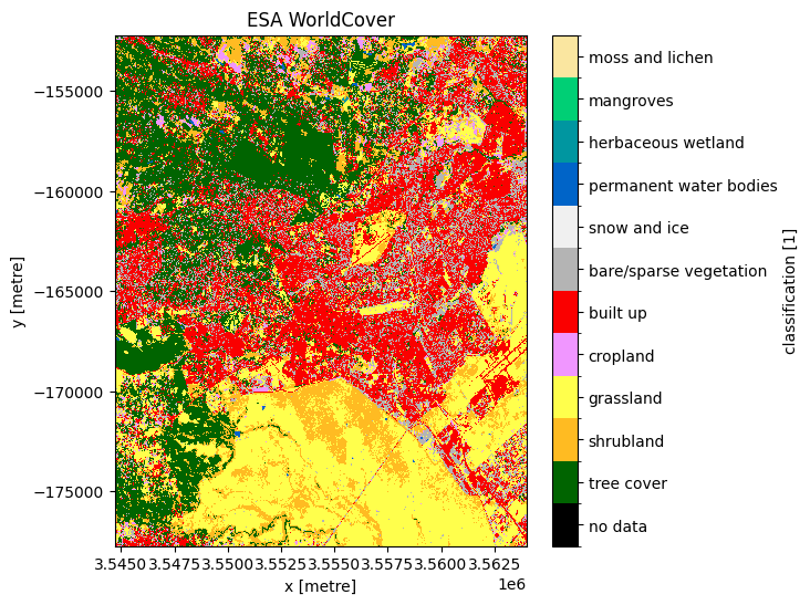
Nous ne nous intéressons qu’aux zones bâties, nous pouvons donc utiliser la définition des indicateurs sur l’ensemble de données pour isoler uniquement la classe « bâtie »
[19]:
ds_esa.classification.attrs["flags_definition"]
[19]:
{'data': {'bits': [0, 1, 2, 3, 4, 5, 6, 7],
  'values': {'0': 'no data',
   '10': 'tree cover',
   '20': 'shrubland',
   '30': 'grassland',
   '40': 'cropland',
   '50': 'built up',
   '60': 'bare/sparse vegetation',
   '70': 'snow and ice',
   '80': 'permanent water bodies',
   '90': 'herbaceous wetland',
   '95': 'mangroves',
   '100': 'moss and lichen'},
  'description': 'Land Use/Land Cover class'}}
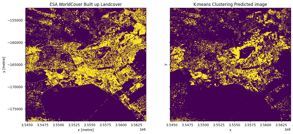
Tracez les zones urbaines de l’ESA le long de l’estimation k-means de S1
[20]:
# Plot the built up land cover from the ESA worldcover dataset.
esa_urban_class = 50

built_up = ds_esa["classification"] == esa_urban_class

fig, ax = plt.subplots(1, 2, figsize=(14, 6), sharey=True)
built_up.plot.imshow(ax=ax[0], add_colorbar=False)
clustering_predicted_ds.plot.imshow(ax=ax[1], add_colorbar=False)
ax[1].set_title("K-means Clustering Predicted image")
ax[0].set_title("ESA WorldCover Built up Landcover");
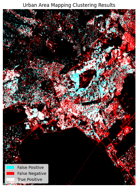
Mesures d’évaluation de la précision
Nous utiliserons les fonctions du module « sklearn.metrics » pour évaluer la classification par clustering k-means. La précision est utilisée lorsque les vrais positifs et les vrais négatifs sont plus importants tandis que le score F1 est utilisé lorsque les faux négatifs et les faux positifs sont cruciaux.
[21]:
# Metrics for the Kmeans Clustering.
y_true = sklearn_flatten(built_up)
y_pred_kmeans = sklearn_flatten(clustering_predicted_ds)

# Producer's Accuracies.
precision_kmeans = precision_score(y_true, y_pred_kmeans, labels=[0, 1], average=None)
urban_precision_kmeans = precision_kmeans[1] * 100

# User's Accuracies.
recall_kmeans = recall_score(y_true, y_pred_kmeans, labels=[0, 1], average=None)
urban_recall_kmeans = recall_kmeans[1] * 100

# Overall Accuracy.
accuracy_kmeans = accuracy_score(y_true, y_pred_kmeans, normalize=True)
overall_accuracy_kmeans = accuracy_kmeans * 100

# F1 score.
f1score_kmeans = f1_score(y_true, y_pred_kmeans)
[22]:
print(
    "\033[1m" + "\033[91m" + "Urban Area Mapping using k-means clustering Results"
)  # bold print and red
print("\033[0m")  # stop bold and red
print("Overall Accuracy: ", round(overall_accuracy_kmeans, 2))
print("F1 score: \t", round(f1score_kmeans, 2))
print("Producer's Accuracy: ", round(urban_precision_kmeans, 2))
print(
    "User's Accuracy: ",
    round(urban_recall_kmeans, 2),
)
Urban Area Mapping using k-means clustering Results

Overall Accuracy:  79.28
F1 score:        0.53
Producer's Accuracy:  67.3
User's Accuracy:  43.47
Les appels « dstack » fournissent aux appels « imshow » des entrées de tableau RVB. Pour l’image tracée, le premier canal (rouge) correspond aux valeurs réelles (vérité terrain, ESA Worldcover), et les deuxième et troisième canaux (vert, bleu) correspondent aux valeurs prédites (vert + bleu = cyan).
[23]:
fig, ax = plt.subplots(figsize=(8, 8))
plt.imshow(
    np.dstack(
        (
            built_up.data.astype(float),
            clustering_predicted_ds.data.astype(float),
            clustering_predicted_ds.data.astype(float),
        )
    )
)
plt.legend(
    [Patch(facecolor="cyan"), Patch(facecolor="red"), Patch(facecolor="white")],
    ["False Positive", "False Negative", "True Positive"],
    loc="lower left",
    fontsize=10,
)
plt.axis("off")
plt.title("Urban Area Mapping Clustering Results");
Informations Complémentaires
Licence Le code de ce notebook est sous licence Apache, version 2.0 <https://www.apache.org/licenses/LICENSE-2.0>`__.
Les données de Digital Earth Africa sont sous licence Creative Commons Attribution 4.0 <https://creativecommons.org/licenses/by/4.0/>.
Contact Si vous avez besoin d’aide, veuillez poster une question sur le canal Slack DE Africa <https://digitalearthafrica.slack.com/> ou sur le GIS Stack Exchange <https://gis.stackexchange.com/questions/ask?tags=open-data-cube> en utilisant la balise open-data-cube (vous pouvez consulter les questions posées précédemment `ici <https://gis.stackexchange.com/questions/tagged/open-data-
Si vous souhaitez signaler un problème avec ce notebook, vous pouvez en déposer un sur Github.
Version de Datacube compatible
[24]:
print(datacube.__version__)
1.8.20
Dernier test :
[25]:
from datetime import datetime

datetime.today().strftime("%Y-%m-%d")
[25]:
'2025-01-16'