Détection des changements de végétation
Produits utilisés : ls8_sr
Mots-clés : données utilisées ; landsat 8, analyse ; détection de changement, indice de bande ; NDVI, indice de bande ; EVI, foresterie
Aperçu
La détection des zones de déforestation et de reboisement dans les images satellite est compliquée par la nécessité de distinguer les changements réels d’utilisation des terres des changements naturels introduits par la variabilité climatique. Pour déterminer les régions qui ont subi des changements significatifs, nous pouvons appliquer des techniques de test d’hypothèses à des piles d’images satellites obtenues par télédétection afin de déterminer où le changement est statistiquement significatif par rapport à la variabilité naturelle de fond.
Description
Dans cet exemple, nous mesurons la présence de végétation à partir d’images Landsat et appliquons un test d’hypothèse pour identifier les zones de changement significatif (ainsi que la direction du changement).
L’exemple pratique présente aux utilisateurs le code nécessaire pour effectuer les opérations suivantes :
Chargez des images Landsat 8 sans nuages pour une zone d’intérêt (AOI).
Calculez les indices qui indiquent la végétation, tels que l’indice de végétation par différence normalisée (NDVI) et l’indice de végétation amélioré (EVI).
Appliquez un test d’hypothèse statistique pour trouver les domaines de changement significatif.
Visualisez les zones statistiquement significatives.
Commencer
Pour exécuter cette analyse, exécutez toutes les cellules du bloc-notes, en commençant par la cellule « Charger les packages ».
Une fois l’analyse terminée, revenez à la cellule « Paramètres d’analyse », modifiez certaines valeurs (par exemple, choisissez un autre lieu ou une autre période à analyser) et relancez l’analyse. Vous trouverez des instructions supplémentaires sur la modification du bloc-notes à la fin.
Charger des paquets
Chargez les principaux packages Python et toutes les fonctions de support pour l’analyse.
[1]:
import datacube
import datacube.utils.rio
import matplotlib.pyplot as plt
import numpy as np
import geopandas as gpd
from scipy import stats
import xarray as xr
from odc.geo.xr import write_cog

from deafrica_tools.datahandling import mostcommon_crs, load_ard
from deafrica_tools.bandindices import calculate_indices
from deafrica_tools.plotting import display_map, rgb
from deafrica_tools.spatial import xr_rasterize
from odc.geo.geom import Geometry
from deafrica_tools.areaofinterest import define_area

#This will speed up loading data
datacube.utils.rio.set_default_rio_config(aws='auto', cloud_defaults=True)
Se connecter au datacube
Activez la base de données Datacube, qui fournit des fonctionnalités pour le chargement et l’affichage des données d’observation de la Terre stockées.
[2]:
dc = datacube.Datacube(app="Change_detection")
Paramètres d’analyse
La cellule suivante définit les paramètres qui définissent la zone d’intérêt et la durée de l’analyse. Il existe également un paramètre permettant de définir la manière dont les données sont divisées dans le temps ; la division produit deux échantillons non superposés, ce qui est une exigence du test d’hypothèse que nous souhaitons exécuter (plus de détails ci-dessous). Les paramètres sont les suivants :
« latitude » : la latitude au centre de votre AOI (par exemple « 0,02 »).
« longitude » : la longitude au centre de votre AOI (par exemple « 35,425 »).
« buffer » : le nombre de degrés à charger autour de la latitude et de la longitude centrales. Pour des temps de chargement raisonnables, définissez cette valeur sur « 0,1 » ou moins.
time: la plage de dates à analyser (par exemple,('2015-01-01', '2019-09-01')). Pour obtenir des résultats raisonnables, la plage doit s’étendre sur au moins deux ans pour éviter de détecter les changements saisonniers.time_baseline: la date à laquelle diviser l’échantillon total en deux échantillons non superposés (par exemple,'2015-12-01''`). Pour des résultats raisonnables, choisissez une date qui se situe à peu près à mi-chemin entre les dates de début et de fin spécifiées dans ``time.
Pour définir la zone d’intérêt, deux méthodes sont disponibles :
En spécifiant la latitude, la longitude et la zone tampon. Cette méthode nécessite que vous saisissiez la latitude centrale, la longitude centrale et la valeur de la zone tampon en degrés carrés autour du point central que vous souhaitez analyser. Par exemple, « lat = 10,338 », « lon = -1,055 » et « buffer = 0,1 » sélectionneront une zone avec un rayon de 0,1 degré carré autour du point avec les coordonnées (10,338, -1,055).
Vous pouvez également fournir des valeurs de tampon distinctes pour la latitude et la longitude d’une zone rectangulaire. Par exemple, « lat = 10.338 », « lon = -1.055 » et « lat_buffer = 0.1 » et « lon_buffer = 0.08 » sélectionneront une zone rectangulaire s’étendant sur 0,1 degré au nord et au sud et 0,08 degré à l’est et à l’ouest à partir du point « (10.338, -1.055) ».
Pour des temps de chargement raisonnables, définissez la mémoire tampon sur « 0,1 » ou moins.
By uploading a polygon as a
GeoJSON or Esri Shapefile. If you choose this option, you will need to upload the geojson or ESRI shapefile into the Sandbox using Upload Files button in the top left corner of the Jupyter Notebook interface. ESRI shapefiles must be uploaded with all the related files
 (.cpg, .dbf, .shp, .shx). Once uploaded, you can use the shapefile or geojson to define the area of interest. Remember to update the code to call the file you have uploaded.
Pour utiliser l’une de ces méthodes, vous pouvez décommenter la ligne de code concernée et commenter l’autre. Pour commenter une ligne, ajoutez le symbole "#" avant le code que vous souhaitez commenter. Par défaut, la première option qui définit l’emplacement à l’aide de la latitude, de la longitude et du tampon est utilisée.
Si vous exécutez le bloc-notes pour la première fois, conservez les paramètres par défaut ci-dessous. Cela montrera comment fonctionne l’analyse et fournira des résultats significatifs. L’exemple couvre une partie de la réserve forestière du nord de Tindiret, au Kenya.
[3]:
# Method 1: Specify the latitude, longitude, and buffer
aoi = define_area(lat=0.02, lon=35.425, buffer=0.1)

# Method 2: Use a polygon as a GeoJSON or Esri Shapefile.
# aoi = define_area(vector_path='aoi.shp')

#Create a geopolygon and geodataframe of the area of interest
geopolygon = Geometry(aoi["features"][0]["geometry"], crs="epsg:4326")
geopolygon_gdf = gpd.GeoDataFrame(geometry=[geopolygon], crs=geopolygon.crs)

# Get the latitude and longitude range of the geopolygon
lat_range = (geopolygon_gdf.total_bounds[1], geopolygon_gdf.total_bounds[3])
lon_range = (geopolygon_gdf.total_bounds[0], geopolygon_gdf.total_bounds[2])

# Set the range of dates for the complete sample
time = ('2013-01-01', '2018-12-01')

# Set the date to separate the data into two samples for comparison
time_baseline = '2015-12-01'
Afficher l’emplacement sélectionné
La cellule suivante affichera la zone sélectionnée sur une carte interactive. La bordure rouge représente la zone d’intérêt de l’étude. Effectuez un zoom avant et arrière pour mieux comprendre la zone d’intérêt. En cliquant n’importe où sur la carte, les coordonnées de latitude et de longitude du point cliqué s’affichent.
[4]:
display_map(x=lon_range, y=lat_range)
[4]:
Charger et visualiser les données Landsat
La première étape de l’analyse consiste à charger les données Landsat pour la zone d’intérêt et la plage horaire spécifiées.
Le code ci-dessous va créer un dictionnaire de requêtes pour notre région d’intérêt, trouver l’objet « crs » correct pour la zone d’intérêt, puis charger les données Landsat à l’aide de la fonction « load_ard ». Pour plus d’informations, consultez le bloc-notes « Using load_ard <../Frequently_used_code/Using_load_ard.ipynb> ». La fonction masquera également automatiquement les nuages de l’ensemble de données, ce qui nous permettra de nous concentrer sur les pixels qui contiennent des données utiles. Elle exclura également les images où plus de 70 % des pixels sont masqués, ce qui est défini à l’aide du paramètre « min_gooddata » dans l’appel « load_ard ».
[5]:
#Create a query object
query = {
    'x': lon_range,
    'y': lat_range,
    'time': time,
    'measurements': ['red',
                     'green',
                     'blue',
                     'nir'],
    'resolution': (-30, 30),
    'group_by': 'solar_day'
}

# find the right crs for the location
crs = mostcommon_crs(dc=dc, product='ls8_sr', query=query)

# load cloud-masked fractional cover using load_ard
ds = load_ard(dc=dc,
              **query,
              products=['ls8_sr'],
              align=(15, 15),
              output_crs=crs,
              min_gooddata=0.7
             )
Using pixel quality parameters for USGS Collection 2
Finding datasets
    ls8_sr
Counting good quality pixels for each time step
Filtering to 52 out of 128 time steps with at least 70.0% good quality pixels
Applying pixel quality/cloud mask
Re-scaling Landsat C2 data
Loading 52 time steps
Une fois le chargement terminé, examinez les données en les imprimant dans la cellule suivante. L’argument « Dimensions » révèle le nombre d’intervalles de temps dans l’ensemble de données, ainsi que le nombre de pixels dans les dimensions x (longitude) et y (latitude).
[6]:
print(ds)
<xarray.Dataset> Size: 457MB
Dimensions:      (time: 52, y: 739, x: 743)
Coordinates:
  * time         (time) datetime64[ns] 416B 2013-04-28T07:50:43.620475 ... 20...
  * y            (y) float64 6kB 1.329e+04 1.326e+04 ... -8.82e+03 -8.85e+03
  * x            (x) float64 6kB 7.588e+05 7.588e+05 ... 7.81e+05 7.81e+05
    spatial_ref  int32 4B 32636
Data variables:
    red          (time, y, x) float32 114MB 0.06073 0.06235 0.05 ... nan nan nan
    green        (time, y, x) float32 114MB 0.0791 0.07838 0.06353 ... nan nan
    blue         (time, y, x) float32 114MB 0.03295 0.03474 0.02775 ... nan nan
    nir          (time, y, x) float32 114MB 0.3758 0.3708 0.2985 ... nan nan nan
Attributes:
    crs:           epsg:32636
    grid_mapping:  spatial_ref
Découpez les ensembles de données selon la forme de la zone d’intérêt
Un géopolygone représente les limites et non la forme réelle, car il est conçu pour représenter l’étendue de l’entité géographique cartographiée, plutôt que sa forme exacte. En d’autres termes, le géopolygone est utilisé pour définir la limite extérieure de la zone d’intérêt, plutôt que les entités et caractéristiques internes.
Il est important de découper les données selon la forme exacte de la zone d’intérêt, car cela permet de garantir que les données utilisées sont pertinentes pour la zone d’étude spécifique. Bien qu’un géopolygone fournisse des informations sur la limite de l’entité géographique représentée, il ne reflète pas nécessairement la forme ou l’étendue exacte de la zone d’intérêt.
[7]:
#Rasterise the area of interest polygon
aoi_raster = xr_rasterize(gdf=geopolygon_gdf, da=ds, crs=ds.crs)
#Mask the dataset to the rasterised area of interest
ds = ds.where(aoi_raster == 1)
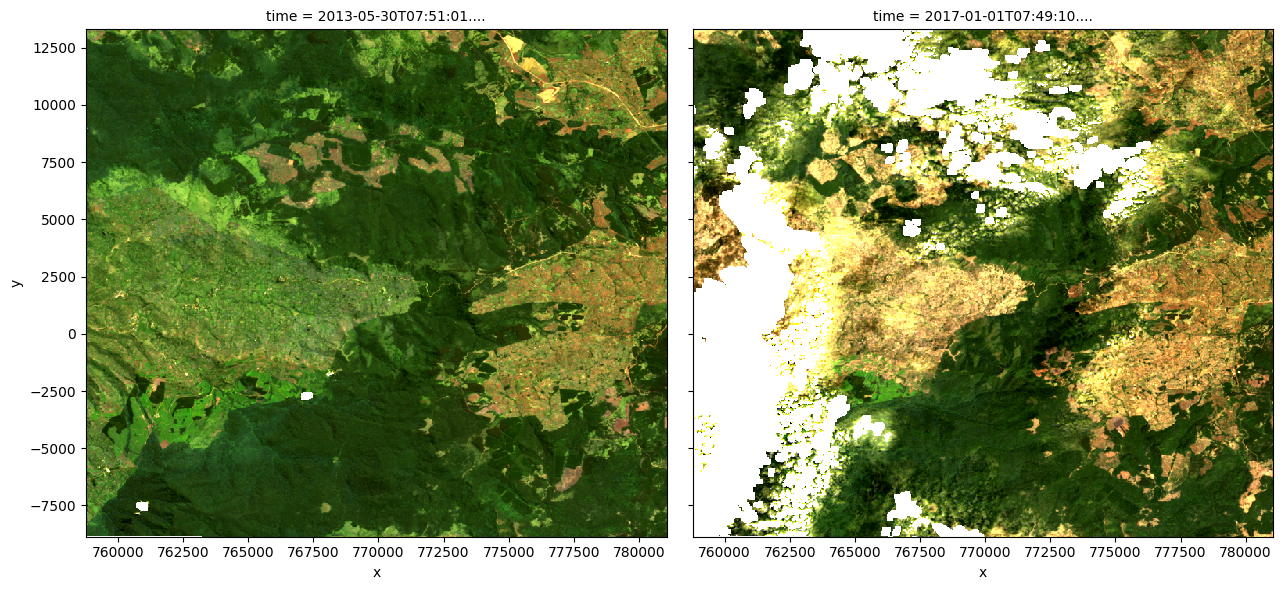
Exemple de tracé de pas de temps en vraies couleurs
N’hésitez pas à expérimenter avec les valeurs des variables « initial_timestep » et « final_timestep » ; réexécutez la cellule pour tracer les images pour les nouveaux pas de temps. Les valeurs des pas de temps peuvent être « 0 » à un de moins que le nombre de pas de temps chargés dans l’ensemble de données. Le nombre de pas de temps est le même que le nombre total d’observations répertoriées comme sortie de la cellule utilisée pour charger les données.
[8]:
# Set the timesteps to visualise
initial_timestep = 2
final_timestep = 37

rgb(ds, index=[initial_timestep, final_timestep])
Calculer les indices de bande
Pour cette étude, il existe deux indices qui peuvent être utilisés comme proxys de la végétation.
Le premier est l’indice de végétation par différence normalisée (NDVI). Cet indice utilise le rapport entre les bandes rouge et proche infrarouge (NIR) pour identifier la végétation verte vivante. La formule est la suivante :
Le deuxième est l’indice de végétation amélioré (EVI). Cet indice utilise les bandes rouge, proche infrarouge (NIR) et bleue pour identifier la végétation ; il est particulièrement sensible aux régions à forte biomasse. La formule est la suivante :
Lors de l’interprétation de ces indices, les valeurs élevées indiquent la présence de végétation.
Utilisation d’un index dans ce carnet
La cellule ci-dessous calcule l’index choisi, l’ajoute à l’ensemble de données, puis crée un nouvel objet « ds_index » qui contient uniquement l’index calculé, lui permettant d’être utilisé dans le reste du bloc-notes.
Pour utiliser « NDVI », exécutez le code suivant dans la cellule ci-dessous :
ds = calculate_indices(ds, 'NDVI', satellite_mission='ls')
ds_index = ds.NDVI
Pour utiliser « EVI », exécutez le code suivant dans la cellule ci-dessous :
ds = calculate_indices(ds, 'EVI', satellite_mission='ls')
ds_index = ds.EVI
[9]:
# Calculate NDVI and add it to the loaded dataset
ds = calculate_indices(ds, 'NDVI', satellite_mission='ls')
ds_index = ds.NDVI
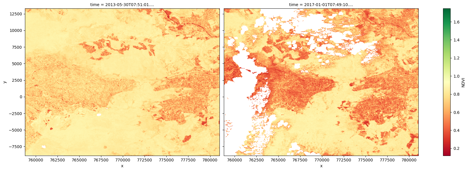
Visualisation de l’index
Les graphiques ci-dessous montrent les valeurs d’indice choisies pour les deux pas de temps sélectionnés utilisés pour créer les images en vraies couleurs ci-dessus. Utilisez les graphiques pour confirmer visuellement si l’indice choisi est adapté à la détection des changements.
[10]:
# Plot the NDVI values for pixels classified as vegetation for the two dates.
ds_index.isel(time=[initial_timestep, final_timestep]).plot.imshow(
    x='x', y='y', col='time', cmap='RdYlGn', figsize=(18, 6)
)

plt.show()
Effectuer un test d’hypothèse
Bien qu’il soit possible de détecter visuellement les changements entre les deux étapes temporelles, il est important de réfléchir à la manière de vérifier rigoureusement les changements positifs dans la végétation (boisement) et les changements négatifs dans la végétation (déforestation).
Cela peut être fait par le biais de tests d’hypothèses. Dans ce cas,
Le test d’hypothèse indiquera les éléments permettant de rejeter l’hypothèse nulle. À partir de là, nous pourrons identifier les zones de changement significatif, selon un niveau de signification donné (abordé plus en détail ci-dessous).
Faire des échantillons
Pour réaliser le test, l’échantillon total sera divisé en deux : un échantillon « baseline » et un échantillon « postbaseline », qui contiennent respectivement les données avant et après la date « time_baseline ». Ensuite, nous pouvons tester une différence dans l’indice de végétation moyen (soit « NDVI » ou « EVI ») entre les échantillons pour chaque pixel de l’échantillon. Dans cette étape, nous réalisons également des composites moyens pour les deux échantillons, qui seront utiles plus tard pour visualiser la comparaison.
Les échantillons sont créés en filtrant l’index en fonction de son observation avant ou après la date « time_baseline ». Le nombre d’observations dans chaque échantillon sera imprimé. Si un échantillon est beaucoup plus grand que l’autre, envisagez de modifier le paramètre « time_baseline » dans la cellule « Paramètres d’analyse », puis réexécutez cette cellule. Les coordonnées sont enregistrées pour une utilisation ultérieure.
[11]:
# Make samples
baseline_sample = ds_index.sel(time=ds['time'] <= np.datetime64(time_baseline))
baseline_composite = ds.sel(time=ds['time'] <= np.datetime64(time_baseline)).mean(dim=['time'])
print(f"Number of observations in baseline sample: {len(baseline_sample.time)}")

postbaseline_sample = ds_index.sel(time=ds['time'] > np.datetime64(time_baseline))
postbaseline_composite = ds.sel(time=ds['time'] > np.datetime64(time_baseline)).mean(dim=['time'])
print(f"Number of observations in postbaseline sample: {len(postbaseline_sample.time)}")

# Record coodrinates for reconstructing xarray objects
sample_lat_coords = ds.coords['y']
sample_lon_coords = ds.coords['x']
Number of observations in baseline sample: 27
Number of observations in postbaseline sample: 25
Test de changement
Pour rechercher des preuves que la valeur moyenne de l’indice a changé entre les deux échantillons (positivement ou négativement), nous utilisons le test t de Welch. Il est utilisé pour tester l’hypothèse selon laquelle deux populations ont des moyennes égales. Dans ce cas, les populations sont la zone d’intérêt avant et après la date « time_baseline », et la moyenne testée est la valeur moyenne de l’indice. Le test t de Welch est utilisé (par opposition au test t de Student) car les deux échantillons de l’étude n’ont pas nécessairement des variances égales.
Le test est exécuté à l’aide de la bibliothèque statistcs du package Scipy, qui fournit la fonction ttest_ind pour exécuter des tests t. Le paramètre equal_var=False signifie que la fonction exécutera le test t de Welch. La fonction renvoie la statistique t et la valeur p pour chaque pixel après avoir testé la différence dans la valeur d’index moyenne. Celles-ci sont stockées sous les noms t_stat et p_val dans l’ensemble de données t_test pour être utilisées dans la section suivante.
[12]:
# Perform the t-test on the postbaseline and baseline samples
tstat, p_tstat = stats.ttest_ind(
    postbaseline_sample.values,
    baseline_sample.values,
    equal_var=False,
    nan_policy='omit',
)

# Convert results to an xarray for further analysis
t_test = xr.Dataset(
    {'t_stat': (['y', 'x'], tstat),
     'p_val': (['y', 'x'], p_tstat)},
    coords={
     'x': (['x'], sample_lon_coords.values),
     'y': (['y'], sample_lat_coords.values)
    }, attrs={'crs': ds.geobox.crs})

print(t_test)
/tmp/ipykernel_11028/952593560.py:2: SmallSampleWarning: After omitting NaNs, one or more axis-slices of one or more sample arguments is too small; corresponding elements of returned arrays will be NaN. See documentation for sample size requirements.
  tstat, p_tstat = stats.ttest_ind(
<xarray.Dataset> Size: 4MB
Dimensions:  (y: 739, x: 743)
Coordinates:
  * x        (x) float64 6kB 7.588e+05 7.588e+05 7.588e+05 ... 7.81e+05 7.81e+05
  * y        (y) float64 6kB 1.329e+04 1.326e+04 ... -8.82e+03 -8.85e+03
Data variables:
    t_stat   (y, x) float32 2MB nan nan nan nan ... -4.45 -4.818 -3.797 -5.055
    p_val    (y, x) float32 2MB nan nan nan ... 2.203e-05 0.0005809 9.102e-06
Attributes:
    crs:      PROJCS["WGS 84 / UTM zone 36N",GEOGCS["WGS 84",DATUM["WGS_1984"...
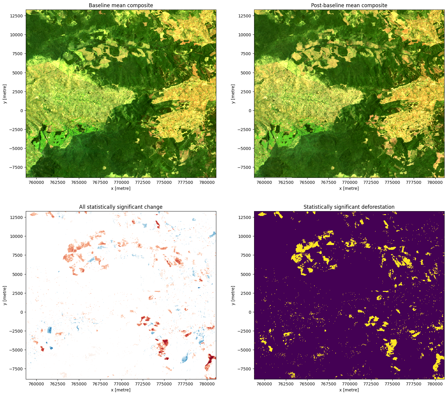
Visualiser le changement
À partir du test, nous nous intéressons à deux conditions : si le changement est significatif (rejet de l’hypothèse nulle) et si le changement est positif (boisement) ou négatif (déforestation).
L’hypothèse nulle peut être rejetée si la valeur p (p_val) est inférieure au niveau de signification choisi, qui est défini comme sig_level = 0,01 pour cette analyse. Si l’hypothèse nulle est rejetée, le pixel sera classé comme ayant subi un changement significatif.
La direction du changement peut être déduite de la différence dans l’indice moyen de chaque échantillon, qui est calculé comme suit \(\text{diff mean} = \text{mean(post baseline)} - \text{mean(baseline)}.\)
Cela signifie que
si la valeur d’index moyenne pour un pixel donné est plus élevée dans l’échantillon « post-baseline » par rapport à l’échantillon « baseline », alors « diff_mean » pour ce pixel sera positif.
si la valeur d’index moyenne pour un pixel donné est inférieure dans l’échantillon « post-baseline » par rapport à l’échantillon « baseline », alors « diff_mean » pour ce pixel sera négatif.
Exécutez la cellule ci-dessous pour tracer les composites de base et post-base, les différences marquées comme significatives et le masque montrant les zones de déforestation significative.
Remarque : pour le graphique montrant les zones de différence significative entre les échantillons, le changement positif est indiqué en bleu et le changement négatif est indiqué en rouge.
[13]:
# Set the significance level
sig_level = 0.01

# Identify any difference in the mean
diff_mean = postbaseline_sample.mean(
    dim=['time']) - baseline_sample.mean(dim=['time'])
diff_mean.name = f"{baseline_sample.name} Difference"

# Identify any difference in the mean classified as significant
sig_diff_mean = postbaseline_sample.mean(dim=['time']).where(
    t_test.p_val < sig_level) - baseline_sample.mean(dim=['time']).where(t_test.p_val < sig_level)
sig_diff_mean.name = f"{baseline_sample.name} Difference"

# Determine areas with significant deforestation (negative difference)
sig_deforestation = sig_diff_mean < 0
sig_deforestation.name = "Deforestation"

# Determine areas with significant afforestations (positive difference)
sig_afforestation = sig_diff_mean > 0
sig_afforestation.name = "Afforestation"
[14]:
# Construct the comparison plot
fig, ax = plt.subplots(2, 2, figsize=(18, 16))
baseline_composite[['red', 'green', 'blue']].to_array().plot.imshow(ax=ax[0,0], robust=True)
postbaseline_composite[['red', 'green', 'blue']].to_array().plot.imshow(ax=ax[0,1], robust=True)
sig_diff_mean.plot(cmap='RdBu', ax=ax[1,0], add_colorbar=False)
sig_deforestation.plot(ax=ax[1,1], add_colorbar=False)
ax[0,0].set_title('Baseline mean composite')
ax[0,1].set_title('Post-baseline mean composite')
ax[1,0].set_title('All statistically significant change')
ax[1,1].set_title('Statistically significant deforestation')
plt.show()
Calculer la variation en pourcentage
En plus de produire des visualisations du changement, nous pouvons également estimer le nombre et la proportion de pixels qui ont subi un changement statistiquement significatif.
[15]:
total_pixels = postbaseline_sample.mean(dim=['time']).count(dim=['x', 'y']).values
total_sig_change = sig_diff_mean.count(dim=['x', 'y']).values
total_deforestation = sig_deforestation.where(sig_deforestation==True).count(dim=['x', 'y']).values

percentage_sig_change = (total_sig_change/total_pixels)*100
percentage_deforestation = (total_deforestation/total_pixels)*100

print(f"{percentage_sig_change:.2f}% of pixels that likely underwent significant change in any direction")
print(f"{percentage_deforestation:.2f}% of pixels that likely underwent deforestation")
7.43% of pixels that likely underwent significant change in any direction
5.64% of pixels that likely underwent deforestation
Tirer des conclusions
Voici quelques questions sur lesquelles réfléchir :
What has happened in the forest over the time covered by the dataset?
Le test a-t-il détecté des changements statistiquement significatifs que vous n’avez pas vus sur les images en vraies couleurs ?
Quels types d’activités/événements pourraient expliquer les changements significatifs ?
Quels types d’activités/événements pourraient expliquer des changements non significatifs ?
De quelles autres informations pourriez-vous avoir besoin pour tirer des conclusions sur la cause des changements statistiquement significatifs ?
Exporter les données
Pour explorer davantage les données dans un programme SIG de bureau, les données peuvent être générées sous forme de GeoTiff. Cela nécessite que les données soient converties en xarray et étiquetées avec le système de référence de coordonnées approprié (crs). Le produit diff_mean sera enregistré sous le nom « ttest_diff_mean.tif », et le produit sig_diff_mean sera enregistré sous le nom « ttest_sig_diff_mean.tif ». Ces fichiers peuvent être téléchargés à partir de l’explorateur de fichiers à gauche de cette fenêtre (voir ces instructions).
**Remarque ** : si vous souhaitez enregistrer les sorties pour plusieurs index, assurez-vous de modifier les noms de fichiers ci-dessous après avoir réexécuté l’analyse avec un index différent.
[16]:
write_cog(diff_mean,
          fname="ttest_diff_mean.tif",
          overwrite=True)

write_cog(sig_diff_mean,
          fname="ttest_sig_diff_mean.tif",
          overwrite=True)
[16]:
PosixPath('ttest_sig_diff_mean.tif')
Prochaines étapes
Une fois terminé, revenez à la section « Paramètres d’analyse », modifiez certaines valeurs (par exemple « latitude », « longitude », « heure » ou « time_baseline ») et relancez l’analyse. Vous pouvez utiliser la carte interactive dans la section « Afficher l’emplacement sélectionné » pour trouver de nouvelles valeurs de latitude et de longitude centrales en effectuant un panoramique et un zoom, puis en cliquant sur la zone pour laquelle vous souhaitez extraire les valeurs d’emplacement. Vous pouvez également utiliser Google Maps pour rechercher un emplacement que vous connaissez, puis renvoyer les valeurs de latitude et de longitude en cliquant sur la carte.
Vous pouvez également revenir à la section « Calculer les indices de bande » et modifier l’indice que vous utilisez. Il peut être intéressant d’enregistrer les GeoTIFF pour les deux indices et de les comparer dans un programme SIG. > Remarque : n’oubliez pas de modifier les noms des fichiers de sortie lors de l’enregistrement des GeoTIFF si vous souhaitez conserver plusieurs résultats différents.
Informations Complémentaires
Licence Le code de ce notebook est sous licence Apache, version 2.0 <https://www.apache.org/licenses/LICENSE-2.0>`__.
Les données de Digital Earth Africa sont sous licence Creative Commons Attribution 4.0 <https://creativecommons.org/licenses/by/4.0/>.
Contact Si vous avez besoin d’aide, veuillez poster une question sur le canal Slack DE Africa <https://digitalearthafrica.slack.com/> ou sur le GIS Stack Exchange <https://gis.stackexchange.com/questions/ask?tags=open-data-cube> en utilisant la balise open-data-cube (vous pouvez consulter les questions posées précédemment `ici <https://gis.stackexchange.com/questions/tagged/open-data-
Si vous souhaitez signaler un problème avec ce notebook, vous pouvez en déposer un sur Github.
Version de Datacube compatible
[17]:
print(datacube.__version__)
1.8.20
Dernier test :
[18]:
from datetime import datetime
datetime.today().strftime('%Y-%m-%d')
[18]:
'2025-01-16'