Détecter les changements dans l’étendue urbaine
Produits utilisés : gm_s2_annual
Mots clés : données utilisées ; géomédiane sentinel-2, indice de bande ; ENDISI, urbain, analyse ; détection de changement
Aperçu
Le taux de croissance des villes, ou taux d’urbanisation, est un indicateur important de la durabilité des villes. Une urbanisation rapide et non planifiée peut avoir des conséquences sociales, économiques et environnementales défavorables en raison d’infrastructures et de services inadéquats et surchargés, qui créent des embouteillages, aggravent la pollution de l’air et entraînent une pénurie de logements adéquats.
La première exigence pour faire face aux impacts de l’urbanisation rapide est de surveiller avec précision et régularité l’expansion urbaine afin de suivre le développement urbain au fil du temps. Les ensembles de données d’observation de la Terre, tels que ceux disponibles via la plateforme Digital Earth Africa, offrent un moyen rentable et précis de cartographier l’étendue urbaine des villes.
Description
Ce carnet de notes utilisera les géomédianes annuelles Sentinel-2 pour examiner l’évolution de l’étendue urbaine entre une période de référence et une période plus récente. La différence d’étendue urbaine (superficie en kilomètres carrés) entre les deux périodes est calculée, ainsi qu’une carte mettant en évidence l’emplacement des points chauds de croissance urbaine.
Ce carnet effectue l’analyse suivante :
Charger les données géomédianes annuelles Sentinel-2 sur la ville/région d’intérêt
Calculer l’indice de différence normalisée améliorée des surfaces imperméables (ENDISI)
Seuiller les parcelles ENDISI pour délimiter l’étendue urbaine
Comparer l’étendue urbaine de l’année de référence à l’étendue urbaine plus récente
Commencer
Pour exécuter cette analyse, exécutez toutes les cellules du bloc-notes, en commençant par la cellule « Charger les packages ».
Charger des paquets
Importez les packages Python utilisés pour l’analyse.
[1]:
%matplotlib inline

import datacube
import numpy as np
import xarray as xr
import geopandas as gpd
import matplotlib.pyplot as plt
from matplotlib.patches import Patch
from matplotlib.colors import ListedColormap

from odc.geo.geom import Geometry
from deafrica_tools.spatial import xr_rasterize
from deafrica_tools.dask import create_local_dask_cluster
from deafrica_tools.bandindices import calculate_indices
from deafrica_tools.plotting import display_map, rgb
from deafrica_tools.datahandling import load_ard
from deafrica_tools.areaofinterest import define_area
Configurer un cluster Dask
Dask peut être utilisé pour mieux gérer l’utilisation de la mémoire et effectuer l’analyse en parallèle. Pour une introduction à l’utilisation de Dask avec Digital Earth Africa, consultez le Dask notebook.
Remarque : nous vous recommandons d’ouvrir la fenêtre de traitement Dask pour afficher les différents calculs en cours d’exécution ; pour ce faire, consultez la section Tableau de bord Dask en Afrique de l’Ouest du Dask notebook.
Pour utiliser Dask, configurez le cluster de calcul local à l’aide de la cellule ci-dessous.
[2]:
create_local_dask_cluster()
Client
Client-fc1fa00b-d420-11ef-a437-1e01ca941b00
| Connection method: Cluster object | Cluster type: distributed.LocalCluster |
| Dashboard: /user/victoria@kartoza.com/proxy/8787/status |
Cluster Info
LocalCluster
c240982c
| Dashboard: /user/victoria@kartoza.com/proxy/8787/status | Workers: 1 |
| Total threads: 7 | Total memory: 59.21 GiB |
| Status: running | Using processes: True |
Scheduler Info
Scheduler
Scheduler-33268be0-c0e4-4f24-95f1-400db9e6f7e8
| Comm: tcp://127.0.0.1:40575 | Workers: 1 |
| Dashboard: /user/victoria@kartoza.com/proxy/8787/status | Total threads: 7 |
| Started: Just now | Total memory: 59.21 GiB |
Workers
Worker: 0
| Comm: tcp://127.0.0.1:45445 | Total threads: 7 |
| Dashboard: /user/victoria@kartoza.com/proxy/40025/status | Memory: 59.21 GiB |
| Nanny: tcp://127.0.0.1:33905 | |
| Local directory: /tmp/dask-scratch-space/worker-wnkeh7_2 | |
Se connecter au datacube
Activez la base de données Datacube, qui fournit des fonctionnalités pour le chargement et l’affichage des données d’observation de la Terre stockées.
[3]:
dc = datacube.Datacube(app='Urbanisation')
Paramètres d’analyse
L’ensemble de cellules suivant définit des paramètres importants pour l’analyse :
« lat » : la latitude centrale à analyser (par exemple « 14,283 »).
« lon » : la longitude centrale à analyser (par exemple « -16,921 »).
« buffer » : le nombre de degrés carrés à charger autour de la latitude et de la longitude centrales. Pour des temps de chargement raisonnables, définissez cette valeur sur « 0,1 » ou moins.
« baseline_year » : l’année de référence, à utiliser comme base de référence pour l’urbanisation (par exemple, « 2017 »)
« analysis_year » : l’année d’analyse pour analyser l’évolution de l’urbanisation (par exemple « 2020 »)
Sélectionnez l’emplacement
Pour définir la zone d’intérêt, deux méthodes sont disponibles :
En spécifiant la latitude, la longitude et la zone tampon. Cette méthode nécessite que vous saisissiez la latitude centrale, la longitude centrale et la valeur de la zone tampon en degrés carrés autour du point central que vous souhaitez analyser. Par exemple, « lat = 10,338 », « lon = -1,055 » et « buffer = 0,1 » sélectionneront une zone avec un rayon de 0,1 degré carré autour du point avec les coordonnées (10,338, -1,055).
Vous pouvez également fournir des valeurs de tampon distinctes pour la latitude et la longitude d’une zone rectangulaire. Par exemple, « lat = 10.338 », « lon = -1.055 » et « lat_buffer = 0.1 » et « lon_buffer = 0.08 » sélectionneront une zone rectangulaire s’étendant sur 0,1 degré au nord et au sud et 0,08 degré à l’est et à l’ouest à partir du point « (10.338, -1.055) ».
Pour des temps de chargement raisonnables, définissez la mémoire tampon sur « 0,1 » ou moins.
By uploading a polygon as a
GeoJSON or Esri Shapefile. If you choose this option, you will need to upload the geojson or ESRI shapefile into the Sandbox using Upload Files button in the top left corner of the Jupyter Notebook interface. ESRI shapefiles must be uploaded with all the related files
 (.cpg, .dbf, .shp, .shx). Once uploaded, you can use the shapefile or geojson to define the area of interest. Remember to update the code to call the file you have uploaded.
Pour utiliser l’une de ces méthodes, vous pouvez décommenter la ligne de code concernée et commenter l’autre. Pour commenter une ligne, ajoutez le symbole "#" avant le code que vous souhaitez commenter. Par défaut, la première option qui définit l’emplacement à l’aide de la latitude, de la longitude et du tampon est utilisée.
[4]:
# Method 1: Specify the latitude, longitude, and buffer
aoi = define_area(lat=6.854, lon=-1.392, buffer=0.035)

# Method 2: Use a polygon as a GeoJSON or Esri Shapefile.
# aoi = define_area(vector_path='aoi.shp')

#Create a geopolygon and geodataframe of the area of interest
geopolygon = Geometry(aoi["features"][0]["geometry"], crs="epsg:4326")
geopolygon_gdf = gpd.GeoDataFrame(geometry=[geopolygon], crs=geopolygon.crs)

# Get the latitude and longitude range of the geopolygon
lat_range = (geopolygon_gdf.total_bounds[1], geopolygon_gdf.total_bounds[3])
lon_range = (geopolygon_gdf.total_bounds[0], geopolygon_gdf.total_bounds[2])

# Change the years values also here
# Note: Sentinel-2 starts from 2017
baseline_year = 2017
analysis_year = 2020
Afficher l’emplacement sélectionné
La cellule suivante affichera la zone sélectionnée sur une carte interactive. N’hésitez pas à zoomer et dézoomer pour mieux comprendre la zone que vous allez analyser. En cliquant sur n’importe quel point de la carte, vous découvrirez les coordonnées de latitude et de longitude de ce point.
[5]:
display_map(lon_range, lat_range)
[5]:
Charger les géomédianes annuelles Sentinel-2
La première étape de cette analyse consiste à charger dans Sentinel-2 les géomédianes annuelles pour les « lat_range », « lon_range » et « time_range » que nous avons fournis ci-dessus.
[6]:
# Create a query
query = {
    'time': (f'{baseline_year}', f'{analysis_year}'),
    'x': lon_range,
    'y': lat_range,
    'resolution': (-20, 20),
    'measurements':['swir_1','swir_2','blue','green','red'],
    'group_by': 'solar_day',

}

# Create a dataset of the requested data
geomedians = dc.load(product='gm_s2_annual',
        output_crs='EPSG:6933',
        dask_chunks={'time': 1, 'x': 750, 'y': 750},
        **query
)
Sélectionnez les images des années de référence et d’analyse
[7]:
#groupby year so the time dimension is converted to year
# the .mean() doesn't do anything here
geomedians=geomedians.groupby('time.year').mean()

geomedians = geomedians.sel(year=[baseline_year, analysis_year])
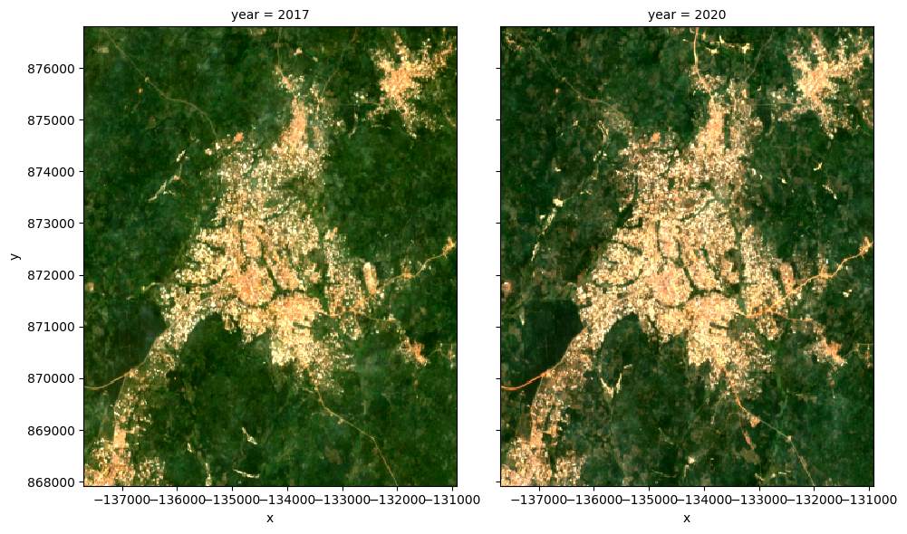
Afficher les données satellite géomédianes
Nous pouvons tracer les deux années pour les comparer visuellement :
[8]:
rgb(geomedians, col='year')
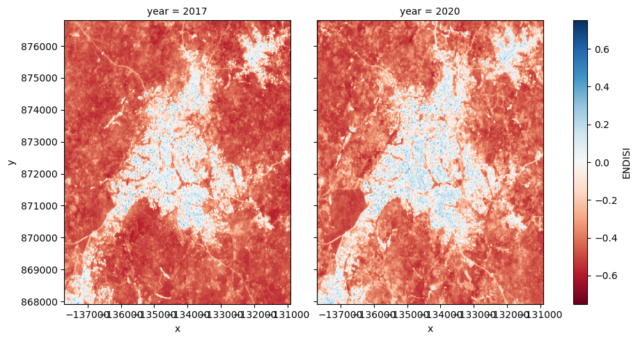
Calculer ENDISI
L’indice de différence normalisée améliorée des surfaces imperméables (ENDISI) est un proxy d’urbanisation récemment développé qui s’est avéré efficace dans une variété d’environnements (Chen et al. 2020). Comme tous les indices de différence normalisée, il a une plage de [-1,1]. Notez que MNDWI, swir_diff et alpha font tous partie du calcul ENDISI.
Les calculs ENDISI sont intégrés dans la fonction « calculate_indices ». Nous utilisons le géomédian Sentinel-2, donc la « mission_satellite » sera « s2 ».
[9]:
# Calculate the ENDISI index
geomedians = calculate_indices(geomedians, index='ENDISI', satellite_mission='s2')
Traçons les images ENDISI pour voir si les zones urbaines sont distinguables
[10]:
geomedians.ENDISI.plot(
    col='year',
    vmin=-.75,
    vmax=0.75,
    cmap='RdBu',
    figsize=(10, 5),
    robust=True
);
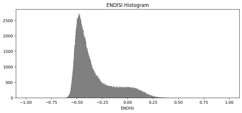
Et maintenant, tracez l’histogramme de tous les pixels du tableau ENDISI
[11]:
geomedians.ENDISI.plot.hist(bins=1000, range=(-1,1), facecolor='gray', figsize=(10, 4))
plt.title('ENDISI Histogram');
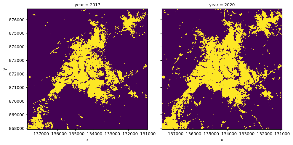
Calculer l’étendue urbaine
Pour définir l’étendue urbaine, nous devons définir un seuil pour les tableaux ENDISI. Les valeurs supérieures à ce seuil seront étiquetées comme « Urbain » tandis que les valeurs inférieures au seuil seront exclues de l’étendue urbaine. Nous pouvons déterminer ce seuil de plusieurs manières (y compris en le définissant simplement manuellement, par exemple « threshold=-0.1 »). Ci-dessous, nous utilisons la méthode Otsu <https://scikit-image.org/docs/dev/auto_examples/segmentation/plot_thresholding.html> » pour définir automatiquement un seuil pour l’image.
Tout d’abord, nous devons remplir toutes les valeurs « NaN » que nous avons dans l’ensemble de données avec la moyenne de l’ensemble de données, sinon la fonction de seuil otsu se plaindra :
[12]:
geomedians['ENDISI'] = geomedians.ENDISI.fillna(geomedians.ENDISI.mean().values)
[13]:
from skimage.filters import threshold_otsu

threshold = threshold_otsu(geomedians.ENDISI.values)
print(round(threshold, 2))
-0.23
Appliquer le seuil
Nous appliquons le seuil et traçons les deux années côte à côte.
[14]:
urban_area = (geomedians.ENDISI > threshold).astype(int)
urban_area.plot(
    col='year',
    figsize=(10, 5),
    robust=True,
    add_colorbar=False
);
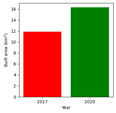
Représentation graphique de l’évolution de l’étendue urbaine
Nous pouvons convertir les données ci-dessus en une superficie totale pour chaque année, puis tracer un graphique à barres.
[15]:
pixel_length = query["resolution"][1]  # in metres
area_per_pixel = pixel_length**2 / 1000**2

urban_area_km2 = urban_area.sum(dim=['x', 'y']) * area_per_pixel

# Plot the resulting area through time
fig, axes = plt.subplots(1, 1, figsize=(4, 4))
plt.bar([0, 1],
        urban_area_km2,
        tick_label=urban_area_km2.year,
        width = 0.8,
        color=['red', 'green']
       )
axes.set_xlabel("Year")
axes.set_ylabel("Built area (km$^2$)");

for y in urban_area_km2.year.values:
    print('Urban extent in '+str(y)+": "+str(round(float(urban_area_km2.sel(year=y).values),3))+' km2')
Urban extent in 2017: 11.852 km2
Urban extent in 2020: 16.285 km2
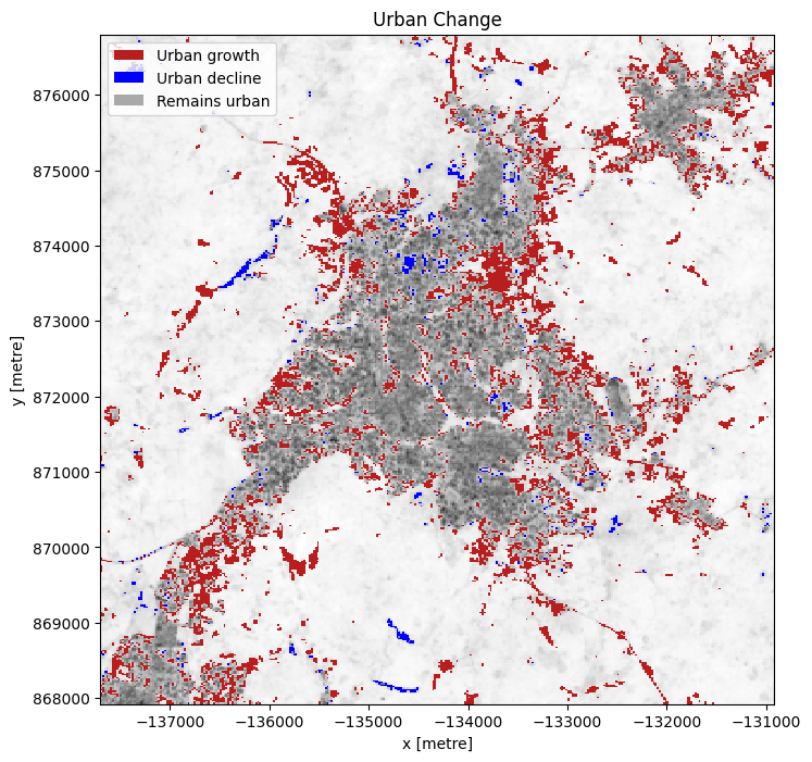
Points chauds de croissance urbaine
Si nous soustrayons l’ENDISI de l’année de référence de l’année d’analyse, nous pouvons mettre en évidence les régions où se produit une croissance urbaine.
Sur ce graphique, nous pouvons voir les zones qui ont connu des changements significatifs, en mettant en évidence les régions d’urbanisation.
[16]:
# Calculate the change between the years
urban_change = urban_area.sel(
    year=analysis_year) - urban_area.sel(year=baseline_year)

urban_growth = urban_change.where(urban_change == 1)
urban_decline = urban_change.where(urban_change == -1)
[17]:
urban_appeared = '#b91e1e'
urban_disappeared = 'Blue'

# Plot urban extent from first year in grey as a background
plot = geomedians.ENDISI.sel(year=baseline_year).plot(size=8,
                                                      aspect=urban_area.y.size /
                                                      urban_area.y.size,
                                               cmap='Greys',
                                               add_colorbar=False)

# add urban growth and decline to the plot
urban_growth.plot(ax=plot.axes,
                  cmap=ListedColormap([urban_appeared]),
                  add_colorbar=False,
                  add_labels=False,
                  )
urban_decline.plot(ax=plot.axes,
                   cmap=ListedColormap([urban_disappeared]),
                   add_colorbar=False,
                   add_labels=False
                   )
# Add the legend
plot.axes.legend(
    [
        Patch(facecolor=urban_appeared),
        Patch(facecolor=urban_disappeared),
        Patch(facecolor='darkgrey'),
        Patch(facecolor='white')
    ],
    ['Urban growth', 'Urban decline', 'Remains urban'],
    loc='upper left'
)

plt.title('Urban Change');
Prochaines étapes
Lorsque vous avez terminé, revenez à la section Paramètres d’analyse, modifiez certaines valeurs (par exemple lat, lon ou time) et réexécutez l’analyse.
Vous pouvez utiliser la carte interactive dans la section « Afficher l’emplacement sélectionné <#View-the-selected-location> » pour rechercher de nouvelles valeurs de latitude et de longitude centrales en effectuant un panoramique et un zoom, puis en cliquant sur la zone pour laquelle vous souhaitez extraire les valeurs d’emplacement. Vous pouvez également utiliser Google Maps pour rechercher un emplacement que vous connaissez, puis renvoyer les valeurs de latitude et de longitude en cliquant sur la carte.
Si vous souhaitez modifier l’emplacement, vous devrez vous assurer que les données Landsat 8 sont disponibles pour le nouvel emplacement, ce que vous pouvez vérifier sur le site Digital Earth Africa Explorer.
Pour des méthodes plus avancées de détection de l’étendue urbaine, consultez le bloc-notes « Machine Learning with ODC <../Real_world_examples/Machine_learning_with_ODC.ipynb> », qui utilise un arbre de décision pour classer les zones urbaines.
Informations Complémentaires
Licence Le code de ce notebook est sous licence Apache, version 2.0 <https://www.apache.org/licenses/LICENSE-2.0>`__.
Les données de Digital Earth Africa sont sous licence Creative Commons Attribution 4.0 <https://creativecommons.org/licenses/by/4.0/>.
Contact Si vous avez besoin d’aide, veuillez poster une question sur le canal Slack DE Africa <https://digitalearthafrica.slack.com/> ou sur le GIS Stack Exchange <https://gis.stackexchange.com/questions/ask?tags=open-data-cube> en utilisant la balise open-data-cube (vous pouvez consulter les questions posées précédemment `ici <https://gis.stackexchange.com/questions/tagged/open-data-
Si vous souhaitez signaler un problème avec ce notebook, vous pouvez en déposer un sur Github.
Version de Datacube compatible
[18]:
print(datacube.__version__)
1.8.20
Dernier test :
[19]:
from datetime import datetime
datetime.today().strftime('%Y-%m-%d')
[19]:
'2025-01-16'