Comparaison de l’indice d’urbanisation avec l’habitat humain mondial (GHS)
Produits utilisés : gm_ls8_annual, wofs_ls_summary_alltime
Balises : index de bande ; NDBI, index de bande ; ENDISI, index de bande ; ASI, urbain
Aperçu
Il existe de nombreux indices d’urbanisation différents, avec des caractéristiques et des cas d’utilisation différents. Il est souvent pratique de pouvoir comparer les performances de plusieurs indices pour une zone donnée, en déterminant lequel est le meilleur pour une zone donnée en fonction des résultats et d’un ensemble de données de « vérité terrain » sur l’urbanisation.
Description
Ce carnet utilise plusieurs indices pour classer les terres comme « urbaines » et compare ensuite ces résultats avec le produit « Global Human Settlement (GHS) » <https://ghsl.jrc.ec.europa.eu/ghs_bu2019.php> »__ qui montre l’étendue de la zone bâtie (étendue urbaine) jusqu’en 2014. Les indices testés ici sont l”indice de construction par différence normalisée (NDBI), l”indice de surface imperméable par différence normalisée améliorée (ENDISI) et l”indice de surface artificielle (ASI).
Chargez une image géomédiane de la région d’intérêt.
Masque à l’eau en utilisant le résumé de tous les temps WOfS
Calculer les indices urbains et afficher les histogrammes des indices.
Sélectionnez les valeurs de seuil minimales et maximales pour les indices afin de déterminer les pixels urbains.
Afficher les images de prédiction d’urbanisation.
Charger et afficher les données de « vérité terrain » (GHS) pour l’année 2014.
Comparez les prévisions d’urbanisation avec les données de « vérité terrain » visuellement et statistiquement.
Le choix des valeurs seuils peut être éclairé par les histogrammes et en comparant les images de prédiction d’urbanisation avec les données d’urbanisation « réelles ».
Commencer
Pour exécuter cette analyse, exécutez toutes les cellules du bloc-notes, en commençant par la cellule « Charger les packages ».
Charger des paquets
Importez les packages Python utilisés pour l’analyse.
[1]:
%matplotlib inline

import datacube
import matplotlib.pyplot as plt
plt.rcParams.update({'font.size': 14})
import numpy as np
import geopandas as gpd
import rioxarray
from collections import namedtuple
from odc.geo.geom import Geometry
from skimage.morphology import remove_small_objects
from skimage.morphology import remove_small_holes
from matplotlib.patches import Patch
from odc.geo.xr import xr_reproject

from deafrica_tools.spatial import xr_rasterize
from deafrica_tools.plotting import display_map, rgb
from deafrica_tools.bandindices import calculate_indices
from deafrica_tools.areaofinterest import define_area
Se connecter au datacube
Activez la base de données Datacube, qui fournit des fonctionnalités pour le chargement et l’affichage des données d’observation de la Terre stockées.
[2]:
dc = datacube.Datacube(app="Urbanization_GHS_Comparison")
Paramètres d’analyse
La cellule suivante définit des paramètres importants pour l’analyse. Les paramètres sont :
« lat » : la latitude centrale à analyser (par exemple « 10,338 »).
« lon » : la longitude centrale à analyser (par exemple « -1,055 »).
lat_buffer: le nombre de degrés à charger autour de la latitude centrale.« lon_buffer » : le nombre de degrés à charger autour de la longitude centrale.
time_range: la plage horaire à analyser, au format AAAA-MM-JJ (par exemple,('2016-01-01', '2016-12-31')).
Sélectionnez l’emplacement
Pour définir la zone d’intérêt, deux méthodes sont disponibles :
En spécifiant la latitude, la longitude et la zone tampon. Cette méthode nécessite que vous saisissiez la latitude centrale, la longitude centrale et la valeur de la zone tampon en degrés carrés autour du point central que vous souhaitez analyser. Par exemple, « lat = 10,338 », « lon = -1,055 » et « buffer = 0,1 » sélectionneront une zone avec un rayon de 0,1 degré carré autour du point avec les coordonnées (10,338, -1,055).
Vous pouvez également fournir des valeurs de tampon distinctes pour la latitude et la longitude d’une zone rectangulaire. Par exemple, « lat = 10.338 », « lon = -1.055 » et « lat_buffer = 0.1 » et « lon_buffer = 0.08 » sélectionneront une zone rectangulaire s’étendant sur 0,1 degré au nord et au sud et 0,08 degré à l’est et à l’ouest à partir du point « (10.338, -1.055) ».
Pour des temps de chargement raisonnables, définissez la mémoire tampon sur « 0,1 » ou moins.
By uploading a polygon as a
GeoJSON or Esri Shapefile. If you choose this option, you will need to upload the geojson or ESRI shapefile into the Sandbox using Upload Files button in the top left corner of the Jupyter Notebook interface. ESRI shapefiles must be uploaded with all the related files
 (.cpg, .dbf, .shp, .shx). Once uploaded, you can use the shapefile or geojson to define the area of interest. Remember to update the code to call the file you have uploaded.
Pour utiliser l’une de ces méthodes, vous pouvez décommenter la ligne de code concernée et commenter l’autre. Pour commenter une ligne, ajoutez le symbole "#" avant le code que vous souhaitez commenter. Par défaut, la première option qui définit l’emplacement à l’aide de la latitude, de la longitude et du tampon est utilisée.
Si vous exécutez le notebook pour la première fois, conservez les paramètres par défaut ci-dessous. La zone par défaut est Dakar, Sénégal.
[3]:
# Method 1: Specify the latitude, longitude, and buffer
aoi = define_area(lat= 14.72, lon=-17.355, buffer=0.2)

# Method 2: Use a polygon as a GeoJSON or Esri Shapefile.
# aoi = define_area(vector_path='aoi.shp')

#Create a geopolygon and geodataframe of the area of interest
geopolygon = Geometry(aoi["features"][0]["geometry"], crs="epsg:4326")
geopolygon_gdf = gpd.GeoDataFrame(geometry=[geopolygon], crs=geopolygon.crs)

# Get the latitude and longitude range of the geopolygon
lat_range = (geopolygon_gdf.total_bounds[1], geopolygon_gdf.total_bounds[3])
lon_range = (geopolygon_gdf.total_bounds[0], geopolygon_gdf.total_bounds[2])

time_range = ("2017")
Afficher l’emplacement sélectionné
La cellule suivante affichera la zone sélectionnée sur une carte interactive. N’hésitez pas à zoomer et dézoomer pour mieux comprendre la zone que vous allez analyser. En cliquant sur n’importe quel point de la carte, vous découvrirez les coordonnées de latitude et de longitude de ce point.
[4]:
# The code below renders a map that can be used to view the region.
display_map(lon_range, lat_range)
[4]:
Charger le GeoMAD annuel de Landsat 8
Nous chargerons le Landsat 8 Annual GeoMAD de 2017.
[5]:
# Create the 'query' dictionary object.
query = {
    "longitude": lon_range,
    "latitude": lat_range,
    "time": time_range,
    "resolution": (-20, 20),
}

# Load the geomedian.
ds = dc.load(product='gm_ls8_annual',
             measurements=["red", "green", "blue", "swir_1", "swir_2", "nir"],
             **query
            ).squeeze()
Une fois le chargement terminé, examinez les données en les imprimant dans la cellule suivante. L’attribut « Dimensions » révèle le nombre d’intervalles de temps dans l’ensemble de données, ainsi que le nombre de pixels dans les dimensions « longitude » et « latitude ».
[6]:
ds
[6]:
<xarray.Dataset> Size: 57MB
Dimensions:      (y: 2471, x: 1930)
Coordinates:
  * y            (y) float64 20kB 1.883e+06 1.882e+06 ... 1.833e+06 1.833e+06
  * x            (x) float64 15kB -1.694e+06 -1.694e+06 ... -1.655e+06
    time         datetime64[ns] 8B 2017-07-02T11:59:59.999999
    spatial_ref  int32 4B 6933
Data variables:
    red          (y, x) uint16 10MB 190 207 209 209 205 ... 180 180 190 185 185
    green        (y, x) uint16 10MB 232 245 249 249 245 ... 275 275 282 277 277
    blue         (y, x) uint16 10MB 106 108 105 105 128 ... 138 138 136 131 131
    swir_1       (y, x) uint16 10MB 238 270 277 277 261 ... 256 256 273 265 265
    swir_2       (y, x) uint16 10MB 221 241 245 245 231 ... 228 228 241 237 237
    nir          (y, x) uint16 10MB 210 223 226 226 216 ... 202 202 211 203 203
Attributes:
    crs:           EPSG:6933
grid_mapping: spatial_refDécoupez les ensembles de données selon la forme de la zone d’intérêt
Un géopolygone représente les limites et non la forme réelle, car il est conçu pour représenter l’étendue de l’entité géographique cartographiée, plutôt que sa forme exacte. En d’autres termes, le géopolygone est utilisé pour définir la limite extérieure de la zone d’intérêt, plutôt que les entités et caractéristiques internes.
Il est important de découper les données selon la forme exacte de la zone d’intérêt, car cela permet de garantir que les données utilisées sont pertinentes pour la zone d’étude spécifique. Bien qu’un géopolygone fournisse des informations sur la limite de l’entité géographique représentée, il ne reflète pas nécessairement la forme ou l’étendue exacte de la zone d’intérêt.
[7]:
#Rasterise the area of interest polygon
aoi_raster = xr_rasterize(gdf=geopolygon_gdf, da=ds, crs=ds.crs)
#Mask the dataset to the rasterised area of interest
ds = ds.where(aoi_raster == 1)
Filtrer les pixels d’eau à l’aide de WOfS
[8]:
# Create a water mask using WOfS.
water = dc.load(
    product="wofs_ls_summary_alltime",
    like=ds.odc.geobox).frequency

# Mask out water.
water_mask = water > 0.1
ds = ds.where(~water_mask.squeeze())
Indices spectraux terrestres
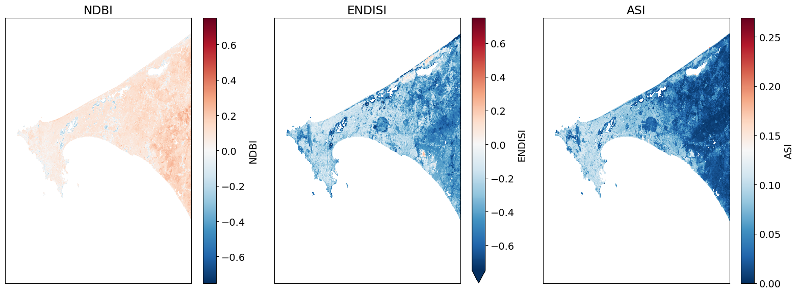
Nous allons calculer NDBI, ENDISI et ASI comme indices d’urbanisation.
NDBI
L’indice de différence normalisée de l’urbanisation (NDBI) est l’un des indicateurs d’urbanisation les plus couramment utilisés. Comme tous les indices de différence normalisée, il a une plage de valeurs de [-1,1].
ENDISI
L’indice de différence normalisée améliorée des surfaces imperméables (ENDISI) est un proxy d’urbanisation développé plus récemment. Comme tous les indices de différence normalisée, il a une plage de [-1,1]. Notez que « MNDWI », « swir_diff » et « alpha » font tous partie du calcul ENDISI.
ASI
L’indice de surface artificielle (ASI) a une plage de [0, 1]. L’ASI est composé de quatre éléments :
Le facteur de surface artificielle (FA) :
Le facteur de suppression de la végétation (VSF) qui comprend l’indice de végétation par différence normalisée et l’indice de végétation ajusté au sol modifié.
Facteur de suppression du sol (SSF) qui comprend l’indice de sol nu modifié (MBI), l’indice d’eau par différence normalisée modifié (MNDWI) et l’indice de sol nu modifié amélioré (EMBI).
Facteur de modulation (MF)
L’indice de surface artificielle (ASI) est finalisé comme suit :
\begin{equation} ASI = f(AF) × f(VSF) × f(SSF) × f(MF) \end{equation}
\(f\) signifie la fonction de normalisation min–max basée sur l’image entière, c’est-à-dire \(y = (x − x_{min})/(x_{max} − x_{min})\)
Calculer NDBI, ENDISI et ASI
[9]:
# NDBI, ENDISI and ASI using DE Africa funciton calculate_indices.
ds = calculate_indices(ds, index=['NDBI', "ENDISI", "ASI"], satellite_mission='ls')
Tracer les indices urbains
[10]:
# Plot.
fig, ax = plt.subplots(1, 3, figsize=(16,6), sharey=True)
ds.NDBI.plot.imshow(ax=ax[0], vmin=-.75, vmax=.75, cmap='RdBu_r')
ds.ENDISI.plot.imshow(ax=ax[1], vmin=-.75, vmax=.75, cmap='RdBu_r')
ds.ASI.plot.imshow(ax=ax[2], cmap='RdBu_r')

ax[0].set_title('NDBI'), ax[0].xaxis.set_visible(False), ax[0].yaxis.set_visible(False)
ax[1].set_title('ENDISI'), ax[1].xaxis.set_visible(False), ax[1].yaxis.set_visible(False)
ax[2].set_title('ASI'), ax[2].xaxis.set_visible(False), ax[2].yaxis.set_visible(False)

plt.tight_layout();
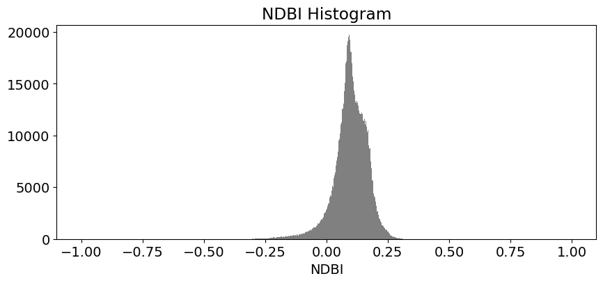
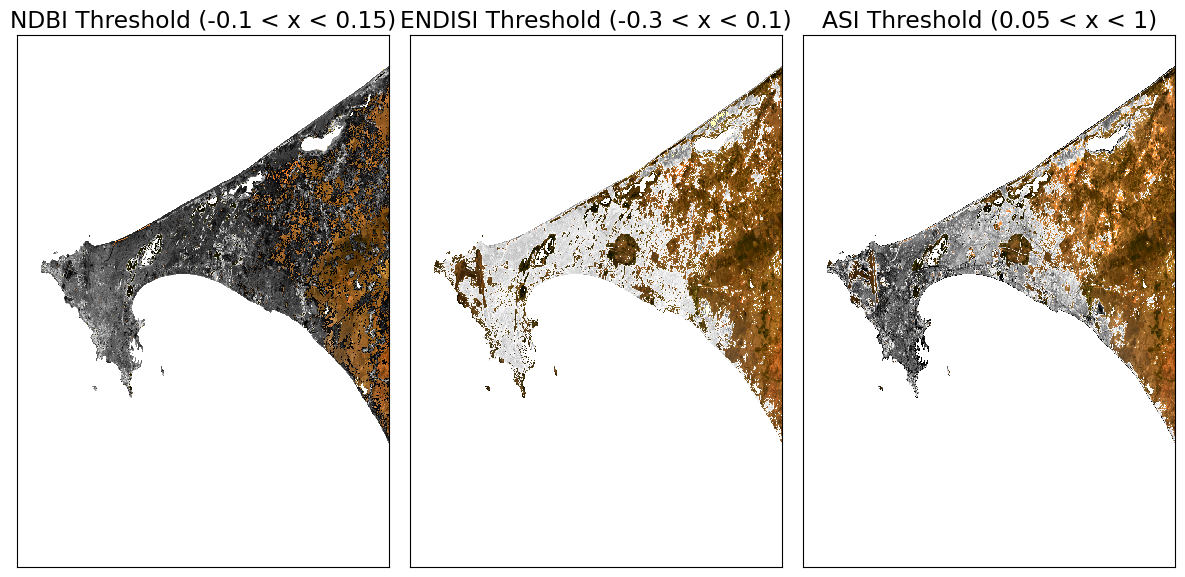
Déterminer les seuils d’urbanisation
Ces histogrammes montrent la distribution des valeurs pour chaque produit. Les valeurs seuils urbaines sont choisies à l’aide de ces histogrammes.
Si l’on examine une zone fortement urbaine, des valeurs maximales doivent être visibles pour ces histogrammes. Les seuils idéaux doivent généralement inclure ces valeurs (voir les axes x des histogrammes) et une plage de valeurs inférieures et supérieures à ces valeurs maximales.
[11]:
# NDBI
ds.NDBI.plot.hist(bins=1000, range=(-1,1), facecolor='gray', figsize=(10, 4))
plt.title('NDBI Histogram')

# ENDISI
ds.ENDISI.plot.hist(bins=1000, range=(-1,1), facecolor='gray', figsize=(10, 4))
plt.title('ENDISI Histogram')

# ASI
ds.ASI.plot.hist(bins=1000, range=(0,1), facecolor='gray', figsize=(10, 4))
plt.title('ASI Histogram')

plt.tight_layout();
Créer des tracés de seuil
Nous allons d’abord définir un seuil minimum et un seuil maximum pour chaque index. Ensuite, nous allons créer des tracés qui colorent la zone de seuil d’une seule couleur (par exemple en rouge).
[12]:
# NDBI = -1.0 to 1.0 (full range)
# NDBI -0.1 to 0.3 is typical for urban areas
min_ndbi_threshold = -0.1
max_ndbi_threshold = 0.15

# ENDISI = -1.0 to 1.0 (full range)
# ENDISI -0.2 to 0.4 is typical for urban areas
min_endisi_threshold = -0.3
max_endisi_threshold = 0.1

# ASI = 0 to 1.0 (full range)
# ASI -0.05 to 1 is typical for urban areas
min_asi_threshold = 0.05
max_asi_threshold = 1 #0.1
[13]:
# Set up the sub-plots.
fig, ax = plt.subplots(1, 3, figsize=(12, 6))

rgb(ds, ax=ax[0])
ds.NDBI.where((ds.NDBI > min_ndbi_threshold) &
                          (ds.NDBI < max_ndbi_threshold)).plot.imshow(
                              cmap='Greys',
                              ax=ax[0],
                              robust=True,
                              add_colorbar=False,
                              add_labels=False)

rgb(ds, ax=ax[1])
ds.ENDISI.where((ds.ENDISI > min_endisi_threshold) &
                            (ds.ENDISI < max_endisi_threshold)).plot.imshow(
                                  cmap='Greys',
                                  ax=ax[1],
                                  robust=True,
                                  add_colorbar=False,
                                  add_labels=False)

rgb(ds, ax=ax[2])
ds.ASI.where((ds.ASI > min_asi_threshold) &
                            (ds.ASI < max_asi_threshold)).plot.imshow(
                                  cmap='Greys',
                                  ax=ax[2],
                                  robust=True,
                                  add_colorbar=False,
                                  add_labels=False)

# Remove axes plotting elements.
for a in ax:
    a.xaxis.set_visible(False)
    a.yaxis.set_visible(False)

# Set titles.
ax[0].set_title(f'NDBI Threshold ({min_ndbi_threshold} < x < {max_ndbi_threshold})')
ax[1].set_title(f'ENDISI Threshold ({min_endisi_threshold} < x < {max_endisi_threshold})')
ax[2].set_title(f'ASI Threshold ({min_asi_threshold} < x < {max_asi_threshold})')

plt.tight_layout();
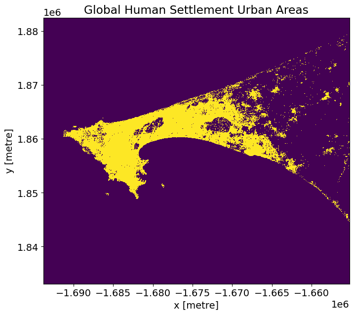
Métriques de comparaison
Nous comparerons les performances des résultats de l’indice urbain avec le produit GHS GeoTIFF (présenté ci-dessous).
Le géotiff SGH pour la région du Sénégal est disponible par défaut dans le dossier « Supplementary_data ». Pour rechercher et télécharger les géotiffs SGH pour d’autres régions, utilisez le lien suivant : https://ghsl.jrc.ec.europa.eu/download.php?ds=bu
[14]:
# Senegal region.
tif = '../Supplementary_data/Urban_index_comparison/GHS_BUILT_LDSMT_GLOBE_R2018A_3857_30_V2_0_12_10.tif'
Ouvrir et reprojeter un ensemble de données pour correspondre à Landsat
[15]:
# Open
ghs_ds = rioxarray.open_rasterio(tif).squeeze().chunk({'x':5000, 'y':5000})

# Reproject to match our landsat composite.
ghs_ds = xr_reproject(ghs_ds,
             ds.odc.geobox,resampling="nearest").compute()

# Threshold GHS to get all the urban areas.
actual = (ghs_ds >= 3) & (ghs_ds <= 6)
[16]:
# Plot.
actual.plot(figsize=(8,7), add_colorbar=False)
plt.title('Global Human Settlement Urban Areas');
Fonctions métriques et de traçage
Le code ci-dessous calculera les sommes vrai/faux positif/négatif et calculera les valeurs d’une matrice de confusion typique pour évaluer les résultats. La précision est utilisée lorsque les vrais positifs et les vrais négatifs sont plus importants tandis que le score F1 est utilisé lorsque les faux négatifs et les faux positifs sont cruciaux.
[17]:
def get_metrics(actual, predicted, minimum_threshold, maximum_threshold, filter_size=1):
    """ Creates performance metrics.

    Args:
        actual: the data to use as truth.
        predicted: the data to predict and to compare against actual.
        minimum_threshold: the minimum threshold to apply on the predicted values for generating a boolean mask.
        maximum_threshold: the maximum threshold to apply on the predicted values for generating a boolean mask.
        filter_size: the filter size to apply on predicted to remove small object/holes with.

    Returns: A namedtuple containing the actual, predicted mask, and varying metrics for a confusion matrix.
    """
    metrics = namedtuple('Metrics',
                         'actual predicted true_positive true_negative false_positive false_negative')

    predicted  = (predicted > minimum_threshold) & (predicted < maximum_threshold)
    predicted = remove_small_objects(predicted, max_size=filter_size, connectivity=2)
    predicted = remove_small_holes(predicted, max_size=filter_size, connectivity=2)

    true_positive=(predicted & actual).sum()
    true_negative=(~predicted & ~actual).sum()
    false_positive=(predicted & ~actual).sum()
    false_negative=(~predicted & actual).sum()

    return metrics(actual=actual,
                   predicted=predicted,
                   true_positive=true_positive,
                   true_negative=true_negative,
                   false_positive=false_positive,
                   false_negative=false_negative)

def print_metrics(metrics):
    norm = metrics.true_positive + metrics.false_negative + metrics.false_positive + metrics.true_negative
    accuracy = (metrics.true_positive + metrics.true_negative)/norm
    ppv = metrics.true_positive/(metrics.true_positive + metrics.false_positive)
    tpr = metrics.true_positive/(metrics.true_positive + metrics.false_negative)
    f1 = (2*ppv*tpr)/(ppv+tpr)

    print('True Positive (Actual + Model = Urban): {tp}'.format(tp=round(metrics.true_positive/norm*100,3)))
    print('True Negative (Actual + Model = Non-Urban): {tn}'.format(tn=round(metrics.true_negative/norm*100,3)))
    print('False Positive (Actual=Non-Urban, Model=Urban): {fp}'.format(fp=round(metrics.false_positive/norm*100,3)))
    print('False Negative (Actual=Urban, Model=Non-Urban): {fn}'.format(fn=round(metrics.false_negative/norm*100,3)))
    print('\nAccuracy: {accuracy}'.format(accuracy=round(accuracy*100, 3)))
    print('F1 Score: {f1}\n'.format(f1=round(f1*100, 3)))
[18]:
indexes =['NDBI','ENDISI', 'ASI']
min_thresholds = [min_ndbi_threshold, min_endisi_threshold, min_asi_threshold]
max_thresholds =[max_ndbi_threshold, max_endisi_threshold, max_asi_threshold]

index_metrics=[]
for index, min_thresh, max_thresh in zip(indexes, min_thresholds, max_thresholds):
    print ('\033[1m' + '\033[91m' + index+' - Comparison Results') # bold print and red
    print ('\033[0m') # stop bold and red
    metrics = get_metrics(actual.values, ds[index].values, min_thresh, max_thresh)
    index_metrics.append(metrics)
    print_metrics(metrics)

#create a dictionary with the accuracy data in it
index_metrics = {indexes[i]: index_metrics[i] for i in range(len(indexes))}
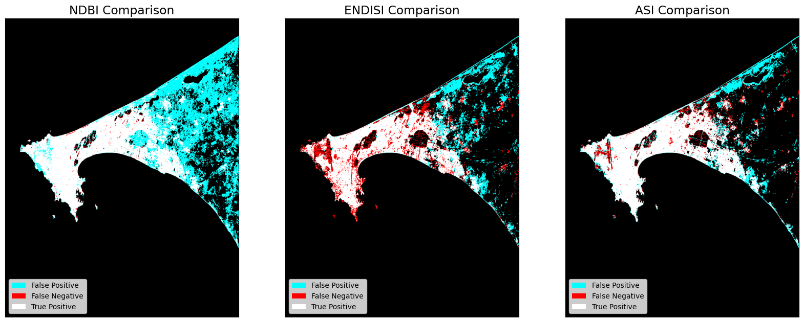
NDBI - Comparison Results

True Positive (Actual + Model = Urban): 9.433
True Negative (Actual + Model = Non-Urban): 80.575
False Positive (Actual=Non-Urban, Model=Urban): 9.732
False Negative (Actual=Urban, Model=Non-Urban): 0.26

Accuracy: 90.008
F1 Score: 65.376

ENDISI - Comparison Results

True Positive (Actual + Model = Urban): 7.265
True Negative (Actual + Model = Non-Urban): 86.92
False Positive (Actual=Non-Urban, Model=Urban): 3.387
False Negative (Actual=Urban, Model=Non-Urban): 2.428

Accuracy: 94.185
F1 Score: 71.42

ASI - Comparison Results

True Positive (Actual + Model = Urban): 8.463
True Negative (Actual + Model = Non-Urban): 87.89
False Positive (Actual=Non-Urban, Model=Urban): 2.417
False Negative (Actual=Urban, Model=Non-Urban): 1.23

Accuracy: 96.353
F1 Score: 82.275
Comparaisons de résultats
Les appels « dstack » fournissent aux appels « imshow » des entrées de tableau RVB. Pour chaque image, le premier canal (rouge) correspond aux valeurs réelles (vérité fondamentale, GHS), et les deuxième et troisième canaux (vert, bleu) correspondent aux valeurs prédites (vert + bleu = cyan).
[19]:
fig, ax = plt.subplots(1, 3, figsize=(20,10))

for a, key in zip(ax, index_metrics):
    a.imshow(np.dstack((index_metrics[key].actual.astype(float),
                        index_metrics[key].predicted.astype(float),
                        index_metrics[key].predicted.astype(float))))
    a.legend(
        [Patch(facecolor='cyan'), Patch(facecolor='red'), Patch(facecolor='white')],
        ['False Positive', 'False Negative', 'True Positive'], loc='lower left', fontsize=10)
    a.xaxis.set_visible(False)
    a.yaxis.set_visible(False)
    a.set_title(key +' Comparison')
Prochaines étapes
L’apprentissage automatique peut également être utilisé pour mesurer l’urbanisation. Consultez this notebook pour un guide sur l’utilisation de l’apprentissage automatique dans le contexte de l’ODC.
Informations Complémentaires
Licence Le code de ce notebook est sous licence Apache, version 2.0 <https://www.apache.org/licenses/LICENSE-2.0>`__.
Les données de Digital Earth Africa sont sous licence Creative Commons Attribution 4.0 <https://creativecommons.org/licenses/by/4.0/>.
Contact Si vous avez besoin d’aide, veuillez poster une question sur le canal Slack DE Africa <https://digitalearthafrica.slack.com/> ou sur le GIS Stack Exchange <https://gis.stackexchange.com/questions/ask?tags=open-data-cube> en utilisant la balise open-data-cube (vous pouvez consulter les questions posées précédemment `ici <https://gis.stackexchange.com/questions/tagged/open-data-
Si vous souhaitez signaler un problème avec ce notebook, vous pouvez en déposer un sur Github.
Version de Datacube compatible
[20]:
print(datacube.__version__)
1.9.13
Dernier test :
[21]:
from datetime import datetime
datetime.today().strftime('%Y-%m-%d')
[21]:
'2026-04-13'