Modélisation de l’élévation intertidale à l’aide de données de marée
Prérequis : Pour plus d’informations sur l’étape de modélisation des marées de cette analyse, reportez-vous au « Cahier de modélisation des marées <../Frequently_used_code/Tidal_modelling.ipynb> » __
Mots-clés : données utilisées ; landsat 5, données utilisées ; landsat 7, données utilisées ; landsat 8, eau ; modélisation des marées, eau ; extraction de la ligne de flottaison, indice de bande ; NDWI, méthodes de données ; composition
Aperçu
Les zones intertidales abritent des habitats écologiques importants (p. ex. plages et rivages sablonneux, vasières, rivages rocheux et récifs) et offrent de nombreux avantages précieux tels que la protection contre les ondes de tempête, le stockage du carbone et les ressources naturelles à usage récréatif et commercial. Cependant, les zones intertidales sont confrontées à des menaces croissantes liées à l’érosion côtière, à la remise en valeur des terres (p. ex. construction de ports) et à l’élévation du niveau de la mer. Des données d’élévation précises décrivant la hauteur et la forme du littoral sont nécessaires pour aider à prédire quand et où ces menaces auront le plus d’impact. Cependant, ces données sont coûteuses et difficiles à cartographier sur l’ensemble de la zone intertidale d’un continent de la taille de l’Afrique.
Cas d’utilisation de Digital Earth Africa
La montée et la descente de la marée peuvent être utilisées pour révéler la forme tridimensionnelle du littoral en cartographiant la frontière entre l’eau et la terre sur une gamme de marées connues (par exemple de la marée basse à la marée haute). En supposant que la frontière terre-eau est une ligne de hauteur constante par rapport au niveau moyen de la mer (MSL), les élévations peuvent être modélisées pour la zone du littoral située entre la marée la plus basse et la marée la plus haute observée.
Les images provenant de satellites tels que le programme NASA/USGS Landsat sont disponibles gratuitement sur l’ensemble de la planète, ce qui fait de l’imagerie satellite un outil puissant et rentable pour modéliser la forme et la structure 3D de la zone intertidale à l’échelle régionale ou nationale.
Référence : Bishop-Taylor et al. 2019, le premier modèle 3D de l’ensemble du littoral australien : le National Intertidal Digital Elevation Model.
Description
Dans cet exemple, nous démontrons une version simplifiée de la méthode NIDEM (National Intertidal Digital Elevation Model) qui combine les données des satellites Landsat 5, 7 et 8 avec des techniques de modélisation des marées, de composition d’images et d’interpolation spatiale. Nous cartographions d’abord la limite entre la terre et l’eau de la marée basse à la marée haute, et utilisons ces informations pour générer des cartes d’élévation 3D continues et fluides de la zone intertidale. Les données obtenues peuvent aider à cartographier les habitats des espèces côtières menacées, à identifier les zones d’érosion côtière, à planifier les événements extrêmes tels que les ondes de tempête et les inondations, et à améliorer les modèles de la façon dont l’élévation du niveau de la mer affectera le littoral. Cet exemple pratique guide les utilisateurs à travers le code requis pour :
Charger une série chronologique Landsat sans nuages.
Calculer un indice hydrique (NDWI).
Étiquetez et triez les images satellites par hauteur de marée.
Créez des images « récapitulatives » ou composites qui montrent la répartition des terres et de l’eau à des intervalles discrets de l’amplitude des marées (par exemple, à marée basse, à marée haute).
Extraire et visualiser la topographie de la zone intertidale sous forme de courbes de profondeur.
Interpoler les contours de profondeur dans un modèle numérique d’élévation (DEM) lisse et continu de la zone intertidale.
Commencer
Pour exécuter cette analyse, exécutez toutes les cellules du bloc-notes, en commençant par la cellule « Charger les packages ».
Une fois l’analyse terminée, revenez à la cellule « Paramètres d’analyse », modifiez certaines valeurs (par exemple, choisissez un autre lieu ou une autre période à analyser) et relancez l’analyse. Vous trouverez des instructions supplémentaires sur la modification du bloc-notes à la fin.
Charger des paquets
Chargez les principaux packages Python et les fonctions de support pour l’analyse.
[1]:
%matplotlib inline

import os
import datacube
import xarray as xr
import pandas as pd
import numpy as np
import geopandas as gpd
import matplotlib.pyplot as plt
from odc.geo.cog import write_cog

from odc.geo.geom import Geometry
from deafrica_tools.datahandling import load_ard, mostcommon_crs
from deafrica_tools.bandindices import calculate_indices
from eo_tides import tag_tides
from deafrica_tools.spatial import subpixel_contours, interpolate_2d, contours_to_arrays, xr_rasterize
from deafrica_tools.plotting import display_map, map_shapefile, rgb
from deafrica_tools.dask import create_local_dask_cluster
from deafrica_tools.areaofinterest import define_area
Configurer un cluster Dask
Dask peut être utilisé pour mieux gérer l’utilisation de la mémoire et effectuer l’analyse en parallèle. Pour une introduction à l’utilisation de Dask avec Digital Earth Africa, consultez le Dask notebook.
Remarque : nous vous recommandons d’ouvrir la fenêtre de traitement Dask pour afficher les différents calculs en cours d’exécution ; pour ce faire, consultez la section Tableau de bord Dask en Afrique de l’Ouest du Dask notebook.
Pour utiliser Dask, configurez le cluster de calcul local à l’aide de la cellule ci-dessous.
[2]:
create_local_dask_cluster()
Client
Client-c7adee5d-3321-11f1-8fe5-66c27c7d89dc
| Connection method: Cluster object | Cluster type: distributed.LocalCluster |
| Dashboard: /user/mpho.sadiki@digitalearthafrica.org/proxy/40161/status |
Cluster Info
LocalCluster
83619f5f
| Dashboard: /user/mpho.sadiki@digitalearthafrica.org/proxy/40161/status | Workers: 1 |
| Total threads: 4 | Total memory: 26.21 GiB |
| Status: running | Using processes: True |
Scheduler Info
Scheduler
Scheduler-2605e2f1-1d86-442e-9b70-078c904b81b6
| Comm: tcp://127.0.0.1:37015 | Workers: 0 |
| Dashboard: /user/mpho.sadiki@digitalearthafrica.org/proxy/40161/status | Total threads: 0 |
| Started: Just now | Total memory: 0 B |
Workers
Worker: 0
| Comm: tcp://127.0.0.1:38615 | Total threads: 4 |
| Dashboard: /user/mpho.sadiki@digitalearthafrica.org/proxy/38467/status | Memory: 26.21 GiB |
| Nanny: tcp://127.0.0.1:35973 | |
| Local directory: /tmp/dask-scratch-space/worker-3s6bh1tc | |
Se connecter au datacube
Activez la base de données Datacube, qui fournit des fonctionnalités pour le chargement et l’affichage des données d’observation de la Terre stockées.
[3]:
dc = datacube.Datacube(app='Intertidal_elevation')
Paramètres d’analyse
L’ensemble de cellules suivant définit des paramètres importants pour l’analyse :
« lat » : la latitude centrale à analyser (par exemple « 11,228 »).
« lon » : la longitude centrale à analyser (par exemple « -15,860 »).
« buffer » : le nombre de degrés carrés à charger autour de la latitude et de la longitude centrales. Pour des temps de chargement raisonnables, définissez cette valeur sur « 0,1 » ou moins.
time_range: la plage de dates à analyser (par exemple,('2000', '2019'))
Sélectionnez l’emplacement
Pour définir la zone d’intérêt, deux méthodes sont disponibles :
En spécifiant la latitude, la longitude et la zone tampon. Cette méthode nécessite que vous saisissiez la latitude centrale, la longitude centrale et la valeur de la zone tampon en degrés carrés autour du point central que vous souhaitez analyser. Par exemple, « lat = 10,338 », « lon = -1,055 » et « buffer = 0,1 » sélectionneront une zone avec un rayon de 0,1 degré carré autour du point avec les coordonnées (10,338, -1,055).
Vous pouvez également fournir des valeurs de tampon distinctes pour la latitude et la longitude d’une zone rectangulaire. Par exemple, « lat = 10.338 », « lon = -1.055 » et « lat_buffer = 0.1 » et « lon_buffer = 0.08 » sélectionneront une zone rectangulaire s’étendant sur 0,1 degré au nord et au sud et 0,08 degré à l’est et à l’ouest à partir du point « (10.338, -1.055) ».
Pour des temps de chargement raisonnables, définissez la mémoire tampon sur « 0,1 » ou moins.
By uploading a polygon as a
GeoJSON or Esri Shapefile. If you choose this option, you will need to upload the geojson or ESRI shapefile into the Sandbox using Upload Files button in the top left corner of the Jupyter Notebook interface. ESRI shapefiles must be uploaded with all the related files
 (.cpg, .dbf, .shp, .shx). Once uploaded, you can use the shapefile or geojson to define the area of interest. Remember to update the code to call the file you have uploaded.
Pour utiliser l’une de ces méthodes, vous pouvez décommenter la ligne de code concernée et commenter l’autre. Pour commenter une ligne, ajoutez le symbole "#" avant le code que vous souhaitez commenter. Par défaut, la première option qui définit l’emplacement à l’aide de la latitude, de la longitude et du tampon est utilisée.
Si vous exécutez le bloc-notes pour la première fois, conservez les paramètres par défaut ci-dessous. Cela montrera comment fonctionne l’analyse et fournira des résultats significatifs. L’exemple génère un modèle d’élévation intertidale pour une zone au large des côtes de la Guinée-Bissau.
Pour garantir que la partie modélisation des marées de cette analyse fonctionne correctement, assurez-vous que le centre de la zone d’étude est situé au-dessus de l’eau lors du réglage de « lat » et « lon ».
[4]:
# Method 1: Specify the latitude, longitude, and buffer
aoi = define_area(lat=11.228, lon=-15.860, buffer=0.02)

# Method 2: Use a polygon as a GeoJSON or Esri Shapefile.
# aoi = define_area(vector_path='aoi.shp')

#Create a geopolygon and geodataframe of the area of interest
geopolygon = Geometry(aoi["features"][0]["geometry"], crs="epsg:4326")
geopolygon_gdf = gpd.GeoDataFrame(geometry=[geopolygon], crs=geopolygon.crs)

# Get the latitude and longitude range of the geopolygon
lat_range = (geopolygon_gdf.total_bounds[1], geopolygon_gdf.total_bounds[3])
lon_range = (geopolygon_gdf.total_bounds[0], geopolygon_gdf.total_bounds[2])

# Set the range of dates for the analysis
time_range = ('2014', '2020')
Afficher l’emplacement sélectionné
La cellule suivante affichera la zone sélectionnée sur une carte interactive. N’hésitez pas à zoomer et dézoomer pour mieux comprendre la zone que vous allez analyser. En cliquant sur n’importe quel point de la carte, vous découvrirez les coordonnées de latitude et de longitude de ce point.
[5]:
display_map(x=lon_range, y=lat_range)
[5]:
Charger des données Landsat masquées par des nuages
La première étape de cette analyse consiste à charger les données Landsat pour les « lat_range », « lon_range » et « time_range » que nous avons fournies ci-dessus. Le code ci-dessous utilise la fonction « load_ard » pour charger les données des satellites Landsat 5, 7 et 8 pour la zone et l’heure spécifiées. Pour plus d’informations, consultez le bloc-notes « Using load_ard <../Frequently_used_code/Using_load_ard.ipynb> ». La fonction masquera également automatiquement les nuages de l’ensemble de données, ce qui nous permettra de nous concentrer sur les pixels qui contiennent des données utiles :
[6]:
# Create the 'query' dictionary object, which contains the longitudes,
# latitudes and time provided above
query = {
    'x': lon_range,
    'y': lat_range,
    'time': time_range,
    'measurements': ['red', 'green', 'blue', 'nir'],
    'resolution': (-30, 30),
}

# Identify the most common projection system in the input query
output_crs = mostcommon_crs(dc=dc, product='ls8_sr', query=query)

# Load available data from all three Landsat satellites
landsat_ds = load_ard(dc=dc,
                      products=['ls5_sr','ls7_sr','ls8_sr'],
                      output_crs=output_crs,
                      min_gooddata=0.5,
                      align=(15,15),
                      group_by='solar_day',
                      dask_chunks={},
                      **query)
Using pixel quality parameters for USGS Collection 2
Finding datasets
    ls5_sr
    ls7_sr
    ls8_sr
Counting good quality pixels for each time step
Filtering to 174 out of 280 time steps with at least 50.0% good quality pixels
Applying pixel quality/cloud mask
Re-scaling Landsat C2 data
Returning 174 time steps as a dask array
/opt/venv/lib/python3.12/site-packages/deafrica_tools/datahandling.py:565: FutureWarning: In a future version of xarray the default value for compat will change from compat='no_conflicts' to compat='override'. This is likely to lead to different results when combining overlapping variables with the same name. To opt in to new defaults and get rid of these warnings now use `set_options(use_new_combine_kwarg_defaults=True) or set compat explicitly.
  ds = xr.merge([ds_data, ds_masks])
Une fois le chargement terminé, examinez les données en les imprimant dans la cellule suivante. L’argument « Dimensions » révèle le nombre d’intervalles de temps dans l’ensemble de données, ainsi que le nombre de pixels dans les dimensions « x » (longitude) et « y » (latitude).
[7]:
print(landsat_ds)
<xarray.Dataset> Size: 61MB
Dimensions:      (time: 174, y: 148, x: 147)
Coordinates:
  * time         (time) datetime64[ns] 1kB 2014-01-14T11:23:15.376568 ... 202...
  * y            (y) float64 1kB 1.244e+06 1.244e+06 ... 1.239e+06 1.239e+06
  * x            (x) float64 1kB 4.039e+05 4.04e+05 ... 4.083e+05 4.083e+05
    spatial_ref  int32 4B 32628
Data variables:
    red          (time, y, x) float32 15MB dask.array<chunksize=(1, 148, 147), meta=np.ndarray>
    green        (time, y, x) float32 15MB dask.array<chunksize=(1, 148, 147), meta=np.ndarray>
    blue         (time, y, x) float32 15MB dask.array<chunksize=(1, 148, 147), meta=np.ndarray>
    nir          (time, y, x) float32 15MB dask.array<chunksize=(1, 148, 147), meta=np.ndarray>
Attributes:
    crs:           EPSG:32628
    grid_mapping:  spatial_ref
Découpez les ensembles de données selon la forme de la zone d’intérêt
Un géopolygone représente les limites et non la forme réelle, car il est conçu pour représenter l’étendue de l’entité géographique cartographiée, plutôt que sa forme exacte. En d’autres termes, le géopolygone est utilisé pour définir la limite extérieure de la zone d’intérêt, plutôt que les entités et caractéristiques internes.
Il est important de découper les données selon la forme exacte de la zone d’intérêt, car cela permet de garantir que les données utilisées sont pertinentes pour la zone d’étude spécifique. Bien qu’un géopolygone fournisse des informations sur la limite de l’entité géographique représentée, il ne reflète pas nécessairement la forme ou l’étendue exacte de la zone d’intérêt.
[8]:
#Rasterise the area of interest polygon
aoi_raster = xr_rasterize(gdf=geopolygon_gdf, da=landsat_ds, crs=landsat_ds.crs)
#Mask the dataset to the rasterised area of interest
landsat_ds = landsat_ds.where(aoi_raster == 1)
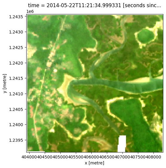
Exemple de tracé de pas de temps en vraies couleurs
Pour visualiser les données, utilisez la fonction utilitaire « rgb » préchargée pour tracer une image en vraies couleurs pour un intervalle de temps donné. Les zones blanches indiquent les endroits où les nuages ou autres pixels non valides de l’image ont été masqués.
Modifiez la valeur de « timestep » et réexécutez la cellule pour tracer un pas de temps différent (les pas de temps sont numérotés de « 0 » à « n_time - 1 » où « n_time » est le nombre total de pas de temps ; voir la liste « time » sous la catégorie « Dimensions » dans l’impression du jeu de données ci-dessus).
[9]:
# Set the timesteps to visualise
timestep = 12

# Generate RGB plots at each timestep
rgb(landsat_ds, index=timestep)
Calculer l’indice d’eau par différence normalisée
Pour extraire les contours de profondeur intertidale, nous devons être capables de séparer l’eau de la terre dans notre zone d’étude. Pour ce faire, nous pouvons utiliser nos données Landsat pour calculer un indice d’eau appelé « Normalised Difference Water Index », ou NDWI. Cet indice utilise le rapport entre le rayonnement vert et le rayonnement proche infrarouge pour identifier la présence d’eau. La formule est :
où « Vert » est la bande verte et « NIR » est la bande proche infrarouge.
Pour interpréter l’indice, les valeurs élevées (supérieures à 0, couleurs bleues) représentent généralement des pixels d’eau, tandis que les valeurs faibles (inférieures à 0, couleurs rouges) représentent la terre. Vous pouvez utiliser la cellule ci-dessous pour calculer et tracer l’une des images après avoir calculé l’indice.
[10]:
# Calculate the water index
landsat_ds = calculate_indices(landsat_ds, index='NDWI',
                               satellite_mission='ls')

# Plot the resulting image for the same timestep selected above
landsat_ds.NDWI.isel(time=timestep).plot(cmap='RdBu',
                                          size=6,
                                          vmin=-0.8,
                                          vmax=0.8)
plt.show()
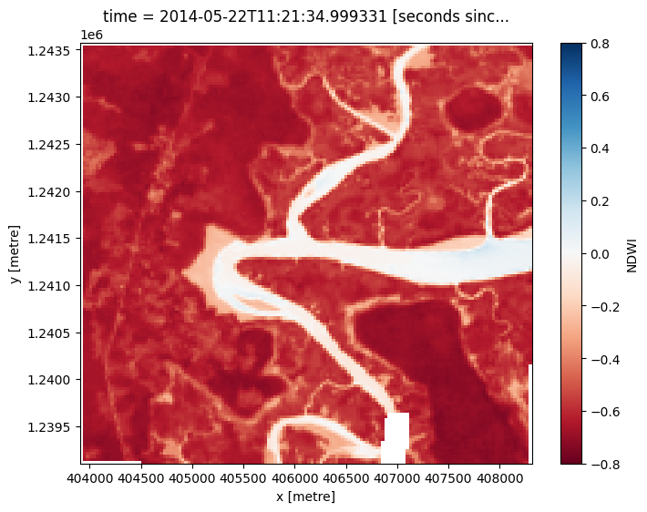
Comment le tracé de l’indice se compare-t-il à l’image optique précédente ? Y avait-il de l’eau ou de la terre à un endroit auquel vous ne vous attendiez pas ?
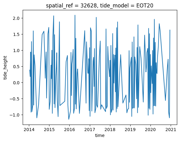
Modèles de hauteurs de marée
L’emplacement du littoral peut varier considérablement entre la marée basse et la marée haute. Dans le code ci-dessous, nous cherchons à calculer la hauteur de la marée au moment exact où chaque image Landsat a été acquise. Cela nous permettra de construire une série chronologique triée d’images prises à marée basse et à marée haute, que nous utiliserons pour générer le modèle d’élévation intertidale.
The tag_tides function below uses the EOT20 model (by default) to calculate the height of the tide at the exact moment each satellite image in our dataset was taken, and adds this as a new tide_m attribute in our dataset (for more information about this function, refer to the Tidal modelling notebook).
Remarque : cette fonction ne peut modéliser correctement les marées que si le centre de votre zone d’étude est situé au-dessus de l’eau. Si ce n’est pas le cas, vous pouvez spécifier un emplacement de modélisation de marée personnalisé en transmettant une coordonnée à « tidepost_lat » et « tidepost_lon » (par exemple, « tidepost_lat=11.228, tidepost_lon=-15.860 »).
[11]:
# Calculate tides for each timestep in the satellite dataset
model_dir="/var/share/tide_models"
landsat_ds_tidal = tag_tides(data=landsat_ds,directory=model_dir, tidepost_lat=None, tidepost_lon=None)

# Print the output dataset with new `tide_m` variable
print(landsat_ds_tidal)
Setting tide modelling location from dataset centroid: -15.86, 11.23
Modelling tides with EOT20
<xarray.DataArray 'tide_height' (time: 174)> Size: 696B
array([ 0.38309392,  0.18121362,  0.9434867 , -0.92526126,  1.2684522 ,
       -0.9068958 , -0.7078813 ,  1.6011052 , -0.7023247 ,  0.85683984,
        0.51686704, -0.32696718, -1.1012332 , -0.6831711 ,  1.4836397 ,
        1.5900179 ,  0.7736116 ,  0.13027655,  0.9443579 , -0.48765886,
        1.5093812 ,  1.7090001 , -0.835805  , -0.59954363,  0.53930473,
        0.11420869,  1.0001456 , -0.961363  ,  1.3729107 ,  2.068674  ,
       -0.66960603,  1.4824675 , -0.7840445 ,  0.18243629,  0.47131032,
        0.92193455, -0.51350963, -1.0623467 ,  1.8822469 , -0.7187311 ,
       -0.58562416,  0.6428211 ,  0.8359527 , -0.6965235 , -1.1455078 ,
       -0.8777404 ,  0.93215644, -0.4080441 ,  0.5737699 ,  0.672434  ,
        1.0276235 , -0.95908594, -0.80646485,  2.0885396 , -0.67565036,
        1.3708299 , -0.8236907 ,  0.30116236,  0.41813204, -0.9639097 ,
        1.6072143 , -0.6450425 ,  1.260702  ,  0.5416248 ,  0.28545073,
        0.28193012,  0.73717254, -0.8752567 ,  1.0796175 , -1.053087  ,
        1.6960765 ,  1.5861217 , -0.8913872 ,  0.66851157,  0.77885544,
       -0.12701906,  1.0520695 , -0.9419231 , -0.80776274,  2.020903  ,
       -0.7030058 , -0.77311987,  0.809234  ,  1.2852067 , -0.8345382 ,
       -0.69428986, -0.9074287 ,  1.6605508 , -0.8081423 , -0.7335851 ,
        1.1176023 ,  0.4694393 ,  0.35733342,  0.1783354 ,  0.6872601 ,
       -1.0073301 ,  1.1492103 , -0.9299268 , -0.8232967 ,  1.5188614 ,
       -0.85963774,  0.86495966, -0.02117424,  0.6967346 ,  0.8500624 ,
       -0.29369253,  1.0685484 , -0.9190542 ,  1.6997185 , -0.81072485,
        1.879463  , -0.75438464,  0.8618954 , -0.6428811 , -0.39058045,
       -0.9436698 , -0.835255  , -0.8134117 ,  0.9872712 , -0.617094  ,
        0.4472909 ,  0.78033495, -1.0572615 ,  1.2562683 , -0.8059752 ,
       -0.77567023,  1.4154866 , -0.7952342 ,  0.792472  ,  0.55756736,
       -0.5097232 ,  1.0854425 , -0.94408303,  1.786267  , -0.77533376,
        1.1118169 ,  0.7441928 , -0.6111341 ,  1.4685115 ,  0.77272177,
        0.32427078,  0.45637968,  0.92188364,  1.056123  , -1.0197587 ,
        1.679382  , -0.8039371 ,  1.5135778 , -0.8367207 ,  0.8689482 ,
       -0.3188648 ,  0.5128833 , -0.03631571,  0.9911029 , -0.98308855,
        1.3795615 , -0.72586036,  1.9600409 , -0.722767  ,  1.2436471 ,
       -0.7355574 ,  0.6143259 ,  0.3058217 ,  0.27282646,  0.77100086,
        1.1272899 ,  1.8236029 ,  1.6044599 , -0.5621493 ,  0.41010094,
        0.72171897, -0.90847   , -1.1007608 ,  1.6268315 ], dtype=float32)
Coordinates:
  * time        (time) datetime64[ns] 1kB 2014-01-14T11:23:15.376568 ... 2020...
    tide_model  <U5 20B 'EOT20'
Maintenant que nous avons modélisé les hauteurs de marée, nous pouvons les tracer pour visualiser la plage de marée capturée par Landsat au cours de notre série chronologique :
[12]:
# Plot the resulting tide heights for each Landsat image:
landsat_ds["tide_height"] = landsat_ds_tidal
landsat_ds.tide_height.plot()
[12]:
[<matplotlib.lines.Line2D at 0x7f8a8c5db680>]
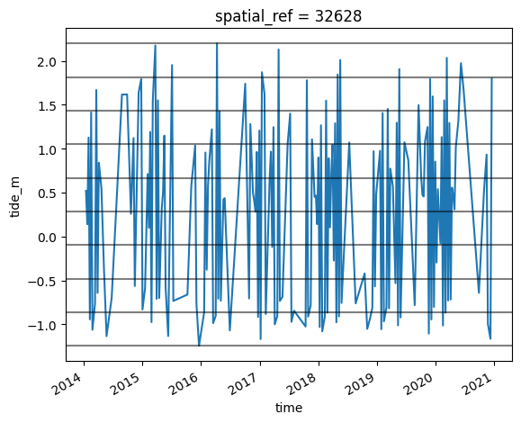
Créer des images récapitulatives de l’indice hydrique de la marée basse à la marée haute
En utilisant ces hauteurs de marée, nous pouvons trier notre ensemble de données Landsat par hauteur de marée pour révéler quelles parties du paysage sont inondées ou exposées de la marée basse à la marée haute.
Les images individuelles de télédétection peuvent être affectées par le bruit, notamment les nuages, les reflets du soleil et les mauvaises conditions de qualité de l’eau (par exemple, les sédiments). Pour produire des images plus nettes qui peuvent être comparées plus facilement entre les stades de marée, nous pouvons créer des images « récapitulatives » ou composites qui combinent plusieurs images en une seule image pour révéler l’apparence « typique » ou médiane du paysage à différents stades de marée. Dans ce cas, nous utilisons la médiane comme statistique récapitulative, car elle empêche les valeurs aberrantes importantes (comme les nuages errants) de fausser les données, ce qui ne serait pas le cas si nous devions utiliser la moyenne.
Dans le code ci-dessous, nous prenons la série chronologique d’images, trions par marée et catégorisons chaque image en 9 intervalles de marée discrets, allant des marées les plus basses (intervalle de marée 1) aux marées les plus hautes observées par Landsat (intervalle de marée 9). Pour plus d’informations sur cette méthode, reportez-vous à Sagar et al. 2018.
[13]:
# Sort every image by tide height
landsat_ds = landsat_ds.sortby('tide_height')

# Bin tide heights into 9 tidal intervals from low (1) to high tide (9)
binInterval = np.linspace(landsat_ds.tide_height.min().values,
                          landsat_ds.tide_height.max().values,
                          num=10)
tide_intervals = pd.cut(landsat_ds.tide_height,
                        bins=binInterval,
                        labels=range(1, 10),
                        include_lowest=True)

# Add interval to dataset
landsat_ds['tide_interval'] = xr.DataArray(tide_intervals.astype(int),
                                           [('time', landsat_ds.time.data)])

print(landsat_ds)
<xarray.Dataset> Size: 76MB
Dimensions:        (time: 174, y: 148, x: 147)
Coordinates:
  * time           (time) datetime64[ns] 1kB 2015-12-19T11:22:13.664612 ... 2...
  * y              (y) float64 1kB 1.244e+06 1.244e+06 ... 1.239e+06 1.239e+06
  * x              (x) float64 1kB 4.039e+05 4.04e+05 ... 4.083e+05 4.083e+05
    spatial_ref    int32 4B 32628
    tide_model     <U5 20B 'EOT20'
Data variables:
    red            (time, y, x) float32 15MB dask.array<chunksize=(1, 148, 147), meta=np.ndarray>
    green          (time, y, x) float32 15MB dask.array<chunksize=(1, 148, 147), meta=np.ndarray>
    blue           (time, y, x) float32 15MB dask.array<chunksize=(1, 148, 147), meta=np.ndarray>
    nir            (time, y, x) float32 15MB dask.array<chunksize=(1, 148, 147), meta=np.ndarray>
    NDWI           (time, y, x) float32 15MB dask.array<chunksize=(1, 148, 147), meta=np.ndarray>
    tide_height    (time) float32 696B -1.146 -1.101 -1.101 ... 2.069 2.089
    tide_interval  (time) int64 1kB 1 1 1 1 1 1 1 1 1 1 ... 8 8 9 9 9 9 9 9 9 9
Attributes:
    crs:           EPSG:32628
    grid_mapping:  spatial_ref
Nous pouvons tracer les limites entre les neuf intervalles de marée sur le même tracé que nous avons généré précédemment :
[14]:
landsat_ds.sortby('time').tide_height.plot()
for i in binInterval: plt.axhline(i, c='black', alpha=0.5)
Maintenant que nous disposons d’un ensemble de données dans lequel chaque image est classée dans une plage distincte de la marée, nous pouvons combiner nos images en un ensemble de neuf images individuelles qui montrent où se trouvent la terre et l’eau de la marée basse à la marée haute. Cette étape peut prendre plusieurs minutes à traiter.
Remarque : nous vous recommandons d’ouvrir la fenêtre de traitement Dask pour afficher les différents calculs en cours d’exécution ; pour ce faire, consultez la section Tableau de bord Dask en Afrique de l’Ouest du Dask notebook.
[15]:
# For each interval, compute the median water index and tide height value
landsat_intervals = (landsat_ds[['tide_interval', 'NDWI', 'tide_height']]
                     .compute()
                     .groupby('tide_interval')
                     .median(dim='time'))

# Plot the resulting set of tidal intervals
landsat_intervals.NDWI.plot(col='tide_interval', col_wrap=5, cmap='RdBu')
plt.show()
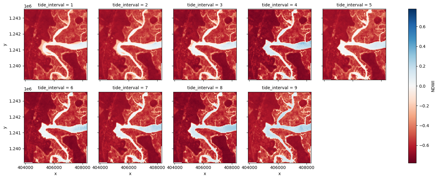
Le graphique ci-dessus devrait montrer clairement comment la forme et la structure du littoral changent considérablement entre la marée basse et la marée haute, car les vasières basses sont rapidement inondées par l’augmentation du niveau de l’eau.
Extraire les contours de profondeur à partir d’images
Nous souhaitons maintenant extraire une limite précise entre la terre et l’eau pour chacun des intervalles de marée ci-dessus. Le code ci-dessous identifie les contours de profondeur en fonction de la limite entre la terre et l’eau en traçant une ligne le long des pixels avec une valeur d’indice d’eau de « 0 » (la limite entre la terre et l’eau). Il renvoie un « geopandas.GeoDataFrame » avec un contour de profondeur pour chaque intervalle de marée étiqueté avec les hauteurs de marée en mètres par rapport au niveau moyen de la mer.
[16]:
# Set up attributes to assign to each waterline
attribute_df = pd.DataFrame({'tide_height': landsat_intervals.tide_height.values})

# Extract waterlines
contours_gdf = subpixel_contours(da=landsat_intervals.NDWI,
                                 z_values=0,
                                 crs=landsat_ds.geobox.crs,
                                 attribute_df=attribute_df,
                                 min_vertices=20,
                                 dim='tide_interval')

# Plot output shapefile over the top of the first tidal interval water index
fig, ax = plt.subplots(1, 1, figsize=(15, 10))
landsat_intervals.NDWI.sel(tide_interval=1).plot(ax=ax,
                                                 cmap='Greys',
                                                 add_colorbar=False)
contours_gdf.plot(ax=ax, column='tide_height', cmap='YlOrRd', legend=True)
plt.show()
/tmp/ipykernel_4069/2239509525.py:7: DeprecationWarning: Geobox extraction logic has moved to odc-geo and the .geobox property is now deprecated. Please access via .odc.geobox instead.
  crs=landsat_ds.geobox.crs,
Operating in single z-value, multiple arrays mode
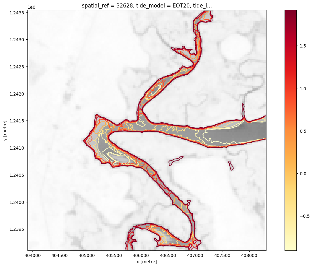
Le graphique ci-dessus est une visualisation basique des contours de profondeur renvoyés par la fonction « subpixel_contours ». Les contours plus profonds (en m par rapport au niveau moyen de la mer) sont colorés en jaune ; les contours moins profonds sont colorés en rouge. Maintenant que nous avons le fichier de formes, nous pouvons utiliser une fonction plus complexe pour créer un graphique interactif permettant de visualiser la topographie de la zone intertidale.
Tracer une carte interactive des courbes de profondeur colorées en fonction du temps
La cellule suivante fournit une carte interactive avec une superposition des courbes de profondeur identifiées dans la cellule précédente. Exécutez-la pour afficher la carte.
Zoomez sur la carte ci-dessous pour explorer l’ensemble des courbes de profondeur obtenues. Grâce à ces données, nous pouvons facilement identifier les zones du littoral qui ne sont exposées qu’à marée basse ou d’autres zones qui ne sont recouvertes d’eau qu’à marée haute.
[17]:
map_shapefile(gdf=contours_gdf, attribute='tide_height', continuous=True)
Interpoler les contours dans un modèle numérique d’élévation (MNE)
Bien que les contours ci-dessus fournissent des informations précieuses sur la topographie de la zone intertidale, nous pouvons extraire des informations supplémentaires sur la structure 3D du littoral en les convertissant en un raster d’élévation (c’est-à-dire un modèle numérique d’élévation ou DEM).
Dans la cellule ci-dessous, nous convertissons le fichier de formes ci-dessus en un tableau de points avec des coordonnées X, Y et Z, où la coordonnée Z est l’élévation du point par rapport au niveau moyen de la mer. Nous utilisons ensuite ces points XYZ pour interpoler des élévations lisses et continues sur la zone intertidale à l’aide d’une interpolation linéaire.
[18]:
# First convert our contours shapefile into an array of XYZ points
xyz_array = contours_to_arrays(contours_gdf, 'tide_height')

# Interpolate these XYZ points over the spatial extent of the Landsat dataset
intertidal_dem = interpolate_2d(ds=landsat_intervals,
                                x_coords=xyz_array[:, 0],
                                y_coords=xyz_array[:, 1],
                                z_coords=xyz_array[:, 2])

# Plot the output
intertidal_dem.plot(cmap='viridis', size=8, robust=True)
plt.show()
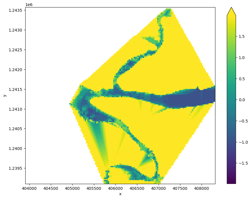
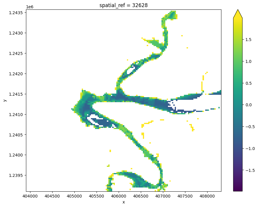
Vous pouvez voir dans le résultat ci-dessus que nos résultats d’interpolation sont très confus. Cela est dû au fait que l’interpolation s’étend à des zones de notre zone d’étude qui ne sont pas affectées par les marées (par exemple, des zones d’eau situées au-delà de la marée la plus basse observée et sur terre). Pour nettoyer les données, nous pouvons restreindre le MNT à la seule zone comprise entre les marées les plus basses et les plus hautes observées :
[19]:
# Identify areas that are always wet (e.g. below low tide), or always dry
above_lowest = landsat_intervals.isel(tide_interval=0).NDWI < 0
below_highest = landsat_intervals.isel(tide_interval=-1).NDWI > 0

# Keep only pixels between high and low tide
intertidal_dem_clean = intertidal_dem.where(above_lowest & below_highest)

# Plot the cleaned dataset
intertidal_dem_clean.plot(cmap='viridis', size=8, robust=True)
plt.show()
Exporter le DEM intertidal au format GeoTIFF
En guise d’étape finale, nous pouvons prendre le DEM intertidal que nous avons créé et l’exporter sous forme de GeoTIFF qui peut être chargé dans un logiciel SIG comme QGIS ou ArcMap (pour télécharger l’ensemble de données depuis le Sandbox, localisez-le dans le navigateur de fichiers à gauche, faites un clic droit sur le fichier et sélectionnez « Télécharger »).
[20]:
# Export as a GeoTIFF
write_cog(intertidal_dem_clean,
          fname='intertidal_dem.tif',
          overwrite=True)
[20]:
PosixPath('intertidal_dem.tif')
Prochaines étapes
Lorsque vous avez terminé, revenez à la cellule « Configurer l’analyse », modifiez certaines valeurs (par exemple, « time_range », « lat » et « lon ») et réexécutez l’analyse.
Si vous souhaitez modifier l’emplacement, vous devrez vous assurer que les données Landsat 5, 7 et 8 sont disponibles pour le nouvel emplacement, ce que vous pouvez vérifier sur DEAfrica Explorer (utilisez le menu déroulant pour afficher tous les produits Landsat).
Modèle numérique national d’élévation intertidale
Pour plus d’informations sur la science derrière ce carnet, veuillez vous référer à l’article scientifique décrivant l’application de cette approche à l’ensemble du littoral australien : Bishop-Taylor et al. 2019 Between the tides: Modelling the elevation of Australia’s exposed intertidal zone at continental scale.
Informations Complémentaires
Licence Le code de ce notebook est sous licence Apache, version 2.0 <https://www.apache.org/licenses/LICENSE-2.0>`__.
Les données de Digital Earth Africa sont sous licence Creative Commons Attribution 4.0 <https://creativecommons.org/licenses/by/4.0/>.
Contact Si vous avez besoin d’aide, veuillez poster une question sur le canal Slack DE Africa <https://digitalearthafrica.slack.com/> ou sur le GIS Stack Exchange <https://gis.stackexchange.com/questions/ask?tags=open-data-cube> en utilisant la balise open-data-cube (vous pouvez consulter les questions posées précédemment `ici <https://gis.stackexchange.com/questions/tagged/open-data-
Si vous souhaitez signaler un problème avec ce notebook, vous pouvez en déposer un sur Github.
Version de Datacube compatible
[21]:
print(datacube.__version__)
1.9.13
Dernier test :
[22]:
from datetime import datetime
datetime.today().strftime('%Y-%m-%d')
[22]:
'2026-04-08'