Analyse des séries chronologiques de température
L’ensemble de données ERA5 est externe à la plateforme Digital Earth Africa.
Mots-clés : données utilisées ; ERA5, ensembles de données ; ERA5, climat, température, température de surface
Aperçu
Nous pouvons être intéressés par la façon dont une variable environnementale a changé ou évolué sur une période à moyen ou long terme. La décomposition des séries temporelles peut nous aider à visualiser les tendances à long terme des variables géospatiales. Cette technique décompose une série temporelle en ses composantes cycliques (saisonnières), de tendance et d’erreur résiduelle.
Description
Pour cet exemple, nous allons charger des données de température de l’air et de surface. La résolution spatiale des données de température de surface nous permet de visualiser les modèles spatiaux entre les points temporels. À l’inverse, la régularité temporelle des données de température de l’air ERA5 signifie qu’elles sont mieux adaptées à l’analyse d’une série temporelle unidimensionnelle.
Le carnet décrit :
Chargement des données de température de l’air ERA5 et de température de surface Landsat.
Tracez et inspectez la température de surface à deux moments précis.
Décomposition d’une série chronologique de données de température de l’air en composantes de tendance, saisonnières et d’erreur aléatoire.
Tracé et interprétation des composantes saisonnières et de tendance des séries chronologiques.
Commencer
Pour exécuter cette analyse, exécutez toutes les cellules du bloc-notes, en commençant par la cellule « Charger les packages ».
Charger des paquets
[1]:
%matplotlib inline

import os
import datacube
import matplotlib.pyplot as plt
import numpy as np
import pandas as pd
import xarray as xr
from deafrica_tools.dask import create_local_dask_cluster
from deafrica_tools.datahandling import load_ard, mostcommon_crs
from deafrica_tools.load_era5 import load_era5
from deafrica_tools.plotting import display_map, rgb
from statsmodels.tsa.seasonal import seasonal_decompose
Se connecter au datacube
[2]:
dc = datacube.Datacube(app="Timeseries_temperature")
Paramètres d’analyse
Nous allons charger les données de température pour une période de quarante ans (1981-2021) pour l’emplacement par défaut du Caire, en Égypte.
La cellule suivante définit des paramètres importants pour l’analyse :
« lat » : plage de latitude que nous souhaitons couvrir.
« lon » : plage de longitude que nous souhaitons couvrir.
time: période de temps
Si vous exécutez le bloc-notes pour la première fois, conservez les paramètres par défaut ci-dessous. Cela permettra de démontrer le fonctionnement de l’analyse et de fournir des résultats significatifs.
[3]:
# Area around Cairo
lat = (29.881, 30.328)
lon = (31.078, 31.662)

# Define the time window
time = "1981-01", "2021-12"

display_map(x=lon, y=lat)
[3]:
Données de température de charge
Nous utiliserons la fonction « load_era5 » pour obtenir la température de l’air à une hauteur de 2 m pour la période et la zone d’intérêt. Nous rééchantillonnons cet ensemble de données aux valeurs moyennes mensuelles au fur et à mesure du chargement, de sorte que la taille de l’ensemble de données soit plus gérable.
Nous utiliserons également « load_ard » pour obtenir la température de la surface terrestre à partir de Landsats 5 et 8, et « dc.load » pour récupérer les géomédianes Landsat afin de pouvoir comparer les images en vraies couleurs à la température de surface.
Température de l’air de chargement
[4]:
var = "air_temperature_at_2_metres"

temp = load_era5(var, lat, lon, time, reduce_func=np.mean, resample="1ME").compute()
[5]:
attrs = temp[var].attrs
attrs["units"] = "C"
temp = temp - 273.15  # convert from Kelvin to Celcius
temp[var].attrs = attrs
Charger la température de surface et la réflectance de surface de Landsat
[6]:
surf_temp_84 = load_ard(
    dc=dc,
    products=["ls5_st"],
    x=lon,
    y=lat,
    time=["1984"],
    measurements=["surface_temperature"],
    output_crs="EPSG:32633",
    resolution=(-30, 30),
    dask_chunks={"x": 3000, "y": 3000},
)

surf_temp_84 = (
    surf_temp_84.resample(time="1Y").mean() - 273.15
)  # resample to annual mean values and convert from K to C

surf_temp_20 = load_ard(
    dc=dc,
    products=["ls8_st"],
    x=lon,
    y=lat,
    time=["2020"],
    measurements=["surface_temperature"],
    output_crs="EPSG:32633",
    resolution=(-30, 30),
    dask_chunks={"x": 3000, "y": 3000},
)

surf_temp_20 = (
    surf_temp_20.resample(time="1Y").mean() - 273.15
)  # resample to annual mean values and convert from K to C

surf_refl_84 = dc.load(
    product=["gm_ls5_ls7_annual"],
    x=lon,
    y=lat,
    time=["1984"],
    measurements=["red", "green", "blue"],
    output_crs="EPSG:32633",
    resolution=(-30, 30),
    dask_chunks={"x": 3000, "y": 3000},
)

surf_refl_20 = dc.load(
    product=["gm_ls8_annual"],
    x=lon,
    y=lat,
    time=["2020"],
    measurements=["red", "green", "blue"],
    output_crs="EPSG:32633",
    resolution=(-30, 30),
    dask_chunks={"x": 3000, "y": 3000},
)
Using pixel quality parameters for USGS Collection 2
Finding datasets
    ls5_st
Applying pixel quality/cloud mask
Re-scaling Landsat C2 data
Returning 22 time steps as a dask array
Using pixel quality parameters for USGS Collection 2
Finding datasets
    ls8_st
<string>:7: FutureWarning: 'Y' is deprecated and will be removed in a future version. Please use 'YE' instead of 'Y'.
Applying pixel quality/cloud mask
Re-scaling Landsat C2 data
Returning 45 time steps as a dask array
<string>:7: FutureWarning: 'Y' is deprecated and will be removed in a future version. Please use 'YE' instead of 'Y'.
Inspecter les changements de température de surface
Le tracé de la température de surface à côté des images en vraies couleurs ci-dessous montre comment les schémas spatiaux de la température de surface ont changé entre 1984 et 2020, et comment ils peuvent être liés aux changements d’utilisation et de couverture des sols. L’ajout de végétation et probablement l’irrigation dans la partie orientale de la zone ont produit une température de surface plus basse en 2020 par rapport à 1984. Cependant, la perte de végétation et le développement des infrastructures dans d’autres zones semblent avoir augmenté la température de surface.
[7]:
fig, ax = plt.subplots(2, 2, sharey=True, figsize=(12, 10))
rgb(surf_refl_84, ax=ax[0, 0])
rgb(surf_refl_20, ax=ax[1, 0])
surf_temp_84.surface_temperature.plot(
    ax=ax[0, 1], cmap="coolwarm", robust=True, vmin=26, vmax=42
)
surf_temp_20.surface_temperature.plot(
    ax=ax[1, 1], cmap="coolwarm", robust=True, vmin=26, vmax=42
)
ax[0, 0].set_title("True colour 1984")
ax[1, 0].set_title("True colour 2020")
ax[0, 1].set_title("Surface temp. 1984 (C)")
ax[1, 1].set_title("Surface temp. 2020 (C)");

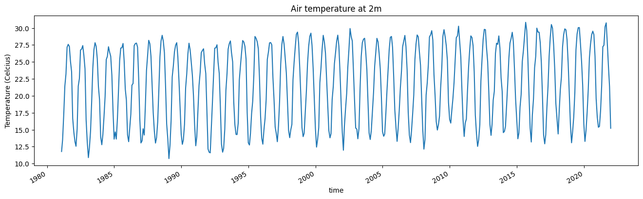
Inspecter les séries chronologiques de température de l’air
Ci-dessous, la série chronologique observée de la température de l’air est représentée. Y a-t-il des tendances ou des anomalies notables ?
[8]:
temp[var].mean(["lat", "lon"]).plot(figsize=(16, 4))
plt.title("Air temperature at 2m")
plt.ylabel("Temperature (Celcius)");
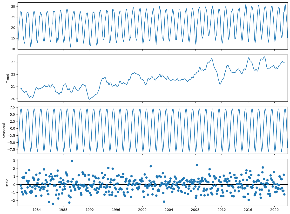
Décomposition des séries temporelles
L’étape suivante consiste à décomposer la série temporelle observée en ses composantes saisonnières et de tendance. La fonction seasonal_decompose fonctionne mieux sur les séries temporelles pandas, nous allons donc agréger spatialement nos séries temporelles et les convertir en un dataframe pandas.
[9]:
temp_air_ts = temp[var].mean(['lat','lon']).to_pandas()
Nous pouvons maintenant utiliser la fonction « seasonal_decompose » sur nos séries temporelles. Les détails sur la fonction sont disponibles dans les « notes du package <https://www.statsmodels.org/dev/generated/statsmodels.tsa.seasonal.seasonal_decompose.html> » et la décomposition générale des séries temporelles est disponible « ici <https://en.wikipedia.org/wiki/Decomposition_of_time_series> » .
Le résultat de la décomposition est représenté ci-dessous et montre la série chronologique observée (indiquée ci-dessus), la composante de tendance (notez la différence dans l’échelle de l’axe des Y), la composante saisonnière (ou cyclique) et l’erreur résiduelle.
[10]:
temp_air_dts = seasonal_decompose(temp_air_ts)

fig = temp_air_dts.plot()
fig.set_size_inches((12, 9))
fig.tight_layout()
plt.show()
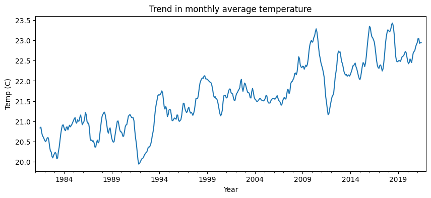
Nous pouvons également tracer des composants individuels, tels que la tendance à long terme, comme ci-dessous, et faire des comparaisons entre la température de l’air et la température de surface.
[11]:
temp_air_dts.trend.plot(figsize = (10,4))
plt.xlabel('Year')
plt.ylabel('%s (%s)'%('Temp', temp[var].attrs['units']))
plt.title('Trend in monthly average temperature');
Interprétation et prochaines étapes
L’analyse exploratoire menée dans ce carnet nous permet d’examiner visuellement les tendances et les schémas saisonniers. Il nous faudrait effectuer d’autres tests statistiques pour déterminer si les tendances observées peuvent être considérées comme « significatives ».
Nous ne sommes pas non plus en mesure de tirer de cette seule analyse des conclusions sur les tendances observées. Nous pourrions émettre l’hypothèse que la tendance à la hausse de la température de l’air est due à une combinaison de l’augmentation de la concentration atmosphérique de gaz à effet de serre et des changements observés dans l’utilisation et la couverture des sols.
Une analyse plus approfondie serait nécessaire pour attribuer ces tendances à l’un de ces facteurs.
Informations Complémentaires
Licence Le code de ce notebook est sous licence Apache, version 2.0 <https://www.apache.org/licenses/LICENSE-2.0>`__.
Les données de Digital Earth Africa sont sous licence Creative Commons Attribution 4.0 <https://creativecommons.org/licenses/by/4.0/>.
Contact Si vous avez besoin d’aide, veuillez poster une question sur le canal Slack DE Africa <https://digitalearthafrica.slack.com/> ou sur le GIS Stack Exchange <https://gis.stackexchange.com/questions/ask?tags=open-data-cube> en utilisant la balise open-data-cube (vous pouvez consulter les questions posées précédemment `ici <https://gis.stackexchange.com/questions/tagged/open-data-
Si vous souhaitez signaler un problème avec ce notebook, vous pouvez en déposer un sur Github.
Version de Datacube compatible
[12]:
print(datacube.__version__)
1.8.20
Dernier test :
[13]:
from datetime import datetime

datetime.today().strftime('%Y-%m-%d')
[13]:
'2025-01-16'