Monitoring Crop Health using Enhanced Vegetation Index
Products used: ls9_sr
Keywords data used; Landsat-9, band index; EVI
Background
Enhanced Vegetation Index can be calculated from Landsat or Sentinel-2 images, and is similar to the Normalized Difference Vegetation Index (NDVI), as it quantifies vegetation greenness. However, the EVI corrects for some atmospheric conditions and canopy background noise and is more sensitive in areas with dense vegetation.
Using Digital Earth Africa’s archive of analysis-ready satellite data, we can easily calculate the EVI for mapping and monitoring vegetation through time, or as inputs to machine learning or classification algorithms.
Description
This notebook demonstrates how to:
Load Landsat 9 images for an area of interest (AOI)
Calculate the Enhanced Vegetation Index (EVI)
Visualize the results.
Getting started
To run this analysis, run all the cells in the notebook, starting with the “Load packages” cell.
Load packages
[1]:
%matplotlib inline

import datacube
import xarray as xr
import geopandas as gpd
import matplotlib.pyplot as plt
from odc.geo.geom import Geometry

from deafrica_tools.datahandling import load_ard, mostcommon_crs
from deafrica_tools.plotting import rgb
from deafrica_tools.bandindices import calculate_indices
from deafrica_tools.areaofinterest import define_area
Connect to the datacube
[2]:
dc = datacube.Datacube(app='crop_health_evi')
Analysis parameters
The following cell sets the parameters, which define the area of interest and the length of time to conduct the analysis over. The parameters are
lat: The central latitude to analyse (e.g.10.338).lon: The central longitude to analyse (e.g.-1.055).buffer: The number of square degrees to load around the central latitude and longitude. For reasonable loading times, set this as0.1or lower.
Select location
To define the area of interest, there are two methods available:
By specifying the latitude, longitude, and buffer. This method requires you to input the central latitude, central longitude, and the buffer value in square degrees around the center point you want to analyze. For example,
lat = 10.338,lon = -1.055, andbuffer = 0.1will select an area with a radius of 0.1 square degrees around the point with coordinates (10.338, -1.055).Alternatively, you can provide separate buffer values for latitude and longitude for a rectangular area. For example,
lat = 10.338,lon = -1.055, andlat_buffer = 0.1andlon_buffer = 0.08will select a rectangular area extending 0.1 degrees north and south, and 0.08 degrees east and west from the point(10.338, -1.055).For reasonable loading times, set the buffer as
0.1or lower.By uploading a polygon as a
GeoJSON or Esri Shapefile. If you choose this option, you will need to upload the geojson or ESRI shapefile into the Sandbox using Upload Files button in the top left corner of the Jupyter Notebook interface. ESRI shapefiles must be uploaded with all the related files
 (.cpg, .dbf, .shp, .shx). Once uploaded, you can use the shapefile or geojson to define the area of interest. Remember to update the code to call the file you have uploaded.
To use one of these methods, you can uncomment the relevant line of code and comment out the other one. To comment out a line, add the "#" symbol before the code you want to comment out. By default, the first option which defines the location using latitude, longitude, and buffer is being used.
If running the notebook for the first time, keep the default settings below. This will demonstrate how the analysis works and provide meaningful results.
[3]:
# Method 1: Specify the latitude, longitude, and buffer
aoi = define_area(lat=31.13907, lon=31.41094, buffer=0.02)

# Method 2: Use a polygon as a GeoJSON or Esri Shapefile.
# aoi = define_area(vector_path='aoi.shp')

#Create a geopolygon and geodataframe of the area of interest
geopolygon = Geometry(aoi["features"][0]["geometry"], crs="epsg:4326")
geopolygon_gdf = gpd.GeoDataFrame(geometry=[geopolygon], crs=geopolygon.crs)

# Get the latitude and longitude range of the geopolygon
lat_range = (geopolygon_gdf.total_bounds[1], geopolygon_gdf.total_bounds[3])
lon_range = (geopolygon_gdf.total_bounds[0], geopolygon_gdf.total_bounds[2])
Create a query and load satellite data
The load_ard function will automatically mask out clouds from the dataset, allowing us to focus on pixels that contain useful data. It will also exclude images where more than 99% of the pixels are masked, which is set using the min_gooddata parameter in the load_ard call.
[4]:
# Create a reusable query
query = {
    'x': lon_range,
    'y': lat_range,
    'time': ('2022'),
    'resolution': (-10, 10)
}

# Identify the most common projection system in the input query
output_crs = mostcommon_crs(dc=dc, product='ls9_sr', query=query)

# Load available data from Landsat 9 and filter to retain only times
# with at least 99% good data
ds = load_ard(dc=dc,
              products=['ls9_sr'],
              min_gooddata=0.99,
              measurements=['red', 'green', 'blue', 'nir'],
              output_crs=output_crs,
              **query)
Using pixel quality parameters for USGS Collection 2
Finding datasets
    ls9_sr
Counting good quality pixels for each time step
Filtering to 30 out of 66 time steps with at least 99.0% good quality pixels
Applying pixel quality/cloud mask
Re-scaling Landsat C2 data
Loading 30 time steps
[5]:
display(ds)
<xarray.Dataset> Size: 84MB
Dimensions:      (time: 30, y: 450, x: 388)
Coordinates:
  * time         (time) datetime64[ns] 240B 2022-01-24T08:23:44.035758 ... 20...
  * y            (y) float64 4kB 3.448e+06 3.448e+06 ... 3.444e+06 3.444e+06
  * x            (x) float64 3kB 3.466e+05 3.466e+05 ... 3.504e+05 3.504e+05
    spatial_ref  int32 4B 32636
Data variables:
    red          (time, y, x) float32 21MB 0.0447 0.0447 ... 0.02567 0.04439
    green        (time, y, x) float32 21MB 0.04164 0.04164 ... 0.03636 0.05229
    blue         (time, y, x) float32 21MB 0.0263 0.0263 ... 0.02121 0.02619
    nir          (time, y, x) float32 21MB 0.1054 0.1054 ... 0.07621 0.2103
Attributes:
    crs:           epsg:32636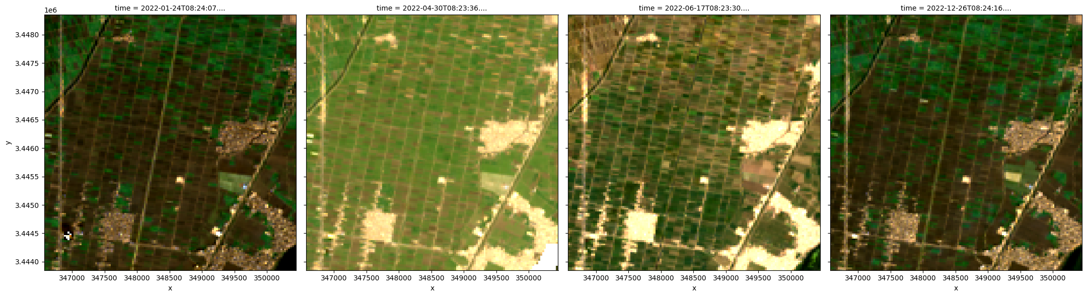
grid_mapping: spatial_refPlot the images to see what the area looks like
We use the rgb function to plot the timesteps in our dataset as true colour RGB images.
[6]:
# Plot an RGB image
rgb(ds, index=[1, 10, 15, -1])
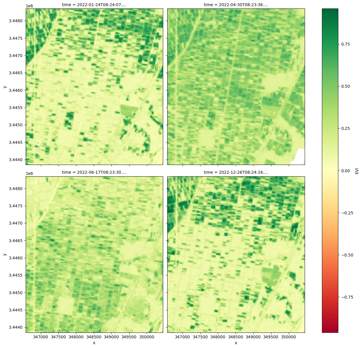
Calculating the EVI using the calculate_indices function
The Enhanced Vegetation Index requires the red, nir and blue bands as well as an “L” value to adjust for canopy background, “C” values as coefficients for atmospheric resistance, and a gain factor (G).
The formula is
The index is available through the calculate_indices function, imported from deafrica_tools.bandindices. Here,satellite_mission='ls' is used since we’re working with Landsat 9.
[7]:
# Calculate EVI using `calculate indices`
ds = calculate_indices(ds, index='EVI', satellite_mission='ls')

#The vegetation proxy index should now appear as a data variable,
#along with the loaded measurements, in the `ds` object.

# Plot the selected EVI results at timestep 1, 10, 15 and last image
ds.isel(time=[1, 10, 15, -1]).EVI.plot(col='time',
                                       cmap='RdYlGn',
                                       size=6,
                                       col_wrap=2)
[7]:
<xarray.plot.facetgrid.FacetGrid at 0x7f4cbacb9490>
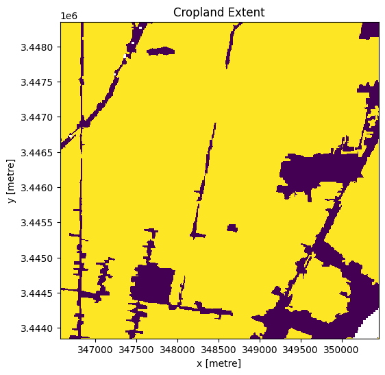
Mask region with DE Africa’s cropland extent map
Load the cropland mask over the region of interest.
[8]:
cm = dc.load(product='crop_mask',
             time=('2019'),
             measurements='filtered',
             resampling='nearest',
             like=ds.geobox).filtered.squeeze()

#Filter out the no-data pixels (255) and non-crop pixels (0) from the cropland map
cm.where(cm < 255).plot.imshow(
    add_colorbar=False,
    figsize=(6, 6))  # we filter to <255 to omit missing data
plt.title('Cropland Extent');
[9]:
#mask only the cropland from the landsat 9 data.
ds = ds.where(cm == 1)
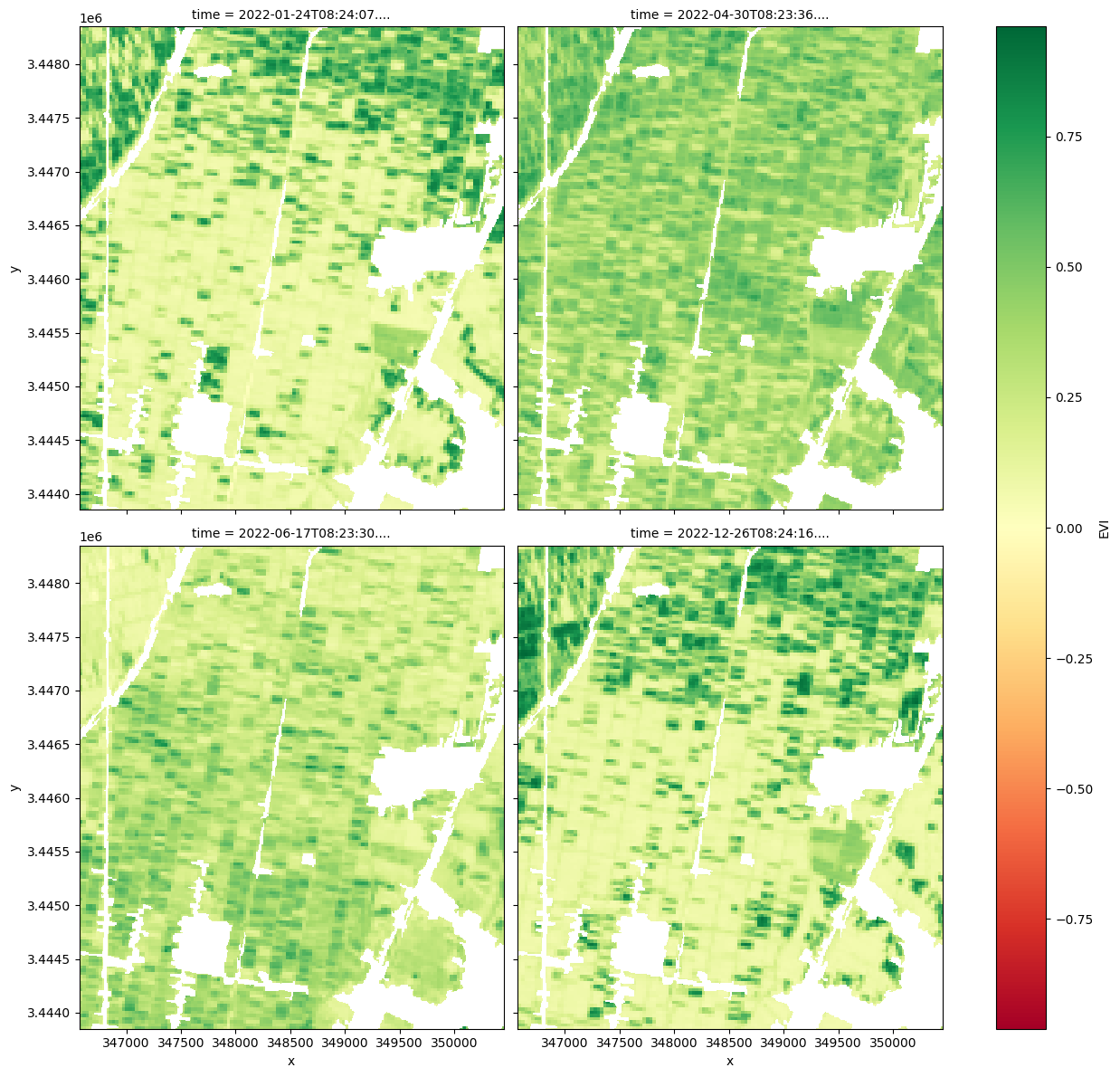
[10]:
# Plot the selected EVI results with crops only at timestep 1, 10, 15 and last image
ds.isel(time=[1, 10, 15, -1]).EVI.plot(cmap='RdYlGn',
                                       col='time',
                                       size=6,
                                       col_wrap=2)
[10]:
<xarray.plot.facetgrid.FacetGrid at 0x7f4ca8f95730>
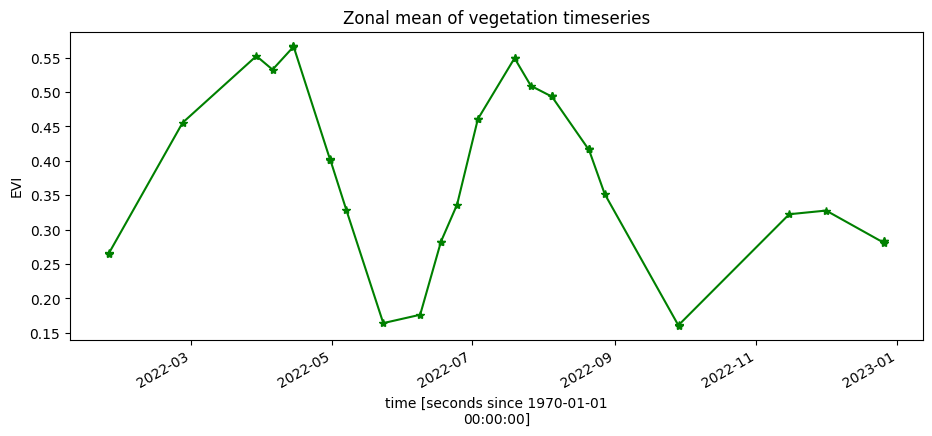
Zonal mean of the EVI
To understand changes in vegetation health throughout the year(s), we plot a zonal time series over the region of interest. First we will do a simple plot of the zonal mean of the data.
The plot below shows two peaks, suggesting the area of interest is used for double cropping (growing two crops per year).
[11]:
ds.EVI.mean(['x', 'y']).plot.line('g-*', figsize=(11, 4))
plt.title('Zonal mean of vegetation timeseries');
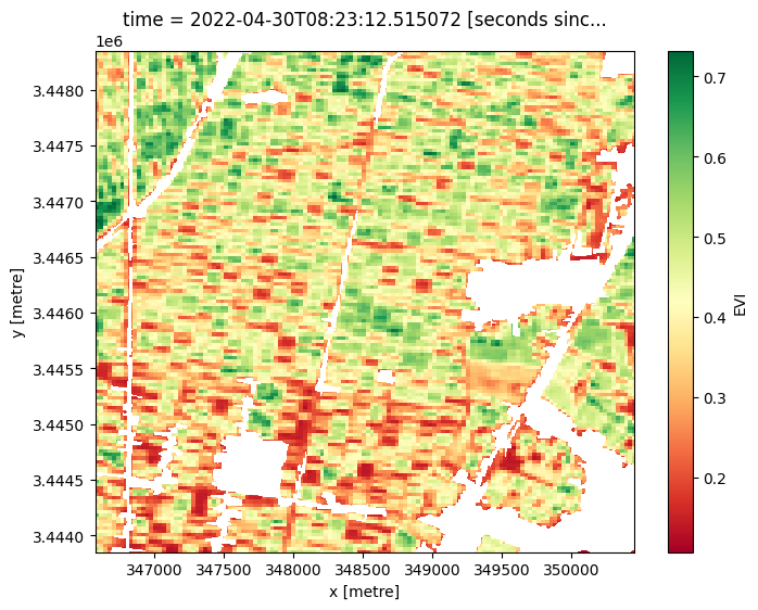
Plot an individual image to view the spatial variations in EVI
[12]:
ds.isel(time=8).EVI.plot(cmap='RdYlGn', size=6, col_wrap=2)
[12]:
<matplotlib.collections.QuadMesh at 0x7f4ca8288890>
Additional information
License The code in this notebook is licensed under the Apache License, Version 2.0.
Digital Earth Africa data is licensed under the Creative Commons by Attribution 4.0 license.
Contact If you need assistance, please post a question on the DE Africa Slack channel or on the GIS Stack Exchange using the open-data-cube tag (you can view previously asked questions here).
If you would like to report an issue with this notebook, you can file one on Github.
Compatible datacube version
[13]:
print(datacube.__version__)
1.8.20
Last Tested:
[14]:
from datetime import date

print(date.today())
2025-01-16