Effectuer une analyse de base
Produits utilisés : s2_l2a
Prérequis : Les utilisateurs de ce notebook doivent avoir une compréhension de base de :
Comment exécuter un Jupyter notebook
Inspection des produits et mesures disponibles en Afrique DE <02_Products_and_measurements.ipynb>`__
Comment charger des données depuis DE Africa <03_Loading_data.ipynb>`__
Comment tracer les données chargées
Mots-clés : guide du débutant ; analyse, analyse ; guide du débutant, données utilisées ; landsat 8, indice de bande ; NDVI, méthodes de données ; exportation
Aperçu
Pour comprendre le monde qui nous entoure, il est important de combiner les étapes clés de chargement, de visualisation, d’analyse et d’interprétation des données satellite. Pour effectuer une analyse, nous commençons par une question et utilisons ces étapes pour parvenir à une réponse.
Description
Ce cahier montre comment réaliser une analyse de base avec les données de DE Africa et Open Data Cube. Il combinera de nombreuses étapes qui ont été couvertes dans les autres cahiers pour débutants.
Dans ce cahier, la question d’analyse est « Comment la santé de la végétation évolue-t-elle au fil du temps dans une zone donnée ? »
Cela pourrait être lié à un certain nombre de questions plus larges :
Quel est l’effet d’une nouvelle pratique d’utilisation des terres sur un champ de cultures ?
Comment une parcelle de forêt a-t-elle changé après un incendie ?
Comment la proximité de l’eau affecte-t-elle la végétation tout au long de l’année ?
Pour ce cahier, la question d’analyse sera simple, sans grand contexte réel. Pour plus d’exemples de cahiers qui montrent comment utiliser DE Africa pour répondre à des questions d’analyse spécifiques, consultez les cahiers dans le dossier « Exemples du monde réel ».
Les sujets abordés dans ce carnet incluent :
Choisir un domaine d’étude.
Chargement des données pour la zone d’étude.
Tracer les données choisies et explorer comment elles évoluent avec le temps.
Calcul d’une mesure de la santé de la végétation à partir des données chargées.
Exportation des données pour une analyse plus approfondie.
Commencer
Pour exécuter cette introduction à l’exécution d’analyses de base avec les données DE Africa et le datacube, exécutez toutes les cellules du bloc-notes en commençant par la cellule « Charger les packages ». Pour obtenir de l’aide sur l’exécution des cellules du bloc-notes, reportez-vous au bloc-notes Jupyter Notebooks <01_Jupyter_notebooks.ipynb>`__.
Charger des paquets
La cellule ci-dessous importe les packages Python utilisés pour l’analyse. La première commande est « %matplotlib inline », qui garantit que les figures s’affichent correctement dans le bloc-notes Jupyter. Les commandes suivantes importent diverses fonctionnalités :
deafrica_toolscontient des fonctions de support utiles, y compris celles du moduledeafrica_plottingque nous utilisons dans ce notebook.« datacube » offre la possibilité d’interroger et de charger des données.
« matplotlib » offre la possibilité de formater et de manipuler des tracés.
[1]:
%matplotlib inline

import datacube
import odc.algo
import matplotlib.pyplot as plt
from datacube.utils.cog import write_cog

from deafrica_tools.plotting import display_map, rgb
Se connecter au datacube
L’étape suivante consiste à se connecter à la base de données datacube. L’objet datacube « dc » résultant peut alors être utilisé pour charger des données. Le paramètre « app » est un nom unique utilisé pour identifier le bloc-notes qui n’a aucun effet sur l’analyse.
[2]:
dc = datacube.Datacube(app="05_Basic_analysis")
Étape 1 : Choisissez un domaine d’étude
Lorsque vous travaillez avec Open Data Cube, il est important de charger uniquement la quantité de données nécessaire. Cela permet de garantir une analyse rapide et d’éviter que le bloc-notes ne plante en raison d’une mémoire insuffisante.
Une façon de définir la zone d’étude consiste à définir une paire de coordonnées de latitude et de longitude centrales, « (central_lat, central_lon) », puis à spécifier le nombre de degrés à inclure de chaque côté de la latitude et de la longitude centrales, appelé « tampon ». Ensemble, ces paramètres spécifient une zone d’étude carrée, comme indiqué ci-dessous :
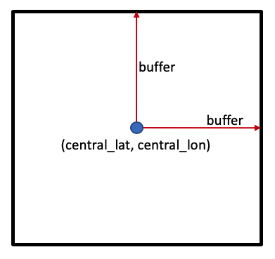
Emplacement
Ci-dessous, nous avons défini la zone d’étude couvrant une zone agricole en Afrique du Sud. Pour charger une zone différente, vous pouvez fournir vos propres valeurs « central_lat » et « central_lon ». Une façon de les obtenir est de rechercher un emplacement sur Google ou de cliquer directement sur la carte dans « Google Maps » <https://www.google.com/maps/place/21%C2%B007’25.4%22N+11%C2%B023’51.1%22W/@21.0925851,-11.555448,82035m/data=!3m1!1e3!4m14!1m7!3m6!1s0x10a06c0a948cf5d5:0x108270c99e90f0b3!2sAfrica!3b1!8m2!3d-8.783195!4d34.508523!3m5!1s0x0:0x0!7e2!8m2!3d21.1237127!4d-11.3975263>`__. Autres options :
Mont Kenya, Kenya
central_lat = -0.243
central_lon = 37.459
Réserve forestière de Bobiri, Ghana
central_lat = 6.688
central_lon = -1.303
**Remarque ** : si vous modifiez la latitude et la longitude de la zone d’étude, vous devrez réexécuter toutes les cellules pour appliquer cette modification à l’ensemble de l’analyse.
Tampon
N’hésitez pas à expérimenter avec la valeur « buffer » pour charger des zones de différentes tailles. Nous vous recommandons de conserver la valeur « buffer » relativement petite, pas plus de « buffer=0,1 » degrés. Cela permettra de maintenir des temps de chargement raisonnables et d’éviter que le notebook ne plante.
Extension : Pouvez-vous modifier le code pour utiliser une valeur « buffer » différente pour la latitude et la longitude ?
Astuce : vous pouvez avoir besoin de deux variables, « buffer_lat » et « buffer_lon » que vous pouvez définir indépendamment. Vous devrez ensuite mettre à jour les définitions de « study_area_lat » et « study_area_lon » avec leur valeur de tampon correspondante.
[3]:
# Set the central latitude and longitude
central_lat = -31.5393
central_lon = 18.2682

# Set the buffer to load around the central coordinates
buffer = 0.03

# Compute the bounding box for the study area
study_area_lat = (central_lat - buffer, central_lat + buffer)
study_area_lon = (central_lon - buffer, central_lon + buffer)
Après avoir choisi la zone d’étude, il peut être utile de la visualiser sur une carte interactive. Cela permet d’avoir une idée de l’échelle. > Remarque : la carte interactive renvoie également les valeurs de latitude et de longitude lorsque vous cliquez dessus. Vous pouvez l’utiliser pour générer de nouvelles valeurs de latitude et de longitude à essayer sans quitter le carnet.
[4]:
display_map(x=study_area_lon, y=study_area_lat)
[4]:
Étape 2 : Chargement des données
Pour les questions d’analyse sur la végétation, il est utile de travailler avec des images optiques, comme Sentinel-2 ou Landsat. Les satellites Sentinel-2 ont une résolution de 10 mètres et remontent à 2017.
Le code ci-dessous définit les informations requises pour charger les données.
[5]:
# Set the data source - s2a corresponds to Sentinel-2A
set_product = "s2_l2a"

# Set the date range to load data over
set_time = ("2018-01-01", "2018-02-01")

# Set the measurements/bands to load
# For this analysis, we'll load the red, green, blue and near-infrared bands
set_measurements = [
    "red",
    "blue",
    "green",
    "nir"
]

# Set the coordinate reference system and output resolution
set_crs = 'EPSG:6933'
set_resolution = (-10, 10)
Après avoir défini tous les paramètres nécessaires, la commande « dc.load() » est utilisée pour charger les données :
[6]:
dataset = dc.load(
    product=set_product,
    x=study_area_lon,
    y=study_area_lat,
    time=set_time,
    measurements=set_measurements,
    output_crs=set_crs,
    resolution=set_resolution,
    group_by='solar_day'
)
Après l’étape de chargement, l’impression de l’objet « dataset » vous donnera un aperçu de toutes les données qui ont été chargées. Pour ce faire, exécutez la cellule suivante.
Il y a beaucoup d’informations à décortiquer, qui sont représentées par les aspects suivants des données :
« Dimensions » : les noms des dimensions de données, souvent « temps », « x » et « y », et le nombre d’entrées dans chacune
« Coordonnées » : les valeurs de coordonnées pour chaque point du cube de données
« Variables de données » : les observations chargées, bandes spectrales souvent différentes d’un satellite
« Attributs » : toute information utile pour les données, telle que le « crs » (système de référence de coordonnées)
[7]:
dataset.red.attrs
[7]:
{'units': '1', 'nodata': 0, 'crs': 'EPSG:6933', 'grid_mapping': 'spatial_ref'}
[8]:
print(dataset)
<xarray.Dataset>
Dimensions:      (time: 6, y: 655, x: 580)
Coordinates:
  * time         (time) datetime64[ns] 2018-01-04T08:57:02 ... 2018-01-29T08:...
  * y            (y) float64 -3.825e+06 -3.825e+06 ... -3.831e+06 -3.831e+06
  * x            (x) float64 1.76e+06 1.76e+06 1.76e+06 ... 1.766e+06 1.766e+06
    spatial_ref  int32 6933
Data variables:
    red          (time, y, x) uint16 2502 2600 2754 2754 ... 1786 1348 880 1292
    blue         (time, y, x) uint16 955 949 1015 1011 954 ... 932 654 586 796
    green        (time, y, x) uint16 1580 1630 1718 1700 ... 1328 969 857 1090
    nir          (time, y, x) uint16 3200 3366 3442 3504 ... 2612 2624 2072 1742
Attributes:
    crs:           EPSG:6933
    grid_mapping:  spatial_ref
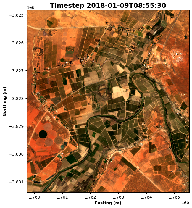
Étape 3 : Tracer les données
Après avoir chargé les données, il est utile de les visualiser pour comprendre la résolution, les observations affectées par la couverture nuageuse et s’il existe des différences évidentes entre les pas de temps.
Nous utilisons la fonction rgb() pour tracer les données chargées à l’étape précédente. La fonction rgb() mappe trois variables de données/mesures de l’ensemble de données chargé aux canaux rouge, vert et bleu qui sont utilisés pour créer une image tricolore. Il existe plusieurs paramètres avec lesquels vous pouvez expérimenter :
time_step=nCeci définit le pas de temps que vous souhaitez afficher. « n » peut être n’importe quel nombre compris entre « 0 » et un de moins que le nombre de pas de temps que vous avez chargés. Le nombre de pas de temps chargés est indiqué dans l’impression des données, sous l’intitulé « Dimensions ». Par exemple, si sous « Dimensions : » vous voyez « time: 6 », alors il y a 6 pas de temps et « time_step » peut être n’importe quel nombre compris entre « 0 » et « 5 ».bandes=[canal_rouge, canal_vert, canal_bleu]Cela définit les mesures que vous souhaitez utiliser pour créer l’image. Toutes les mesures peuvent être mappées sur les trois canaux, et différentes combinaisons mettent en évidence différentes caractéristiques. Deux combinaisons courantes sontvraie couleur :
bandes = ["rouge", "vert", "bleu"]fausse couleur :
bandes = ["nir", "rouge", "vert"]
Pour plus de détails sur la personnalisation des tracés, consultez le bloc-notes Introduction au traçage.
Extension : si « time_step » est défini sur un tableau de valeurs, par exemple « time_step=[time_1, time_2] », il tracera tous les pas de temps fournis. Voyez si vous pouvez modifier le code pour tracer la première et la dernière image. Si vous le faites, quels changements remarquez-vous ?
Astuce : Pour obtenir la dernière image, vous pouvez utiliser une valeur de pas de temps de « -1 »
[9]:
# Set the time step to view
time_step = 1
[10]:
# Set the band combination to plot
bands = ["red", "green", "blue"]

# Generate the image by running the rgb function
rgb(dataset, bands=bands, index=time_step, size=8)

# Format the time stamp for use as the plot title
time_string = str(dataset.time.isel(time=time_step).values).split('.')[0]

# Set the title and axis labels
ax = plt.gca()
ax.set_title(f"Timestep {time_string}", fontweight='bold', fontsize=16)
ax.set_xlabel('Easting (m)', fontweight='bold')
ax.set_ylabel('Northing (m)', fontweight='bold')

# Display the plot
plt.show()
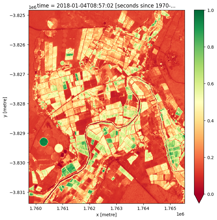
Étape 4 : Calculer la santé de la végétation
Bien qu’il soit possible d’identifier la végétation dans l’image RVB, il peut être utile de disposer d’un indice quantitatif pour décrire directement la santé de la végétation.
Dans ce cas, l’indice de végétation par différence normalisée <https://en.wikipedia.org/wiki/Normalized_difference_vegetation_index> (NDVI) peut aider à identifier les zones de végétation saine. Pour les données de télédétection telles que l’imagerie satellite, il est défini comme
où \(\text{NIR}\) est la bande proche infrarouge des données et \(\text{Red}\) est la bande rouge. Le NDVI peut prendre des valeurs de -1 à 1 ; les valeurs élevées indiquent une végétation saine et les valeurs négatives indiquent une absence de végétation (comme de l’eau).
Le code suivant calcule séparément le haut et le bas de la fraction, puis calcule directement la valeur NDVI à partir de ces composants. Les valeurs NDVI calculées sont stockées dans leur propre tableau de données.
Remarque : avant de calculer le NDVI, nous devons convertir le type de données en « float32 », ce qui convertira les valeurs nodata dans l’ensemble de données « uint16 » d’origine en « NaN », et ignorera donc ces valeurs dans le calcul du NDVI.
[11]:
# convert dataset to float32 datatype so no-data values are set to NaN
dataset =  odc.algo.to_f32(dataset)
[12]:
# Calculate the components that make up the NDVI calculation
band_diff = dataset.nir - dataset.red
band_sum = dataset.nir + dataset.red

# Calculate NDVI and store it as a measurement in the original dataset
ndvi = band_diff / band_sum
Après avoir calculé les valeurs NDVI, il est possible de les tracer en ajoutant la méthode .plot() à ndvi (la variable dans laquelle les valeurs sont stockées). Le code ci-dessous tracera une seule image, en fonction du temps sélectionné avec la variable ndvi_time_step. Essayez de modifier cette valeur pour tracer la carte NDVI à différents pas de temps. Remarquez-vous des différences ?
Extension 1 : Parfois, il est utile de modifier l’échelle de couleurs pour une compréhension intuitive de l’image. Par exemple, la carte de couleurs « viridis » affiche des valeurs élevées en vert/jaune (correspondant à la végétation) et des valeurs faibles en bleu (correspondant à l’eau). Essayez de modifier la commande
.plot(cmap="RdYlGn")ci-dessous pour utilisercmap="viridis"à la place.
[13]:
# Set the NDVI time step to view
ndvi_time_step = 0

# This is the simple way to plot
# Note that high values are likely to be vegetation.
plt.figure(figsize=(8, 8))
ndvi.isel(time=ndvi_time_step).plot(cmap="RdYlGn", vmin=0, vmax=1)
plt.show()
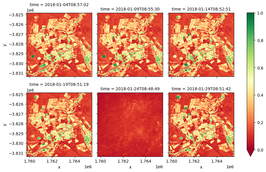
Extension 2 : pour la cellule ci-dessus, un seul pas de temps a été sélectionné à l’aide de la méthode « .isel() ». Il est possible de tracer tous les pas de temps en supprimant la méthode « .isel() » et en modifiant la méthode « .plot() » pour qu’elle devienne « .plot(col=”time”, col_wrap=3) » où « time » correspond aux pas de temps des images. Le tracé simultané de tous les pas de temps peut faciliter la détection des différences de végétation au fil du temps.
[14]:
plt.figure(figsize=(8, 8))
ndvi.plot(col='time', cmap="RdYlGn", vmin=0, vmax=1, col_wrap=3)
plt.show()
<Figure size 800x800 with 0 Axes>
Étape 5 : Exportation des données
Parfois, vous souhaiterez analyser des images satellite dans un programme SIG, tel que QGIS. La commande write_cog() de la bibliothèque Open Data Cube permet d’exporter les données chargées vers GeoTIFF, un format de fichier couramment utilisé pour les données géospatiales. Cet exemple exporte une image en fonction du time_step fourni. Pour plus d’informations sur l’exportation de plusieurs images, consultez Exporting GeoTIFFS notebook > Remarque : le fichier enregistré apparaîtra dans le même répertoire que ce notebook, et il peut être téléchargé à partir d’ici pour une utilisation ultérieure.
[15]:
# You can change the name from example,tiff to your prefered name, if you like.
filename = "example.tif"

write_cog(geo_im=dataset.isel(time=time_step).to_array(), fname=filename, overwrite=True)
[15]:
PosixPath('example.tif')
Étapes suivantes recommandées
Pour ce carnet
De nombreuses variables utilisées dans cette analyse sont configurables. Nous vous recommandons de revenir au début du bloc-notes et de réexécuter l’analyse avec un emplacement, des dates, des mesures, etc. différents. Cela vous aidera à mieux comprendre comment exécuter votre propre analyse. Si vous n’avez pas essayé les activités d’extension la première fois, essayez de travailler dessus lorsque vous parcourez à nouveau le bloc-notes.
Pour les autres cahiers
Il s’agit du cinquième cahier du guide du débutant ; si quelque chose n’était pas clair, nous vous recommandons de réviser le cahier concerné :
Réalisation d’une analyse de base (ce carnet)
Une fois que vous avez terminé les didacticiels ci-dessus, rejoignez les utilisateurs avancés pour explorer :
Le répertoire « Datasets » du référentiel, où vous pouvez explorer en profondeur les produits DE Africa.
Le répertoire « Code fréquemment utilisé », qui contient un livre de recettes de techniques et méthodes courantes pour l’analyse des données DE Africa.
Le répertoire « Exemples du monde réel », qui fournit des flux de travail plus complexes et des études de cas d’analyse.
Informations Complémentaires
Licence : Le code de ce carnet est sous licence Apache, version 2.0 <https://www.apache.org/licenses/LICENSE-2.0>. Les données de Digital Earth Africa sont sous licence Creative Commons par attribution 4.0 <https://creativecommons.org/licenses/by/4.0/>.
Contact : Si vous avez besoin d’aide, veuillez poster une question sur le canal Slack Open Data Cube <http://slack.opendatacube.org/>`__ ou sur le GIS Stack Exchange en utilisant la balise open-data-cube (vous pouvez consulter les questions posées précédemment ici). Si vous souhaitez signaler un problème avec ce bloc-notes, vous pouvez en déposer un sur Github.
Version de Datacube compatible :
[16]:
print(datacube.__version__)
1.8.15
Dernier test :
[17]:
from datetime import date
print(date.today())
2023-08-11